
Infuriating Video Shows How Text Appears To A Dyslexic Person
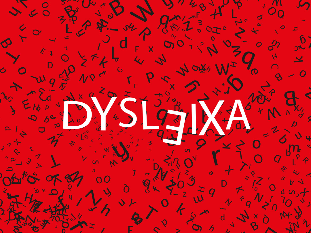
Illustration 194332346 © Iwona Suchomska | Dreamstime.com
If you want to know what it’s like to never take accessible design for granted, try walking in a dyslexic individual’s shoes… or reading a newspaper in their view.
Upworthy brings to light a compelling video by Dyslexia Improvements, a platform for parents whose kids have the condition, that offers a glimpse at how challenging it can be to read packaging, articles, signs—you name it—for somebody with dyslexia, a learning difficulty caused by anomalies in parts of the brain responsible for language processing and expression.
Text appears differently to everyone with the condition. As illustrated in the minute-long video, it could become “three-dimensional,” in which the print is perceived to be floating above itself. It’s also not static, sometimes following the gaze like a parallax effect.
Words could also be seen as split into jigsaw puzzle pieces of sorts. They could vanish suddenly, or even swirl or shake.
All these variations might be great as WordArt, but not if they’re a part of your everyday experience. “Man, imagine what it feels like to be reading like that,” says the video’s narrator.
You’ll see why so much is being done for legibility, though whether those efforts are for someone with a reading disability is another thing. As it so happens, Comic Sans—one of the most contentious typefaces—is an optimal choice for dyslexic readers, thanks to its irregular shapes that make words easy to isolate. However, if you can’t bring yourself to adopt Comic Sans in your work, there are also alternatives like ‘Dyslexie’, a charming, handwritten font created just for people with dyslexia.
[via Upworthy and Dyslexia Improvements, cover illustration 194332346 © Iwona Suchomska | Dreamstime.com]


