
Minute Maid Squeezes Retro, Feel-Good Elements Into Fresh Global Rebrand

Distilling how alive customers worldwide feel when they take a sip of juice, Minute Maid has introduced a zesty new brand identity that’s consistent everywhere.
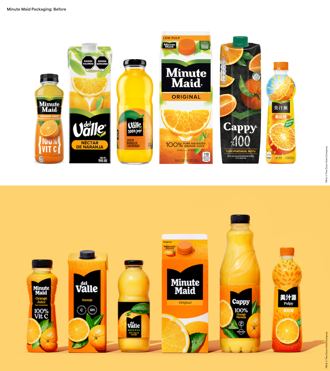
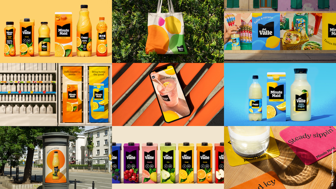
Notably, Minute Maid assumes many names across its 100 global markets. In the US and Asia, it’s known as Minute Maid. In Europe and Africa, drinkers call it Cappy. In Latin America, Minute Maid goes by del Valle. Yet, the packaging differs slightly depending on where you live.

This is the first time in the brand’s 77-year history that Minute Maid and all its international names will share the same iconic look, so there will be no comparing between oranges and apples. To carry out this ambitious feat, the Coca-Cola-owned company’s in-house design team worked with creative agencies Jones Knowles Ritchie (JKR), Grey, VMLY&R, and Landor & Fitch to develop a harmonious look and feel.

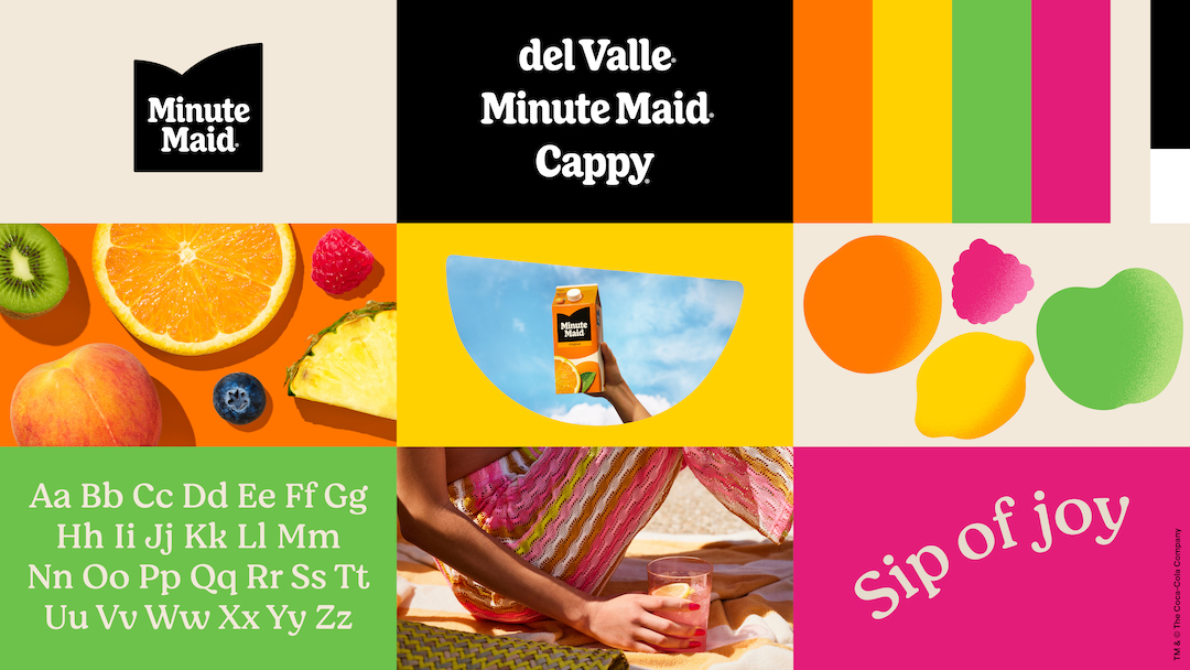
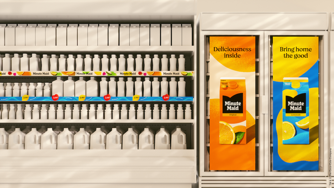
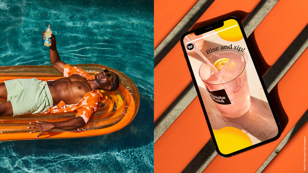
The overhaul squeezes more energy into the visual identity with warm, lively hues inspired by nature, delightful illustrations, and effervescent photography that bottles up the feeling of enjoyment.
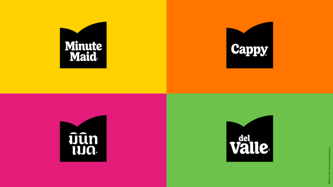
Flattened elements contrast, and elevate, the brightness of the fruit imagery. And blending the entire look together is a softer, retro wordmark that looks closer to Minute Maid’s first logo from 1945, according to It’s Nice That.
The label’s curvature has also been smoothened, but given a greater incline for a subliminal association with splashing juice, per the report.
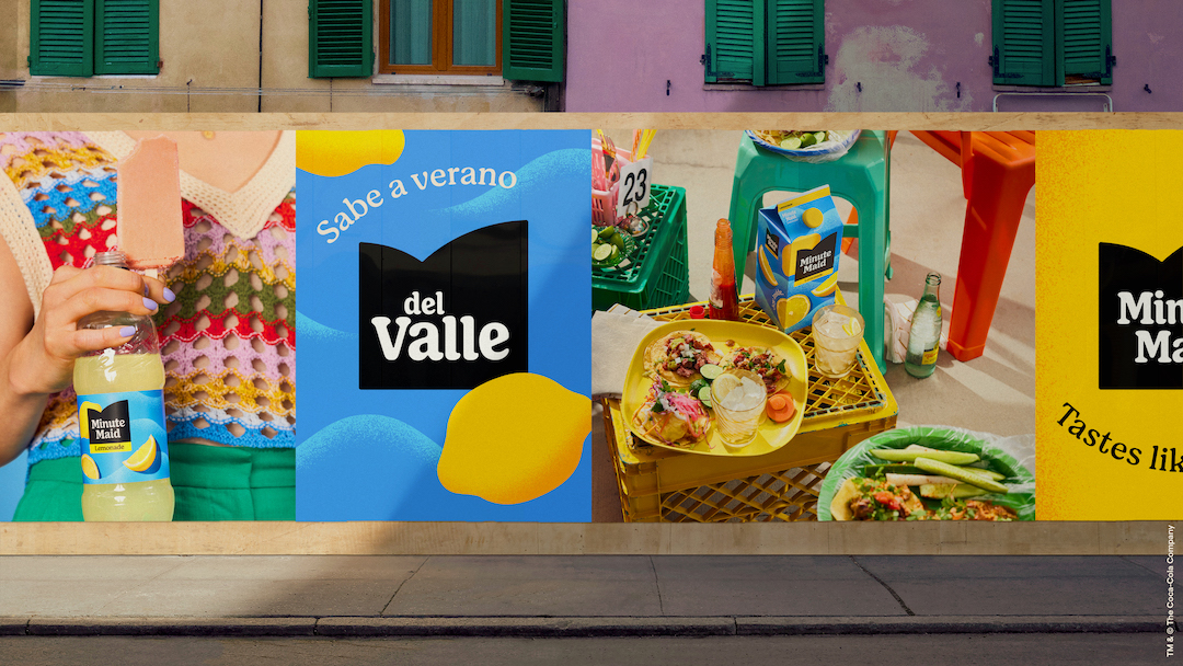
Accompanying the brand system is a new Filled with Life campaign that acknowledges busy lifestyles and the need to “stop, sip, and celebrate” when days get hectic.
Katalin Czigler, Global Brand Strategy Director at Minute Maid, says consumer research has shown that drinking juice isn’t just about the taste—“it’s about hydration, nourishment, indulgence and more.”
“The experience people get from drinking Minute Maid makes them feel good,” Czigler elaborates. “Minute Maid wanted to bring that to life visually and in our communications worldwide.”
“This perfectly reflects our brand mission to help anyone, anywhere and at any time, feel alive, which is needed now more than ever,” says Czigler.
Rapha Abreu, Global Vice President of Design at the Coca-Cola Company, comments: “We started with the aim of making seasonal orange juice available year-round and have since evolved into being a much-loved staple in family kitchens. Today, the brand is enjoyed by many worldwide, but the brand experience can vary depending on where you encounter it. We felt the Minute Maid family was due for an elevation to the icon it truly is.”

Abreu adds that the team approached the revamp by looking at the entire brand “holistically” to highlight the parts of Minute Maid that make it unique for consumers around the world.
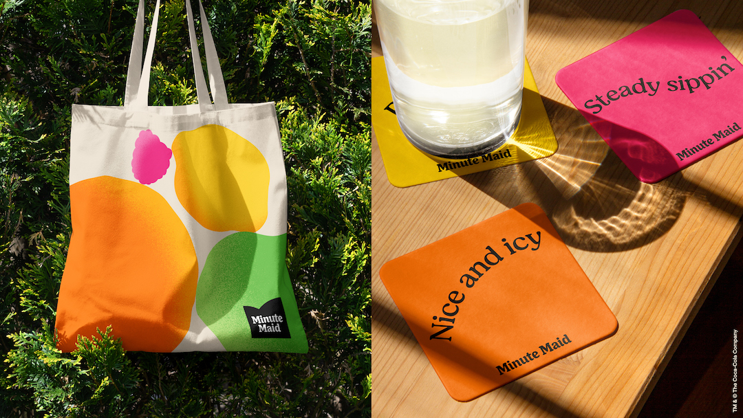
The fun global refresh and campaign will roll out this year.
[via Jones Knowles Ritchie, It’s Nice That, Dieline, images by Jones Knowles Ritchie and featured with permission]


