
A 2025 Color Of The Year Has Already Surfaced
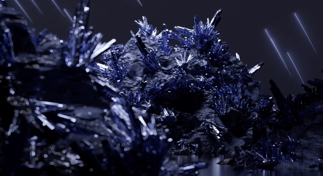
Video screenshot via Coloro
In the space of just months, the ways of the world have been overturned by artificial intelligence. And not to rekindle a shared trauma, but we all experienced a nuance of the Dark Ages when the pandemic rolled in without warning. In spite of these, Worth Global Style Network (WGSN), which specializes in trend forecasting, has gone ahead to announce ‘Future Dusk’ as the color to watch in 2025.
WGSN, which claims to predict trends with 90% accuracy, together with its sister brand Coloro are presenting Future Dusk—a dark violet tinged with the night sky—as the visual snapshot of the physical, virtual, and visionary landscapes in 2025, following up on its outlooks of a ‘Digital Lavender’ as the color of the year for 2023 and ‘Apricot Crush’ for 2024.
View this post on Instagram
“Future Dusk has a sense of mystery and escapism,” details Coloro, a color system. It adds that the blue-purple evokes “surreal and otherworldly qualities [that] align with the influence of the second space age.”
“It also feeds into themes of transition—whether it be moving from dark to light, or dusk to dawn—making it perfect for a period of immense change.”
As Architectural Digest describes, the surreal 2025 shade seemingly emanates futuristic digital art and the deep sky, along with features of nature that appear otherworldly at the same time.
As with other color-of-the-year forecasts, Coloro bases its defining hues on insights about emerging patterns in society. Future Dusk, for one, represents the growing magnetism of space tourism, AI, and the metaverse, and other themes that are moving into the realms of technology, creativity, politics, and the environment.
Future Dusk can be applied onto clothing or interiors to create a statement or stand as a playful neutral, serving as “a fresh take on dependable dark blue,” says Coloro. In metallic finishes, the color offers a “celestial allure.”
Along with the moody purple, WGSN and Coloro have already painted a full palette for Spring/Summer 2025. The other hues include ‘Aquatic Awe’, “a transformative turquoise that celebrates the strange and wondrous aspects of nature” as well as the synthetic appeal of the digital world; ‘Sunset Coral’, an “energizing and feel-good color that appeals to the pursuit of joy”; ‘Transcendent Pink’, a “barely-there hue that feels more like an elevated neutral than a traditional pink”; and ‘Ray Flower’, a “radiant yellow with a warm and inviting quality.”
[via Architectural Digest and Fashionista, images via Coloro]


