
NASA Dedicates ‘Worm’ Logo Display To Original Designer

Photo 190687512 © Kuprevich | Dreamstime.com
NASA was christened the hip and cool federal division thanks in large to its branding. Now, the space agency is honoring one of the creatives behind its famous ‘worm’ logo almost 50 years after its debut.
On Monday, November 6, NASA invited Richard Danne, one of the designers who brought the logomark to life, back to its headquarters in Washington DC to reflect on the brand. It was here that Danne was also presented with NASA’s Exceptional Public Achievement Medal, awarded to non-government workers who have made an impact in the organization’s astronomical rise.
In 1975, the agency, seeking a more modern image, commissioned Danne and Bruce Blackburn of the New York design firm Danne & Blackburn. The resulting graphic, dubbed the ‘worm’ due to its red, stylized rendering of the letters N-A-S-A in a continuous, worm-like stream, was part of NASA’s broader initiative to update its visual presence. This rebranding was in line with the federal government’s push for graphic modernity across its agencies, while matching NASA’s own futuristic vision and spirit of exploration.
The designers only had about a week to come up with their proposed graphic and roughly two months to finalize it, per collectSPACE. The stakes were even higher as the studio was newly minted.
“Our firm was only about a year old and Bruce, may he rest in peace, was very involved in federal things before—he had designed the American Bicentennial symbol; we think that’s one of the reasons that we got invited,” Danne recalled at the panel discussion. “So we decided to propose one symbol, only one, and support it with about 25 demonstrations, and that was radical then and it’s radical now.”
Despite being retired in 1992 in favor of the original ‘meatball’ insignia, the ‘worm’ remains an iconic symbol of space exploration’s heyday. It was revived in 2017 for merchandise, and then in 2020 for the SpaceX Falcon 9 rocket’s Demo-2 mission, blending nostalgia with the agency’s forward-looking endeavors.
“It’s more popular today in the world than it was back then, and that’s hard to explain,” Danne remarked. “There’s something at the core of the whole thing and the fact it was serious but inspirational in a way. It’s hard to do that with very simple things, but that’s the way I’ve lived my life and career—with simplicity—so it works.”
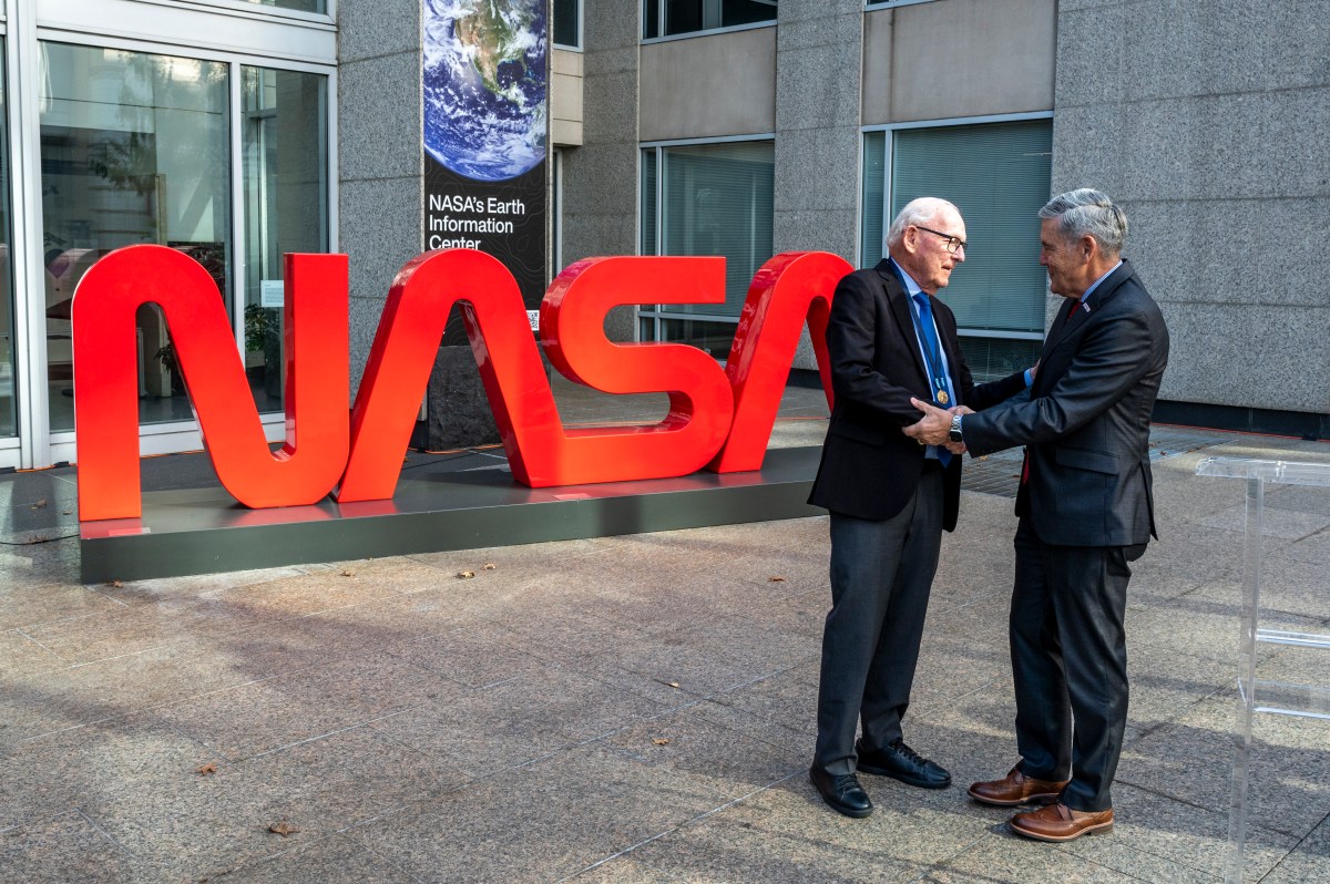
Image via NASA/Keegan Barber
With that, NASA also honored Danne, Blackburn, and former director of the NASA Art Program, Robert Schulman, by engraving their names on a plaque near its Worm monument outside the Mary W. Jackson NASA Headquarters building.
Pentagram partner Michael Bierut, who was one of the members of the panel, said he was just in his first year of design school when the wordmark was unveiled.
“From the minute I saw it, I understood all those things that it was meant to represent, even things that a normal person like my mom, who was a housewife, might say: ‘Well, why aren’t there lines… making those A’s?’ and I would have said, ‘Well, Mom, that’s supposed to look like the nose cone of a rocket ship, you know? It’s modern, it’s like one sleek path.’”
Bierut also commended the logo’s innate simplicity, which he believed had a part in fueling young ambitions. “To put it very simply, a four-year-old can draw it, and if you’re talking about seizing the imagination of the next generation and the generation after that, that sort of capacity to… inculcate them in the excitement and reduce it to a simple shape like that, it’s just really thrilling.”
Bierut added that the work was the ideal example of a logo that works “from a million miles away.”
When presenting the award to Danne, NASA associate administrator Bob Cabana proclaimed: “Making the impossible possible through innovation, inspiring through discoveries that transform our knowledge of the universe and our place in it, and providing benefits to all of humanity are what we do at NASA, and what people think of when they see this simple yet striking logo. Thank you for giving the agency an image that fit the time and also that continues to endure alongside the iconic NASA ‘meatball’ as one of the most recognizable and popular symbols of what we can achieve when we work together.”
[via Space.com, collectSPACE, NASA, images via various sources]
This article was crafted with assistance from an AI engine, and has been manually reviewed & edited.


