Monotype Visualizes 2024 Type Trends With Bold AI-Generated Album Covers
By Mikelle Leow, 09 Feb 2024
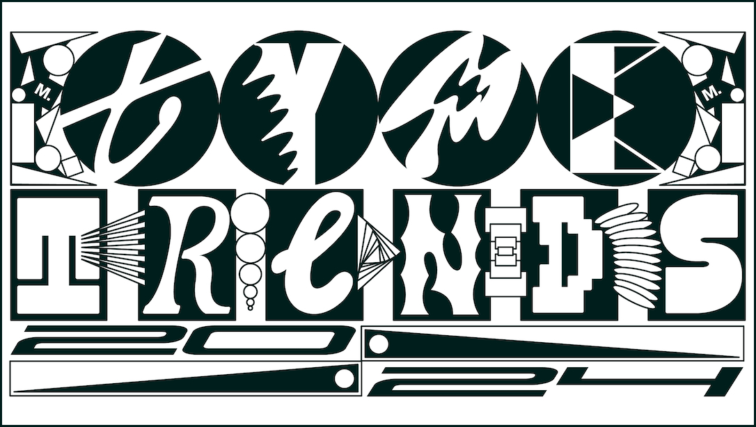
Image courtesy of Monotype
Monotype has unveiled its latest annual Type Trends Report, with a symphony of typefaces awaiting in the wings of 2024. Curated by the font foundry platform’s creative type designer Jordan Bell and creative type director Damien Collot, the forecast delves into 10 trends shaping the world of type and brand design, from AI-inspired surrealism to the resurgence of classic serifs.
Akin to a mixtape for type nerds, the report is paired with imaginative vinyl LP and album covers, each representing a specific musical genre—including jazz and punk—created using Midjourney.

Image courtesy of Monotype
“We found a movement away from the trend of cuddly, squishy, empathetic fonts that many brands and creatives embraced after the alienation and stress of the pandemic,” Bell notes. “This year, in a time that can feel nostalgic for the digital simplicity of the pre-smartphone, pre-AI world, we see designers returning to the heritage and comfort of more traditional serif fonts, and also finding new creative inspiration in 90s and early ’00s scenes like grunge, jungle, and early rave culture.”
1. Everythingallofthetime
This trend captures the essence of maximalism, blending a myriad of typefaces, textures, and technologies into a single, cohesive design. It’s a nod to the limitless possibilities artificial intelligence brings to the creative table, inspired by Bo Burnham’s satirical song, Welcome to the Internet.

Image courtesy of Monotype
2. Whatever
‘Whatever’ resurrects the bold and rebellious spirit of the 90s and early 2000s, with designs that echo the era’s iconic rave flyer through vibrant digital gradients and chunky fonts. It’s a celebration of retro aesthetics, fueled by a wave of nostalgia currently sweeping through music, fashion, and design.

Image courtesy of Monotype
3. Systm
Emphasizing the principles of slow design, ‘Systm’ projects an engineered yet human-made feel. This theme signifies a return to traditional design principles, with a focus on modular, mechanical, and industrial typefaces that have evolved to become warmer and more nuanced.
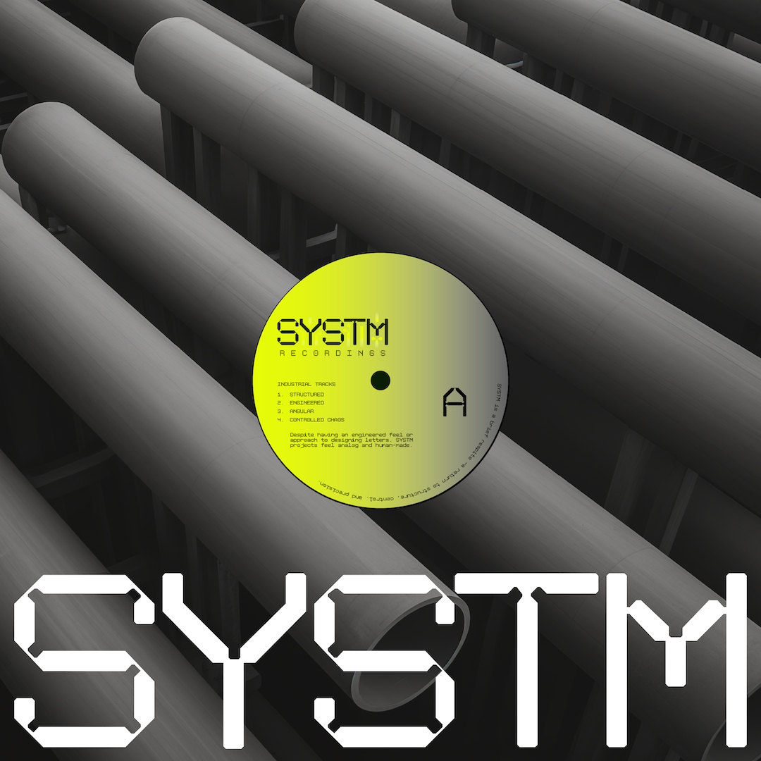
Image courtesy of Monotype
4. De-Form
Marking a bold departure from conventional design norms, ‘De-form’ challenges the notions of legibility and aesthetics by distorting characters and arranging them in tightly competitive spaces. It’s a reflection of visual disobedience in the face of global cultural and societal issues.

Image courtesy of Monotype
5. Flux
Dedicated to dynamic action and movement, ‘Flux’ makes type instantly captivating amidst visual clutter. Whether through actual animation or designs inspired by motion, this trend brings a sense of speed and dynamism to typography.
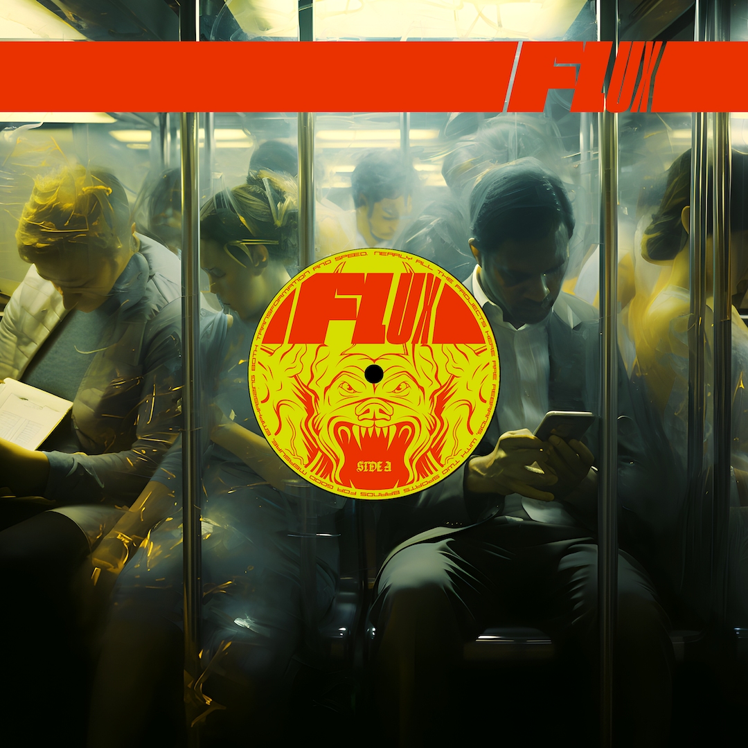
Image courtesy of Monotype
6. Quirk
Balancing the desire for uniqueness with the comfort of familiarity, ‘Quirk’ introduces subtle, eye-catching details into otherwise solid and stable sans-serif fonts. It’s about finding a sweet spot between standing out and staying grounded.

Image courtesy of Monotype
7. Counter Attack
‘Counter Attack’ celebrates negative space, creating dynamic energy and charisma around the hollow shapes at the heart of each letter. Inspired by architectural forms, this concept explores the spaces within letterforms, offering a fresh perspective on type design.
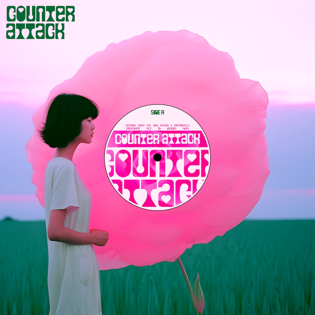
Image courtesy of Monotype
8. Profeshinal
Presenting a quirky twist to professional brands, this trend champions perfectly imperfect designs that are authentic and unapologetically human. It’s a counterbalance to the polished perfection often sought in graphic design, embracing naiveté within parameters.
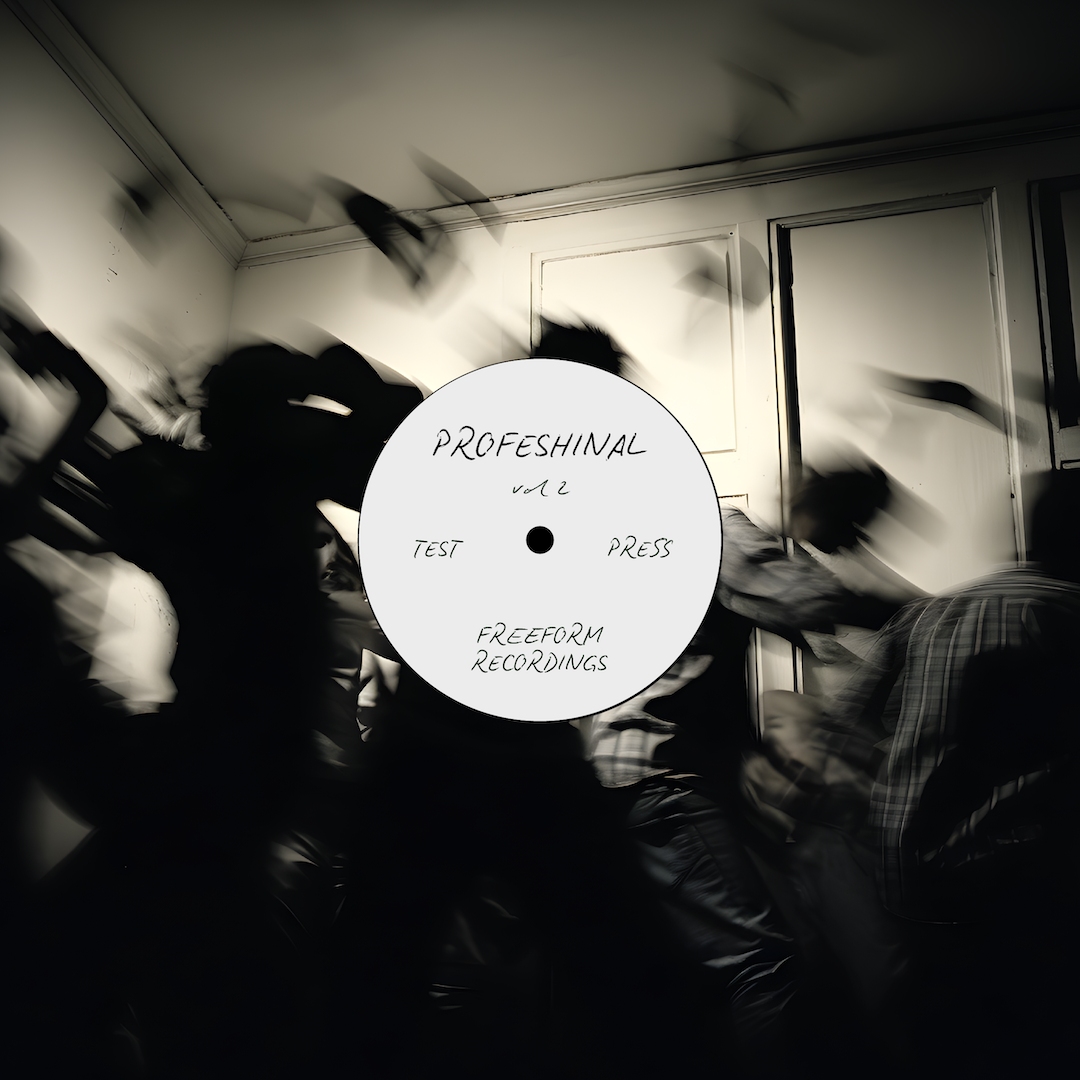
Image courtesy of Monotype
9. 100% Natural
Reflecting a blend of sustainability and craftsmanship, ‘100% Natural’ emphasizes organic, hand-made qualities in design. It’s about connecting with nature and the promise of goodness, whether through sustainable branding or the tactile joy of crafting by hand.

Image courtesy of Monotype
10. Return of the Serif
Moving away from the “soft and squishy” fonts that gained popularity post-pandemic, designers are now gravitating towards the heritage and comfort of traditional serif fonts. This trend reflects a longing for the digital simplicity of the pre-smartphone era, coupled with a desire to reconnect with historical roots.
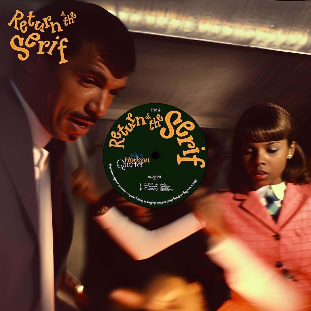
Image courtesy of Monotype
“Type is both a reflection and a catalyst of the cultural conversations that shape our everyday lives. In this, our fourth annual Type Trends report, we wanted to explore what type tells us about culture and the world in 2024,” says Collot, creative type director at Monotype.
“Against a backdrop of break-neck speed innovation and social change, we found seemingly opposing concepts being combined by designers, influenced by both future possibilities and nostalgia for the past, perhaps heralding a new, more contradictory era of creativity.” You can check out the full vibrant forecast here.
[via Monotype, images courtesy]


