TJ Maxx Moves On From Helvetica For A More Vivacious Personal Font
By Mikelle Leow, 03 Apr 2024

Images via McCann Design
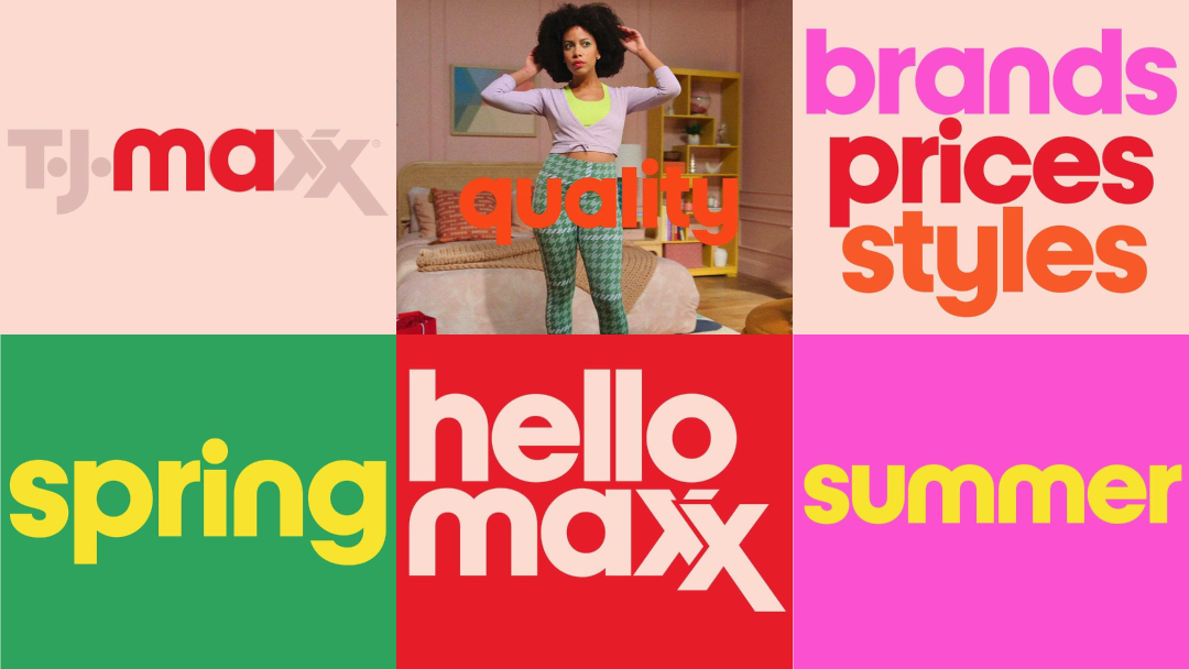
Forget the “dress for less” motto—TJ Maxx has made a surprising font-forward move to dress for more! The beloved department store has bid farewell to the minimalist, ubiquitous Helvetica to welcome the maxx-imalist, bespoke typeface, simply called ‘Maxx’.
For decades, Helvetica has been a mainstay in the retail world, gracing countless logos and signage with its clean lines and simple elegance. It’s been through thick and thin with TJ Maxx, or TK Maxx for those who live across the pond. But the beloved department store is finally breaking free from the mold and moving on to something that fits its identity to a big fat letter T.
The new sans-serif, developed in collaboration with McCann Design and type expert Jeremy Mickel, is part of TJ Maxx’s brand refresh, which includes its new Maxx What Makes You, You campaign. Drawn from the distinctive shapes of the TJ Maxx logo itself, the font aims to capture the brand’s quirky and individualistic spirit with clean lines, a drop of whimsy, and an overall modern feel.
By developing its own typeface, TJ Maxx now has greater control over its visual identity. This ensures consistency across all platforms and ultimately solidifies its brand presence. It goes against the grain of companies modernizing themselves through “blanding.”
Maxx, available in four weights for optimal versatility, will gradually be rolled out in the US across all marketing materials and in-store branding, from television commercials to price tags.
[via Fast Company, It’s Nice That, What Font Is, Little Black Book, images via McCann Design]


