LEGO Builds Joyful Brand Identity That Starts With The Toy Brick
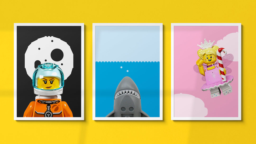
Image via Interbrand
The LEGO Group has rolled out a playful yet comprehensive brand identity that, quite simply, stacks up. The overhaul aims to connect every dot in the LEGO universe—from its logo, physical sets, and catalogs to its digital presence, video games, educational tools, and more—while evolving alongside its ever-expanding lines.
Built by the company’s in-house creative team at Our LEGO Agency (OLA) and branding consultancy Interbrand, the new look centers around what LEGO does best: sparking happiness and creativity through its iconic bricks. The idea is to make every interaction feel like you’re stepping into a world where every color, shape, and icon tells a part of its story, with the ultimate wish to click deeper with builders of all ages.
For this cohesive house of bricks, the team created the brand’s first full set of design elements envisioned to “bring the joy and pride of building and creating to life in a whole new way,” explains Interbrand, with LEGO’s core System-in-Play architecture as its foundation.
Video via Interbrand
Video via Interbrand
The toolbox includes a “clutch system,” a nod to the way the plastic bricks click together, transformed into digital glyphs and icons that let the company piece together digital designs in a similar manner to physical LEGO builds.

Image via Interbrand
Alongside type foundry Colophon, the team has also constructed a bespoke typeface called ‘LEGO Typewell’, a play on the Danish phrase “leg godt,” meaning play well, that—you guessed it—inspired the name for LEGO. Borrowing from elements in LEGO’s archives, it’s designed to be easily understood by children around the world and reflects the brand’s commitment to learning through play, across 120 languages.
“The LEGO Group’s archives were a treasure trove of elements that contributed to crafting the final solution—a mix of storytelling pieces that we used to build out a full LEGO set just as iconic and timeless as the brick itself,” explains Oliver Maltby, executive creative director and portfolio lead at Interbrand. “The playfulness of the new identity reinforces the vision of the LEGO brand as a global force for learning through play.”
Video via Interbrand
The typeface also dictates the brand’s color scheme, taking cues from the primary hues of LEGO bricks to paint its world in vibrant yellows, reds, blues, and greens.
Making the visual language jump off the table are action graphics crafted from 58 specific LEGO pieces. These pieces infuse static images with movement and emotion, telling stories without words, reminiscent of comic book dynamism and the animated spark of LEGO play.
New motion principles, mirroring the way fans naturally interact with LEGO parts, guide the animation and transition of design elements across LEGO’s virtual presence, capturing the essence of building, deconstructing, and even the happy accidents that occur during play, as well as connecting tactile and digital play.
Video via Interbrand
“The LEGO Group has been the master of constant reinvention for 90 years. LEGO play offers the chance for discovery and invention, where you can always create something new from something familiar,” says Thomas Holst Serensen, global head of design at Our LEGO Agency. “Our new brand DNA reflects what is important for the LEGO brand. It is a beautiful, simple, and well-constructed system that both unifies and breaks free the creative and playful expression of our brand and product experiences.”
[via Creative Review and Creative Boom, videos and cover image via various sources]


