Spotify Gets Into Its Groove With All-New Font Echoing Throughout The App
Video screenshot via Spotify
Spotify’s latest unraveling may be music to design enthusiasts’ ears. The music streaming giant has tuned up its visual identity with a new custom typeface, aptly named ‘Spotify Mix’. This bespoke design has muted out the former ‘Circular’ font, with the purpose of better capturing the varied moods and emotions of the listening experience.
While the previous selection, which can be used by a general audience, did its part, it lacked the intonations of the full spectrum of what Spotify can offer.
To orchestrate the creation of Spotify Mix, the company partnered with Berlin-based foundry Dinamo Typefaces, which leaned into its expertise in music, art, and fashion to develop not just a typographic asset but also deliver a versatile tool that resonates with the creative needs of artists and designers.
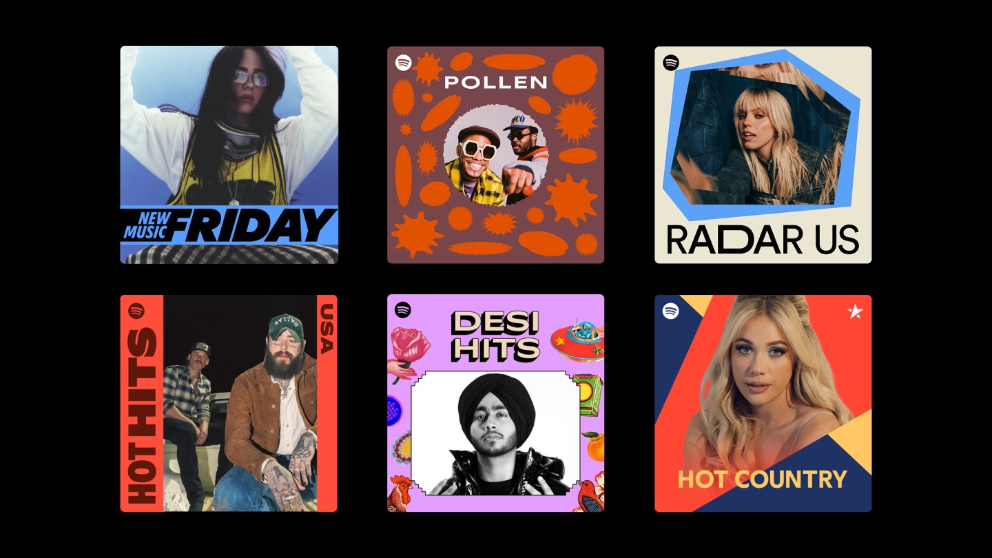
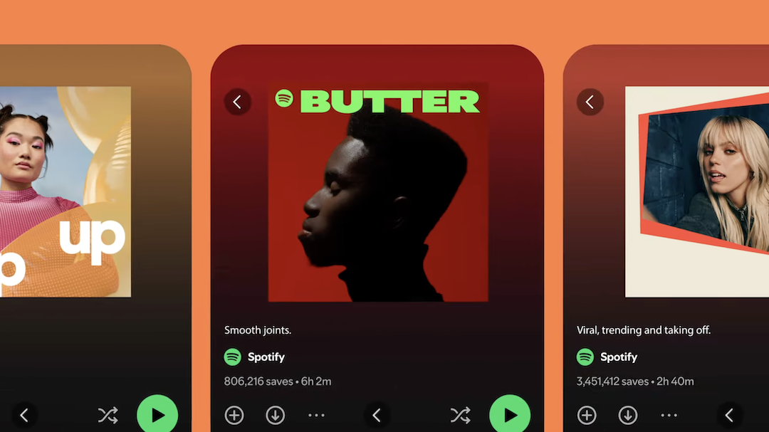
Image via Spotify
The resulting sans-serif creation is dynamic and expressive, alluding to sound waves to highlight the platform’s musical roots. It possesses both classic and contemporary traits, blending sharp angles and smooth curves for a distinctive Spotify look and feel.
Image via Spotify
Spotify users will soon see the exclusive Spotify Mix integrated throughout the app, as the rollout has already commenced and will continue over the next few weeks. Whether browsing playlists, discovering new music, or enjoying personalized recommendations, listeners can enjoy the enhanced visual harmony brought by the bespoke typeface.
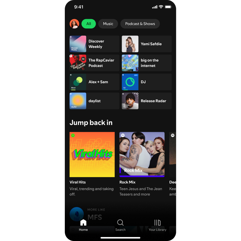
Image via Spotify
Initially, Spotify Mix will appear in languages that use Latin-based scripts, including Vietnamese.
Beyond the app, the font will also be prominently featured in the company’s marketing campaigns and events. For instance, attendees of the Cannes Lions Festival of Creativity can look forward to seeing the typeface in action at Spotify Beach starting June 17. The new addition will be utilized in digital advertisements and physical installations, belting out its role as a core element of Spotify’s visual identity.
[via TechCrunch and Marketing-Interactive, video and images via Spotify]


