
Google Gives Gemini AI’s Logo A Dazzling Makeover—And A Cute Monster To Match
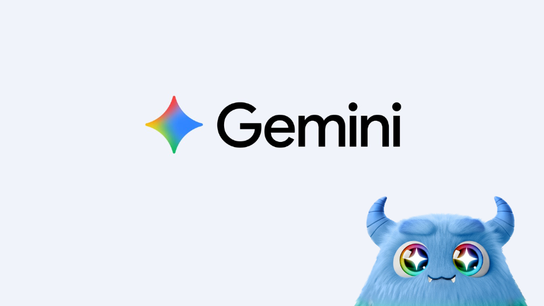
Images via Google Gemini App and Google Japan
Google’s Gemini has gotten a glow-up. The tech giant has unveiled a redesigned app icon that swaps out the previous moody gradient for something brighter and more unmistakably Google.
Now featuring the brand’s signature red, blue, green, and yellow hues, the new logo adopts a rounded, sparkle-inspired shape that brings it in line with other staples like Chrome, Gmail, and Maps—making it feel more like a permanent fixture.
Google Gemini just got a new logo! I really like this! pic.twitter.com/NwN3KJl96S
— Cameran C (@Cameran020923) July 5, 2025
By the looks of it, the updated Gemini icon is designed to be easier to spot on cluttered home screens, with a larger footprint and softened edges that increase legibility, especially at smaller sizes. It also carries a slight gradient detail, a subtle nod to the more stylized icons that have started to appear across Google’s product suite.
Google updated the Gemini logo pic.twitter.com/lhwNivPzJ7
— Andreas Storm (@avstorm) July 2, 2025
This change follows a comprehensive refresh that began earlier this year, including updates to the ‘G’ monogram
itself.
The redesign also arrives alongside functional upgrades. Android users can now take advantage of a beefed-up Gemini widget, which includes direct access to video and screen-sharing features linked to Gemini Live. iPhone users haven’t been left out either; iOS now supports conversation search within the app, a feature previously limited to the web.
Google Gemini's new logo 👀 pic.twitter.com/TcwG6HP4nS
— Alfaiz Ali (@AlfaizAliX) July 3, 2025
Hey @testingcatalog and @AssembleDebug .
— OscaR-_-010 (@OscaR_010__) July 5, 2025
The new Google Gemini logo is now available as the cover of the app on Android. The Google Gemini app update has arrived today. pic.twitter.com/M0MnPGY1Q8
To commemorate the branding, Google Japan enlisted the Gemini tool itself to generate a character based on the new design, resulting in a rainbow-furred anime-style monster that captures the icon’s colorful essence, complete with eyes that sparkle.
Gemini ã®æ–°ãƒã‚´ãƒªãƒ‹ãƒ¥ãƒ¼ã‚¢ãƒ«ã«åˆã‚ã›ã¦
— Google Japan (@googlejapan) July 2, 2025
ã‚ャラクターも Gemini ã§ä½œã£ã¦ã¿ã¾ã—ãŸï¼
ã“ã®åã«ä¼¼ã¦ã„ã‚‹ã‚ャラを作りãŸã„æ–¹ã¯ãƒªãƒ—ライã§ï¼ pic.twitter.com/AWO7XYDddS
A pair of horns and little fangs give it edge, while also perhaps referencing the pointed ends of the Gemini icon.
Although the official icon hasn’t yet made its way to web platforms or Chromebooks, users across iOS and Android can expect to see the changes roll out this month.
[via ChromeUnboxed, Android Authority, 9to5Google, Creative Bloq, PhoneArena, images via Google Gemini App and Google Japan]


