
Designer Tweaks Colors On Google’s Gmail Logo & Now It Makes More Sense
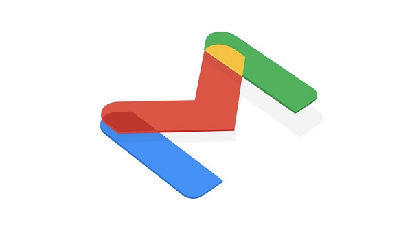
Image via Google
Google recent revealed its new Gmail logo-stripping off its iconic envelope design to adopt a much minimalist icon.
The minimalist logo features Google’s signature colors—red, green, yellow and blue. While many users have voiced out their frustrations on the new design, claiming it looked similar to the other icons on Google Workspace, Android leaker and designer Evan Blass decided to share his take on how the icon should have looked.
Blass did not address the similarity of the logos but instead, he tweaked the colors on the icon. The overlapping colors on the edges of the letter made more sense as blue and yellow makes green, while yellow and red becomes orange.
Blass shared his concept on Twitter, which delighted many logo fans out there. They claimed Blass’ logo is more “logical” and looked aesthetically pleasing as well.
“Agreed, we all learned which 2 colors combined will make another color in kindergarten. They missed it on this one,” a user tweeted. “This is so much, much better,” another user commented on Blass’ design.
Check out Blass’ take on the Gmail logo below.
I feel like the new Gmail logo should have looked more like this, given the overlaps. pic.twitter.com/SAo2TLUgFX
— Evan Blass (@evleaks) October 27, 2020
oh my god this is so much better
— 👻🎃miguel👨🏽💻🎃👻 (@miguelisyourson) October 27, 2020
This is so much, much better
— Martin 🐀 (@MiguelenaMartin) October 27, 2020
Agreed, we all learned which 2 colors combined will make another color in kindergarten. They missed it on this one.
— Daniel Trujillo (@Boondee007) October 28, 2020
Yes It's much easier on the eyes!
— Moshe F (@MosheFasten) October 27, 2020
[via Creative Bloq, cover image via Google]
Also check out these recent news


