
Apple & Prepear App Settle Bitter Dispute With Tweak To ‘Similar’ Pear Logo
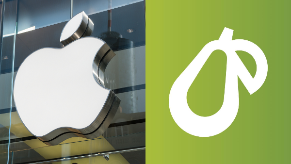
Image via r.classen / Shutterstock.com and Prepear
Two brands with fruit-themed logos have made amends and are smoothie-ing things over after a logo dispute that dragged on for six months.
Prepear, an app by family meal-planning startup Super Healthy Kids, has tweaked the leaf in its symbol to address Apple’s complaint of another “minimalistic fruit design with a right-angled leaf.”
Apple had contested a trademark application by Prepear that depicted a pear with a leaf located perpendicularly on the right, claiming that it “readily [called] to mind Apple’s famous Apple logo.”
This spurred Prepear co-founder Russell Monson to launch a petition painting the app as David and Apple as a Goliath. He admonished the tech giant for picking on a small team of just five members who naturally could not afford mounting legal fees from a “trillion-dollar” company.
In December, it was reported that the two companies were negotiating a settlement between themselves. Prepear has since confirmed they have come to an agreement.
The deal is to update the Prepear logo so its leaf looks less like Apple’s. As shown in images obtained by iPhone in Canada, the resulting refresh shows a similar pear icon but with a half-moon leaf.
Monson shared that the logo will take on its new form “in the coming weeks,” and expressed that Prepear is “happy” with the matter being “amicably resolved.”
Old icon
Posted by Prepear on Friday, December 9, 2016
New icon
Posted by Prepear on Tuesday, February 9, 2021
Old wordmark
Posted by Prepear on Thursday, February 7, 2019
New wordmark
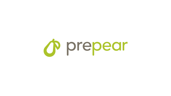
Image via Prepear
[via MacRumors and iPhone in Canada, images via various sources]
Also check out these recent news


