
Amazon Opposes Similar Charity Shop Logo, But Things End Off With A Smile
Image via Eric Broder Van Dyke / Shutterstock.com
Amazon has gotten tangled in yet another logo hiccup, as the e-commerce giant has opposed the branding of a new charity shop set up to fight homelessness.
The shop in Worcestershire, named Amaze, was about to officially open when owners Chris Lee and Polly Reehal received notice from Amazon regarding its logo, according to Metro.co.uk.
On a black background, the shop’s name is written in a lower-case, rounded, white font. Plus, an orange arrow extends below from the letters ‘a’ to ‘z’. Having seen it, it’s hardly so surprising that Amazon had come knocking.
In a 35-page document, Amazon expressed concern that consumers might experience brand confusion due to the similarity of Amaze’s branding. And while no Amazon charity outlets exist at the moment, it’s not far-fetched to think some people might assume it’s an offshoot of the brand.
Fortunately, instead of taking the matter to court, the charity shop has removed the ’smile’ from its logo.
In return, Amazon has offered to make a donation to the charity, and will be in touch soon to assist further. One of Amazon’s graphic designers could offer them a logo redesign, perhaps?
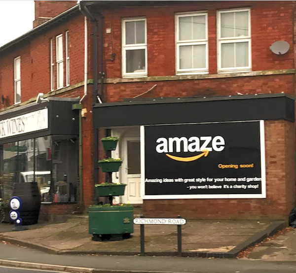
Image via All Change
[via Metro.co.uk and Creative Bloq, images via various sources]
Also check out these recent news


