
Twitter Looks Different Now, With New Official Typeface & Higher Contrast
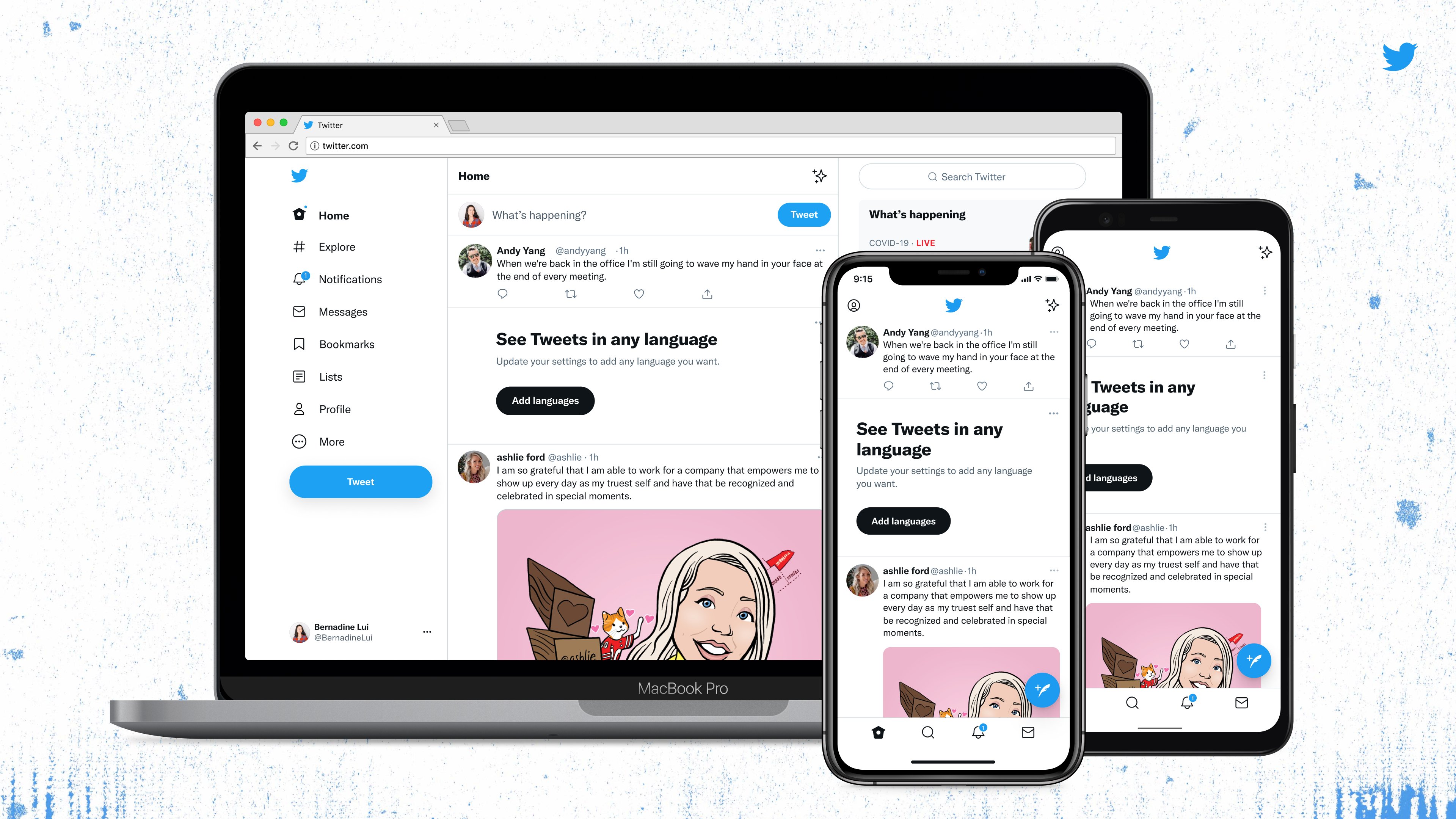
Click to view enlarged version. Image via Twitter Design
If you logged into Twitter today and thought, “Hey, something looks different—new haircut?” you’re not completely wrong. The social network has had a little trim across its desktop and mobile interfaces, possibly to make way for new major features like a subscription service with an ‘Undo’ feature.
On Wednesday, Twitter announced a crisp revamp to its website it says would make it more accessible and intuitive. The refresh also sees the official rollout of ‘Chirp’, Twitter’s brand typeface designed to phase out its use of the legible SF Pro, Roboto and Helvetica Neue.
In line with the typographical change, Western-language text will now be aligned to the left for readability.
The social media platform is also more “high contrast,” surprisingly dialing back on the blue and giving buttons, like the ‘Follow’ button, a fresh coat of black paint to shift the gaze to content and important actions. And it may or may not get less blue—Twitter says new color palettes are on the way.
Overall, with fewer borders and gray backgrounds, the interface appears cleaner and more spacious. For a lighter feel, Twitter says it has also added more space to “make text easier to read.”
“While it might feel weird at first, these updates make us more accessible, unique, and focused on you and what you’re talking about,” Twitter’s design team says. Honestly, we’ve seen worse.
Notice anything different?
— Twitter Design (@TwitterDesign) August 11, 2021
Today, we released a few changes to the way Twitter looks on the web and on your phone. While it might feel weird at first, these updates make us more accessible, unique, and focused on you and what you’re talking about.
Let’s take a deeper look. 🧵 pic.twitter.com/vCUomsgCNA
In January, we revealed our new font, Chirp — and it’s ready for you to use today.
— Twitter Design (@TwitterDesign) August 11, 2021
All Western-language text now aligns left, making it easier to read as you scroll. Non-Western languages remain unchanged.https://t.co/nlgxXJs5F6
We’ve updated our colors to be high contrast and a lot less blue — a change made to draw attention to the photos and videos you create and share.
— Twitter Design (@TwitterDesign) August 11, 2021
We’re also rolling out new colors soon, giving you a fresh palette.
Our new buttons are high contrast too.
— Twitter Design (@TwitterDesign) August 11, 2021
Now the most important actions you can take stand out. Yes, the follow buttons look different, but they’ll help you see what actions you’ve taken at a glance.
Finally, we cleaned up a lot of visual clutter.
— Twitter Design (@TwitterDesign) August 11, 2021
There are fewer gray backgrounds and unnecessary divider lines. We also increased space to make text easier to read.
This is only the start of more visual updates as Twitter becomes more centered on you and what you have to say!
[via TechCrunch, images via Twitter Design]


