
ABC Retreats To Simpler Days With Modern Remake Of Designer Paul Rand’s Logo
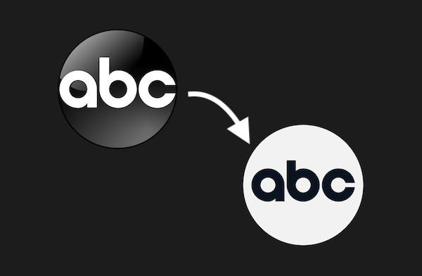
Old logo (left) VS new logo (right). Images via Wikimedia Commons and ABC
Scrubbing off the varnish from its branding to depart from a sea of shiny distractions, ABC has debuted a flat redesigned logo reminiscent of the one created by Paul Rand in 1962.
Although the refresh had been leaked months ahead, Variety reports that the design officially appeared on-air at the Bachelorette finale on August 9. The network tasked branding agency Trollbäck+Company to complete the revamp, and is currently working with its divisions and subsidiaries to phase into the new logo.
The ABC logo has undergone several polishes over the years, but the latest version sees its return to the matte look that appears as simple as A, B, C. Design enthusiasts will likely recognize the ode to Paul Rand’s original work, though a few refinements have been made to support mobile screens of all sizes.
Somebody give me this logo’s mattifying makeup routine
— Summer Ray (@SummerRay) September 11, 2021
https://t.co/oj3RV6KsXo
Paul Rand’s ABC logo (1962)
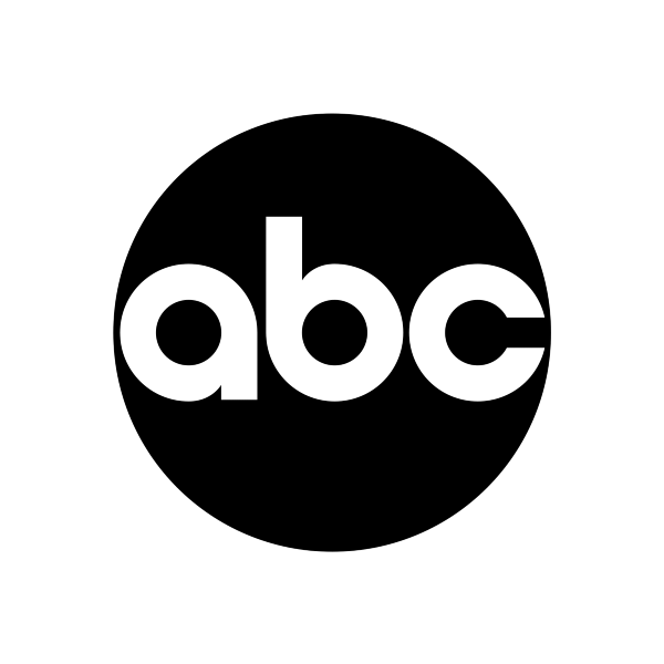
Image via Wikimedia Commons

Old logo (left) VS new logo (right). Images via Wikimedia Commons and ABC
The facelift features typographic modifications to the ‘dot’, which is what the circular emblem is officially called. The counters (the spaces) in the lowercase letters are now rounder, turning into near-perfect circles. According to Variety, these circles will be incorporated into the company’s animation system.
Perhaps more obvious is the additional legroom between the characters and the globe for legibility purposes. As you’ve been told, a little social distancing would do you good.
Across the board, ABC will adopt the “timeless, unique and bold” Heldane and GT America as its primary typefaces.
“We felt it was time to evolve the overall look of the network to make it more vibrant, modern and fresh,” Shannon Ryan, president of content marketing at Hulu and ABC parent Disney General Entertainment, told the news outlet. Ryan described that the revamp “visually represents our strategy and our diverse slate of programming.”
new abc logo pic.twitter.com/Aqfq35EEBj
— Kian (@kianworld) May 22, 2021
[via >Variety, images via various sources]
Also check out these recent news


