
Autodesk Reveals New Monochrome Redesign, Much To Displeasure Of Some Users
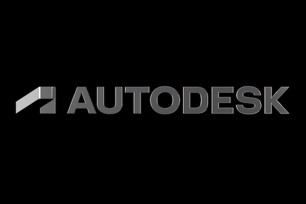
Image via Autodesk
Creative software company Autodesk has debuted its redesigned new look as the “first of several bold moves.” Gone are the days of the blue-and-green folded ‘A’ monogram, and enter a sleek monochromatic look that boasts a font more, well, bold.
Described by the company as “dynamic, modern, and memorable,” it boasts the new “strong” and “simple” logo as one that “represents action, momentum, and a clear direction toward the future.”
Autodesk has a new look! But it goes deeper than a new logo. See how we’re helping empower innovators to achieve new possibilities and better outcomes. https://t.co/zYh8pYQWC4 pic.twitter.com/tY3kOrHztH
— Autodesk (@autodesk) September 9, 2021
It also features “abstract 3D geometric forms created by focusing on parts of the symbol in the new logo” alongside a new color palette that features eight shades: four monochrome, and four deep accent hues in red, green, blue, and yellow.
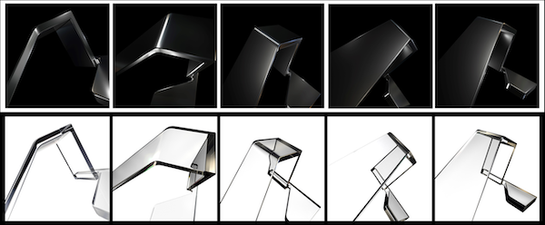
Image via Autodesk
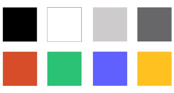
Image via Autodesk
Although the brand has explained where the concept is headed with this redesign, fans aren’t happy. A quick delve into the Twitter is all that is needed to see much of the community’s dissatisfaction with the new “dated” look.
Were the designers restricted to drawing the logo in autocad?
— chris is boring, aia (@boringarchitect) September 8, 2021
I’m struggling to think of a logo that looks more dated.
How do you survey the graphic aesthetic of the entire software industry and come up with something like this? https://t.co/fRLK1WTTWu
The new logo seems a lot more generic, and plain, no? I’m sure there’s method in their madness though! The old @autodesk logo was much more identifiable. Now it looks more like a.. I dunno, surfing company? Maybe a v corporate, plain surfboard company? :)
— Tobias Cook (@MrTobyCook) September 9, 2021
The new #Autodesk logo looks exactly like the baggers they help building in the largest, most polluting coal mine of Europe. pic.twitter.com/4RNBl6yZVw
— Autodesk.earth (@AutodeskEarth) September 7, 2021
I like the natural progression towards modernity of Autodesk' rebrand.
— designbyjamestan (@jamestandesign) September 10, 2021
But the new logo does make it look like a car brand 🤷🏻♂️
Can't get the licensing fixed .. but can spend millions in new logo marketing.
— myneutralzone (@myneutralzone) September 9, 2021
What is going on with the new Autodesk logo? Looks like the A toppled over and the banner is reminiscent of the 1984 film The Terminator. #huh
— Sean David Burke Ⓥ (@seandburke) September 7, 2021
Someone has even compared it to the infamous KIA logo saga.
I thought KIA's new logo was bad, Autodesk's new logo is worse. Is there a logo challenge out there to see who can make the letters not look like letters in logos? pic.twitter.com/dxcM5aGrpt
— Christopher Fugitt (@C3DReminders) September 7, 2021
Kean Walmsley, an Autodesk employee based in the research office in Switzerland, details how this isn’t the first branding shift he’s been through, and acknowledges on his blog that the change may not be welcome. “If you find it a bit too different, I do recommend giving it a few days/weeks to settle in,” he states.
He also reasons that the monochromatic identity will allow attention to shift more towards the stunning work done using the software, rather than the software itself.
And if the ‘A’ is still too confusing, there’s an animation on Autodesk’s branding website that may help the visualization along.
What in the fresh graphic design hell is??!?
— AutoCADmemes (@AutoCADmemes) September 9, 2021
What do we think of Autodesk's new logo??!?!!@andrew_anagnost @autodesk explain yourself.
Also,#Autodesk #AutoCAD #mompickmeupimscared pic.twitter.com/1dznUzxmxB
[via Archinect, image via Autodesk]


