
Kia’s Revamped Logo Still Has People Wondering What Company This Is Meant To Be
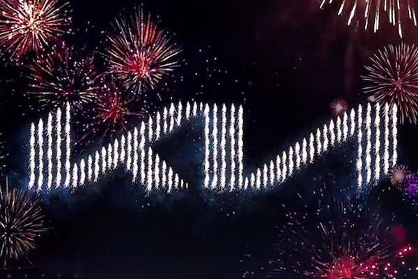
Image via Kia
When car manufacturer Kia revealed its logo redesign at the beginning of this year, it probably didn’t expect it to cause the hubbub that it has on social media.
Despite it having been more than half a year since the logo was changed and has begun to make an appearance on newer cars on the road, people are still highly confused over it. Users are still pointing out that they have no idea what the typography is trying to spell.
Its “rhythmical, unbroken line” is supposed to spell out “Kia,” of course, but the most common misinterpretation sees the audience reading it as “KM” or “KN.”
“It took me forever to realize it said kia and wasn’t a new russian car called kи,” one Twitter user has lamented.
Another person posted a photo of a car bearing the new logo, asking if it was a fake “or actually legit,” since he’d presumably never seen it before. This isn’t a singular occurrence; a user had also taken to Reddit asking if anyone had ever heard of this mysterious “car company” called KM Cars.
Can anybody tell me if this is a fake car logo or actually legit? If real, what car company does the badge belong to? pic.twitter.com/ghFsCvBCLv
— Tom Frederick (@tfredmuggs) August 11, 2021
The mystery of the KM Cars - submitted by @MiiAutomaton pic.twitter.com/YiUUhzkvC0
— Unexplained Occurrences 🏳️🌈🏳️⚧️ (@TalesOfBeyond) August 3, 2021
And someone has also pointed out that it looks a little too reminiscent of the band Nine Inch Nails’ logo, with the “ia” part of “Kia” looking like a backwards N. This one is hard to unsee.
No way I’m the only person who saw this when the new KIA logo hit. pic.twitter.com/HMMBZZUt0L
— Flood! (@meaghanflood) August 11, 2021
The new Kia logo looks like “K backwards N.” pic.twitter.com/t0TbVyWxki
— Drew Sykes ❄️ (@drewsykes) August 12, 2021
Though the misinterpretations were most probably unintentional, the logo still has people talking even after a period following its release.
Spent ages watching the cricket wondering who KN were, and why they were sponsoring the Oval.
— James (@snudge27) August 14, 2021
“Kia’s new logo represents the company’s commitment to becoming an icon for change and innovation”, explains Ho Sung Song, Kia’s President and CEO, in the logo redesign announcement. Perhaps it could be argued that the new logo has become an icon in its own right, even if it’s due to a collective humorous confusion.
[via Creative Bloq, image via Kia]
Also check out these recent news


