
McDonald’s Trades Its Golden Arches For OutrageOus LOgO Designed PrO BOnO
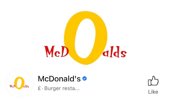
Spoof logo designed by Emily Zugay, screenshot via McDonald’s Facebook profile
Internet users went into a McFlurry as McDonald’s replaced the profile pictures across its official social media channels with a radically different logo. A huge departure from the memorable monogram, the revamp features an oversized ‘O’ you’d be able to spot a mile from any restaurant.
To complete this supposed rebrand, the fast-food chain even altered some of its display names to read “mcdOalds.”
Depending on whether you’re in on the joke about this change, you might be lovin’ it. McDonald’s is, in actual fact, one of the latest brands to adopt a satirical redesign from artist Emily Zugay, who has been dishing out design critiques on TikTok and giving logos objectively jarring “improvements.”
Brands love them so much, they’ve requested to have their logos roasted and overhauled by Zugay, who says she has a degree in design. Companies that have trusted the designer and gone ahead with a (temporary) logo transition include The Washington Post, Tinder, NASCAR, and Tampax. The Detroit Lions went further and even printed team shirts displaying her revamp of its logo.
Spoof logo designed by Emily Zugay, screenshot via McDonald’s Instagram profile
After being commissioned by McDonald’s, the designer returned with what could be its greatest makeover since its founding.
@mcdonalds hi welcome to mcdOalds #mcd #mcdonalds #mcdoalds @Emily’sTikTok.edu
♬ original sound - mcdOalds
“I don’t think you meant for your logo to look suggestive, but right now this looks like two knees to me,” Zugay responded. “I don’t want to think about knees when I’m eating my McChicken.”
Zugay seemed to be making a reference to a long-standing Freudian theory that the Golden Arches appear the way they do to subliminally remind diners of a mother’s nourishing breasts.
McDonald’s has few qualms about experimenting with its logo, having turned its branding into directional signs and M-shaped haircuts in the past. However, it’s rare for the company to deviate from the Golden Arches.
The “new” wordmark is set in a casual, ‘Jokerman’-like typeface, with the ‘O’ in the middle dramatically magnified. Zugay explained that McDonald’s could lean into this makeover to venture into the untapped category of onion rings. She had no issues with the red and yellow color scheme, though, and decided to keep it.
hi welcome to mcdOalds
— mcdOalds (@McDonalds) September 23, 2021
“hi welcome to mcdOalds,” the brand tweeted, introducing its new logo. It’s now splashed across platforms, amusing—and confusing—many.
i wOnt tell if u wOnt
— mcdOalds (@McDonalds) September 23, 2021
It's official! McDonalds has rebranded! from
graphic_design
Spoof logo designed by Emily Zugay, screenshot via McDonald’s Twitter profile
[via r/graphic_design, images via various sources]
Also check out these recent news


