Don't miss the latest stories
Advertise Newsletter
Network
  • The Creative Finder
  • The Bazaar
  • Deals
  • Status Is Down
Community
  • Sign up / Log in
  • Discussion Forums
  • Calendar of Events
NEW

Follow

Share this

Typography
Creativity
Graphic Design
Imaging
LEGO
  • Imaging
  • LEGO
MENU
  • Advertise with us
  • Submit tip/feedback
  • Work with us
  • Subscribe to newsletter
  • Subscribe to RSS
Advertise here
Advertisement

Fonts Crafted With LEGO Bricks: Satisfying Type Obsession Down To The Pixel
By Ell Ko, 21 Jan 2022

Subscribe to newsletter
Like us on Facebook
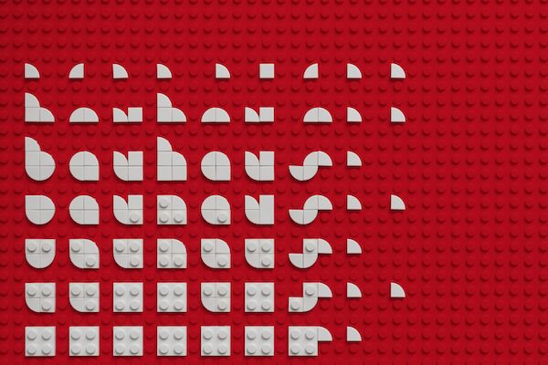
Image via Craig Ward and featured with permission


You can build almost anything with LEGO, and that is what gives these little plastic bricks so much magic for adults and children alike. 


But one artist has found a way to expand 2D creations with LEGO, unique to most of the other 3D designs that we see today, like the incredible recreation of the Titanic.


Craig Ward, creator of Brik Font, has been taking to the blocks to recreate typefaces in iconic styles. From Bauhaus to Garamond, there’s bound to be something familiar at every scroll down his project Instagram page. 
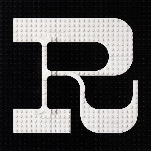
 

Image via Craig Ward and featured with permission


Every letter is carefully crafted, made to look like 8-bit offerings that one might get zooming all the way in on a computer screen, or perhaps on a retro video game. 
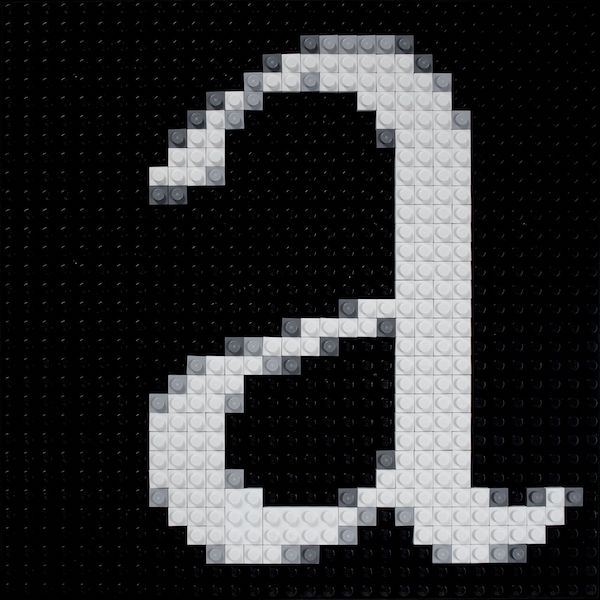
 

Image via Craig Ward and featured with permission


Jason Kottke of kottke.org likens it to what a font looks like when narrowing right in on Photoshop to do detailed work up close.

Advertisement
Advertisement


But hold it at arm’s length, and you’re reminded that this is, indeed, a LEGO-hued work of art. It’s not just letters, either; there have also been explorations in symbols, like arrows. 
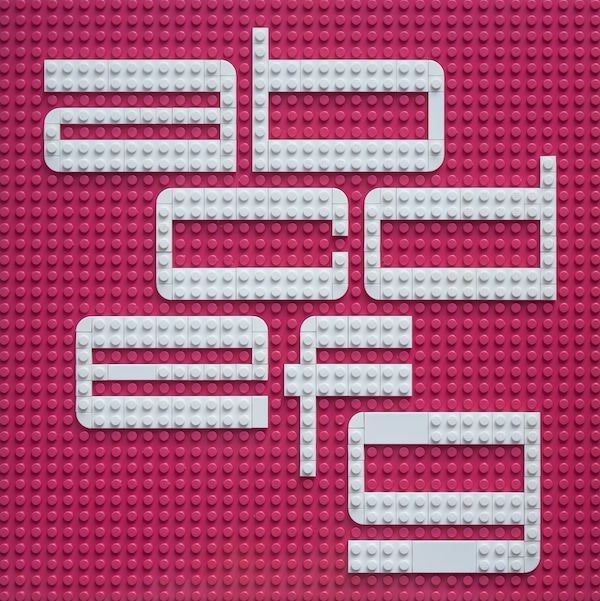
 

Image via Craig Ward and featured with permission


“Type studies, a little learning and the quest for the perfect Lego typeface,” Ward writes of the project on his Instagram page’s profile description. 
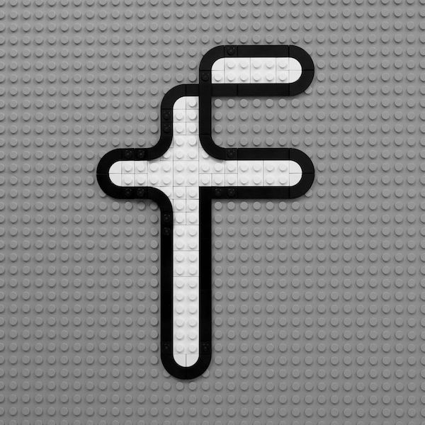
 

Image via Craig Ward and featured with permission


Some say the quest for perfection is a never-ending pursuit, but the satisfaction at seeing how all the rectangular bricks fit together to create the tantalizingly smooth curve of the letter “O” comes pretty close.
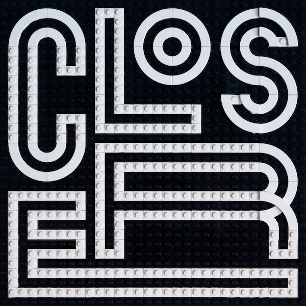
 

Image via Craig Ward and featured with permission


View this post on Instagram


A post shared by Brik Font (@brikfont)


View this post on Instagram


A post shared by Brik Font (@brikfont)


[via Creative Bloq and kottke.org, images via Craig Ward and featured with permission]

Receive interesting stories like this one in your inbox
Advertise here

More related news

Advertise here
Also check out these recent news
Web Design
Link to news page

When Your Website Goes Down, This Is the Page Customers Meet Instead

2027
Link to news page

2027 Already Has A Color Of The Year And It’s Beginning On ‘Grounded’ Territory

IKEA
Link to news page

IKEA & Xbox Press Play On Furniture & Storage Inspired By The Iconic Controller

Fashion
Link to news page

Vogue Presents ‘United Flags of Fashion’ With Top Designers For All 50 States

Coca-Cola
Link to news page

Coca-Cola Pours Fresh Life Into Its Iconic Branding With Worldwide Redesign