
Instagram Rolls Out Vivid Refresh That Extends Its Logo’s ‘Squircle’ Everywhere
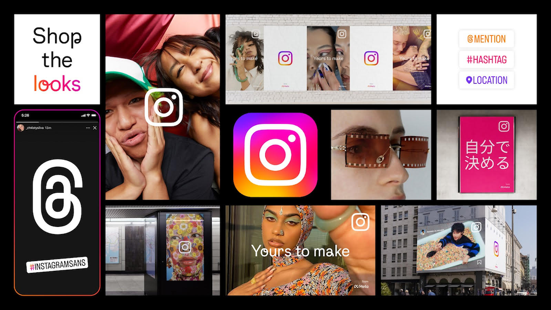
Image courtesy of Instagram
If you’ve noticed that Instagram has been looking a little different lately, your suspicions were right. Instagram has been working on refreshing its entire design system, with the first and most evident revamp being the colors of its logo.
The overall look is brighter and more youthful, which the social network tells us is reflective of its role as a platform “for people to express themselves.” The new identity “puts expression first,” Instagram adds.
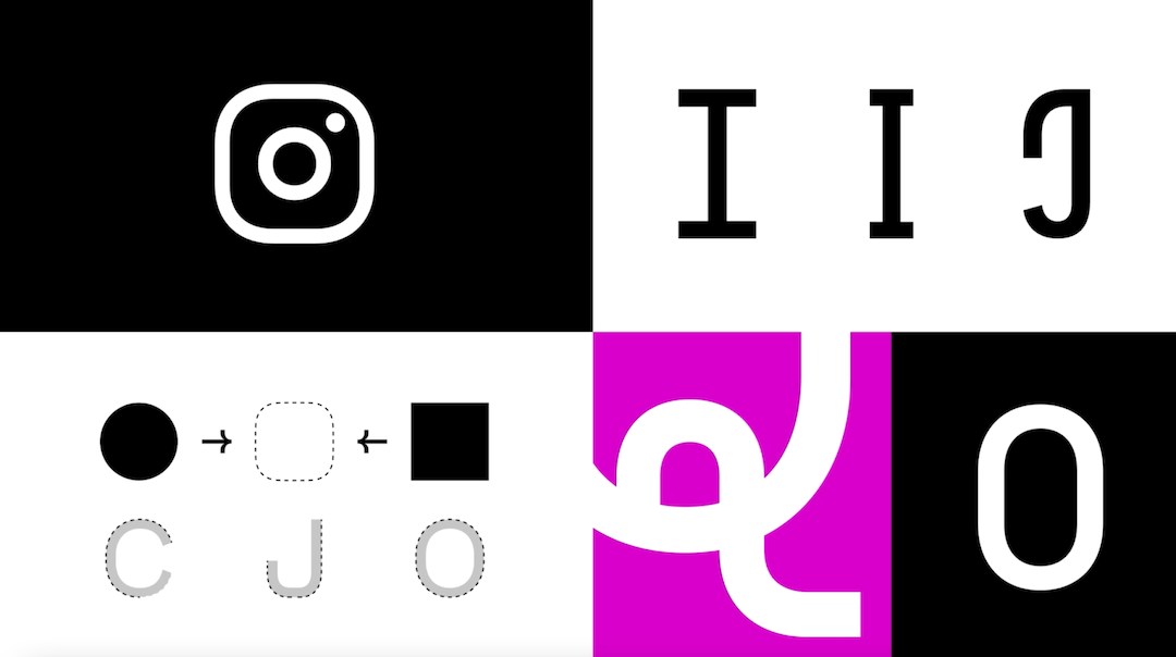
Image courtesy of Instagram
Punctuating the revamp is a brand-new bespoke typeface, ‘Instagram Sans’, which interestingly takes after the shape and nuances of its ‘squircle’ (square with circle corners) logo and wordmark, like the soft corners. Quirks in characters like ‘Q’ and ‘@‘ provide a human touch.
Video courtesy of Instagram
The sans-serif, designed by Colophon Foundry and other global type foundries, adorns the app in ‘Regular’, ‘Headline’, and ‘Condensed’ styles. More than 40 typographers and linguistic experts contributed to the typeface to unify Instagram Sans across languages.
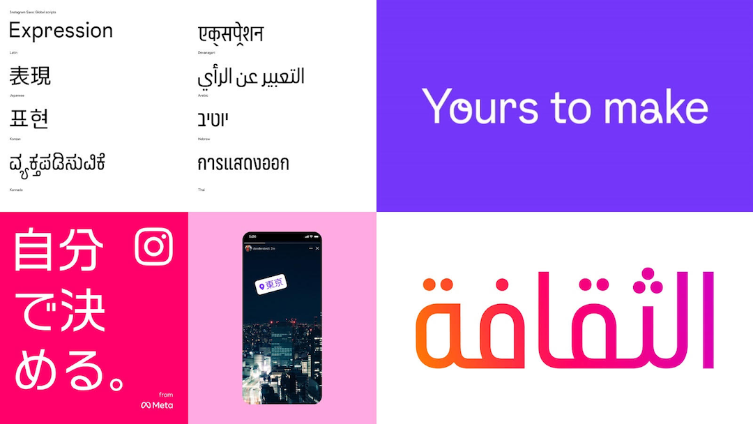
Image courtesy of Instagram
“We explored how typography can be a tool for expression and how our new typeface can go beyond letters on a screen. Instagram Sans is inspired by the design of our logo and the script letterforms from our wordmark. The letterforms in Instagram Sans Headline add a human touch, as well as a moment of ownership, joy and surprise,” explains Daniel S., Creative Director at Instagram from Meta.
Instagram’s bright gradient is now even more saturated and dynamic to appear less “one-dimensional.”
View this post on Instagram
We called it when we joked that the new Instagram emblem generates its own solar energy. To that, Meta explains that the symbol feels “lit from within,” like a beacon that leads the way to “exploration and discovery.”
To create the gradient, Instagram enlisted 3D digital artist and motion designer Rose Pilkington to design a customizable “digital light” with a gradient that flexibly meets various applications.
“Our refreshed visual system puts expression, inclusion and creativity first, affirming Instagram’s mission to support the creators and communities who are pushing culture forward,” Meta concludes in a statement emailed to DesignTAXI. “We’re inspired by our community’s sense of exploration—and we can't wait to see what's next.””
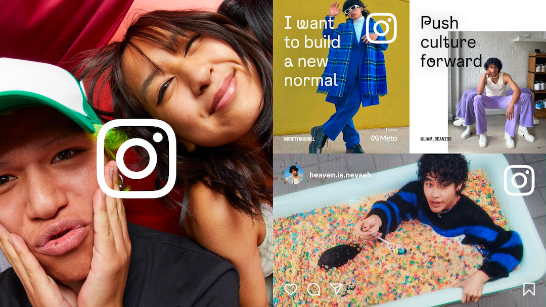
Image courtesy of Instagram
[via Instagram]


