
Instagram Did Tweak Its Icon, Your Eyes Aren’t Playing Tricks On You
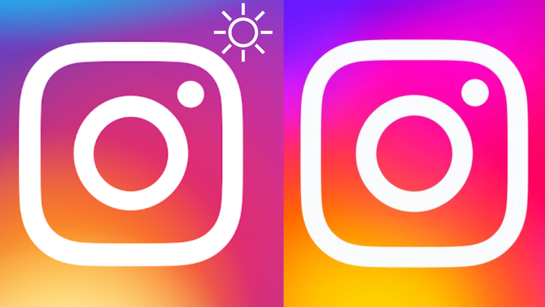
Images via Google Play Store, Apple App Store, Pigguu | Dreamstime.com
Remember when Instagram’s icon used to be a graphic of a brown instant camera? Users had to squint their eyes when it suddenly introduced a flat version with colorful gradients in 2016. Well, be prepared to crank down your screen’s brightness, because the social network has once again saturated those hues.
No, you’re not imagining things—the icon is more saturated and vibrant now. It’s so bright that one has to wonder if the logo generates its own solar power.
Jane Manchun Wong, who reverse-engineers app codes to uncover hidden features, anticipates that the tweak is part of a brand refresh that Instagram intends to roll out.
looks like a part of the greater rollout of IG's brand refresh pic.twitter.com/anuaa0dubG
— Jane Manchun Wong (@wongmjane) May 16, 2022
Meta has been envisioning great things for Instagram lately, with massive features like NFT support incoming. We’re seeing this as an attempt by Instagram to remain relevant in the eyes of younger users, who in no doubt have been flocking to the hipper and trendier TikTok.
TikTok’s future is bright, but the Instagram glyph is brighter.
Instagram’s new app icon side by side and split. pic.twitter.com/JmVYzkl4mc
— Steve Moser (@SteveMoser) May 16, 2022
sheeeeesh they cranked up the saturation on the Instagram app icon pic.twitter.com/q6qJ1Y2X7J
— Parker Ortolani (@ParkerOrtolani) May 16, 2022
I don’t have the new Instagram icon yet. Thankfully. 😵💫 pic.twitter.com/7kGmo2o0GV
— Noah Evans 🇺🇦 (@ThisIsNoahEvans) May 16, 2022
To think that in 2016 we used to see the Instagram logo as the brightest possible logo for an app. Now the old looks desaturated 😂
— Danimonech (@danimonech) May 16, 2022
[via Jane Manchun Wong and Creative Bloq, images via various sources]


