
Elon Musk ‘Agonized’ Over Font Choices For His Brands’ Logos
Back in 2018, when Elon Musk was debating taking Tesla Motors public, the founder revealed on Twitter that the company’s ’T’ emblem was based on the cross-section of an electric motor.
At the time, it was even estimated that the logo itself could be worth a staggering US$4 billion.
Recently, in a series of tweets, the business mogul gave us a deeper look into how he came up with his firms’ logos, saying that he had “somewhat agonized” over the font choices for each of them.
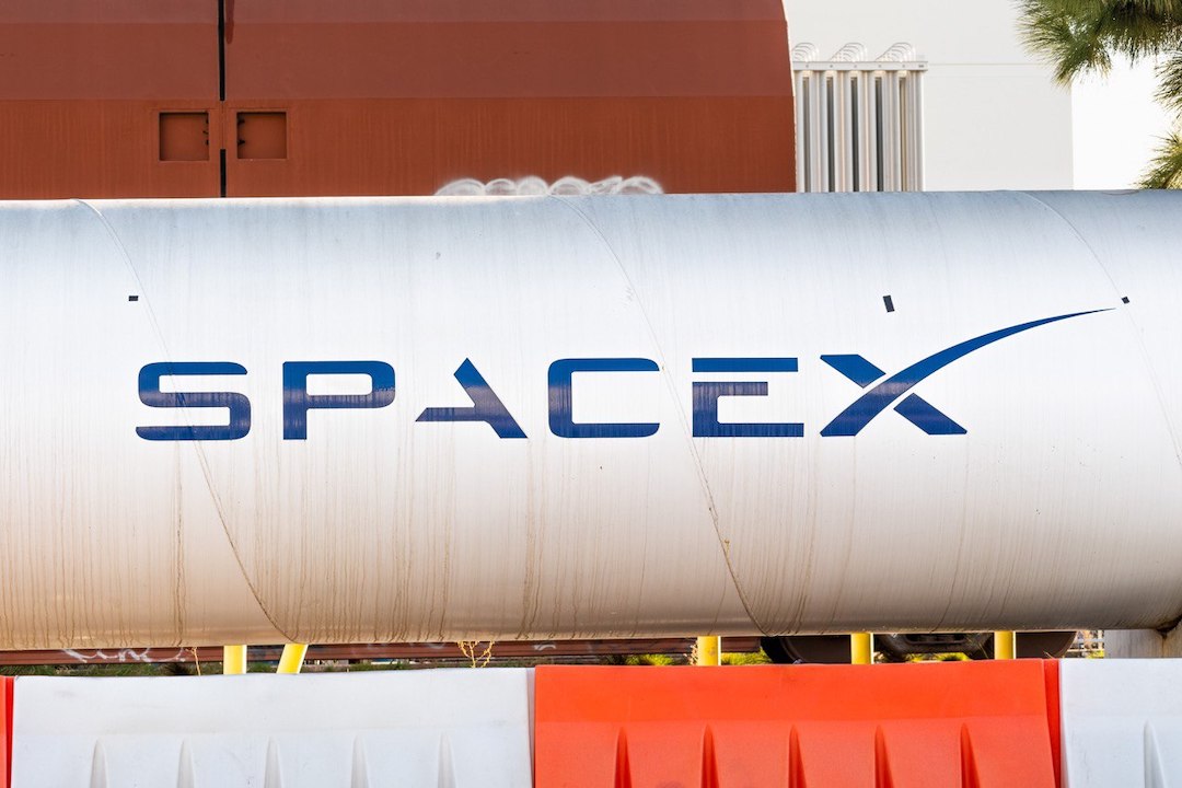
In response to a fan praising the ‘TESLA’ motif, Musk declared that he was a font lover and designed both Tesla and SpaceX’s brandings such that they shared similarities. In particular, he fixated on their “use of negative space,” though tweaks have been made to the designs over the years.
Interestingly, it seems the SpaceX logo—which ends with an extended ‘X’—has a hidden meaning, with the swoop of the letter “meant to represent the rocket’s arc to orbit.”
Typeface geeks will no doubt take delight in the world’s richest person taking an interest in the subject of typography, with Musk even replying to a tweet pointing out the recent lack of serif fonts with a pun on the good ol’ Times New Roman.
I somewhat agonized over the Tesla & SpaceX font design (love fonts tbh). There are some similarities, particularly use of negative space. We’ve made many little tweaks over the years.
— Elon Musk (@elonmusk) August 28, 2022
The swoop of the X is meant to represent the rocket’s arc to orbit
— Elon Musk (@elonmusk) August 28, 2022
Maybe it’s times for new roman
— Elon Musk (@elonmusk) August 28, 2022
[via Insider and Elon Musk, cover image via Andreistanescu | Dreamstime.com]


