
Twitter Blue Relaunches With An All New 80s-Style Logo
Twitter Blue has been the star of a will-they-won’t-they saga currently happening in the social media sphere. The program was updated, pulled from the platform, and relaunched much to the chagrin of the users and skeptics who watched on as Elon Musk reformed the site.
This week, the company announced that the paid subscription plan is back for good. And it’s taking an 80s approach to mark its arrival.
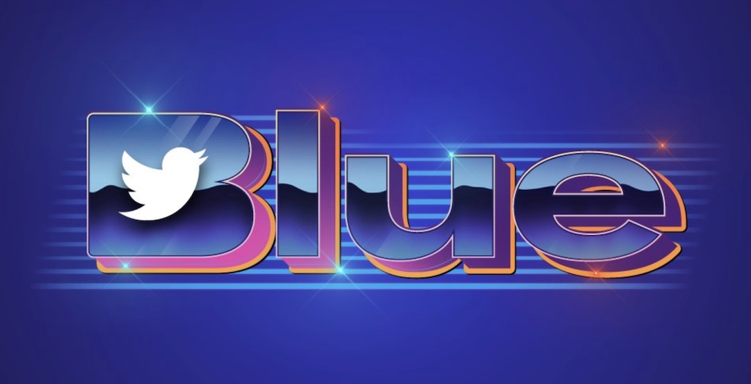
The business has decided to attempt something different instead of sticking with its customary basic design choices, which often revolve around its bird emblem and the color blue. The new logo features the word ‘Blue’ in a chrome finish with pink and orange highlights, giving it a nearly vaporwave vibe. The branding is set against a background of lines and a shade darker than the typical Twitter blue.
The script is a touch off-balance, with a proportionately larger ‘B’ than the other letters and a bird in the center. One only has to wonder if the design team may have been among the 3,700 people told to leave the company.
Overall, the logo has not struck a chord with some, with Fast Company calling it a “train wreck.”
Under the newly improved Twitter Blue, verified users will only be granted the now-infamous blue checks after verifying their phone numbers and undergoing an approval process.
Twitter previously announced a multicolored verification system in which the site will award nonprofits with gold marks and government accounts with a gray tick.
Outside of the intriguing new motif, Apple users will now pay US$11 instead of the promised US$8, with the price increase ostensibly implemented to offset the 30% fee Apple retains from advertising.
[via Fast Company and Hypebeast, cover image via Twitter]


