
Paris 2024 Rolls Out Pictograms & Colorful, Extended Visual Identity

Paris 2024’s branding is already iconic as it is. Its symbol, ‘Marianne’, of a female figure who’s also a flame and medal has caused quite the sizzle—some fans have the hots for her, while others are likening her to “Karen.” And for the first time, both the Olympic and Paralympic logos are identical.
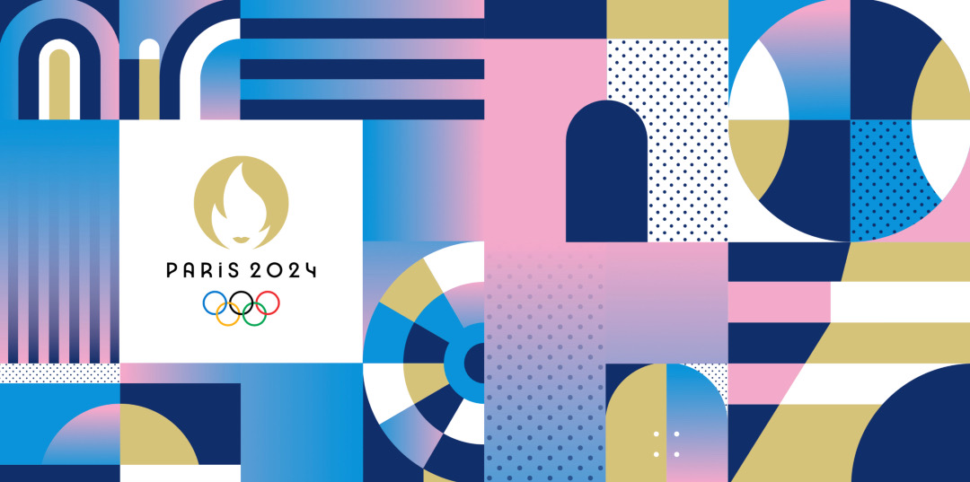
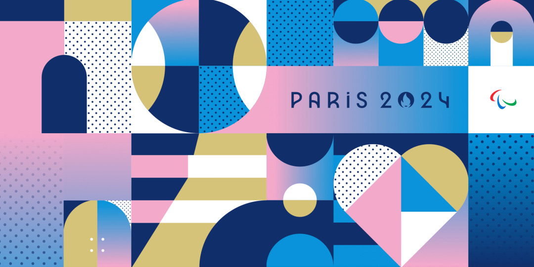
But the celebrations have just begun. The Games have now pulled back the curtain on an entire visual identity as well as unleashed 2024’s pictograms. ‘The Look of the Games’, as the brand system is called, finds its muses in fashion, food, architecture, and history—and the Parisian spirit all in all.
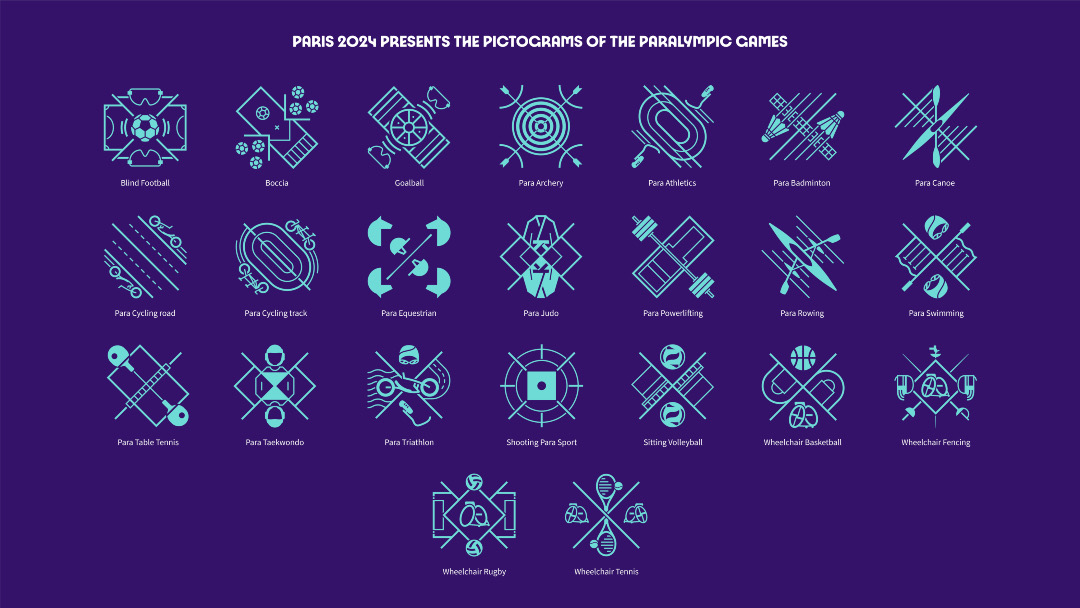
You may recall the 2020 Tokyo Olympics’ power-packed pictograms of athletes in their respective sports. Paris 2024’s symbols are more abstract, with every participating sport reimagined as an honorable coat of arms.
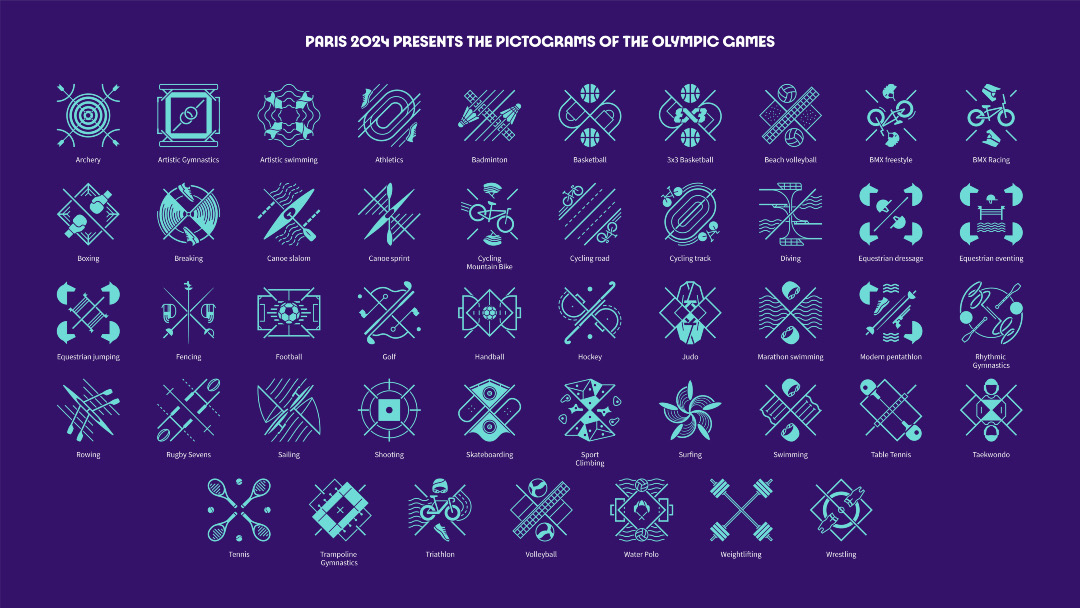
Each icon is built on the basis of symmetry, while featuring objects that represent the sport and capturing the game from a top-down view.
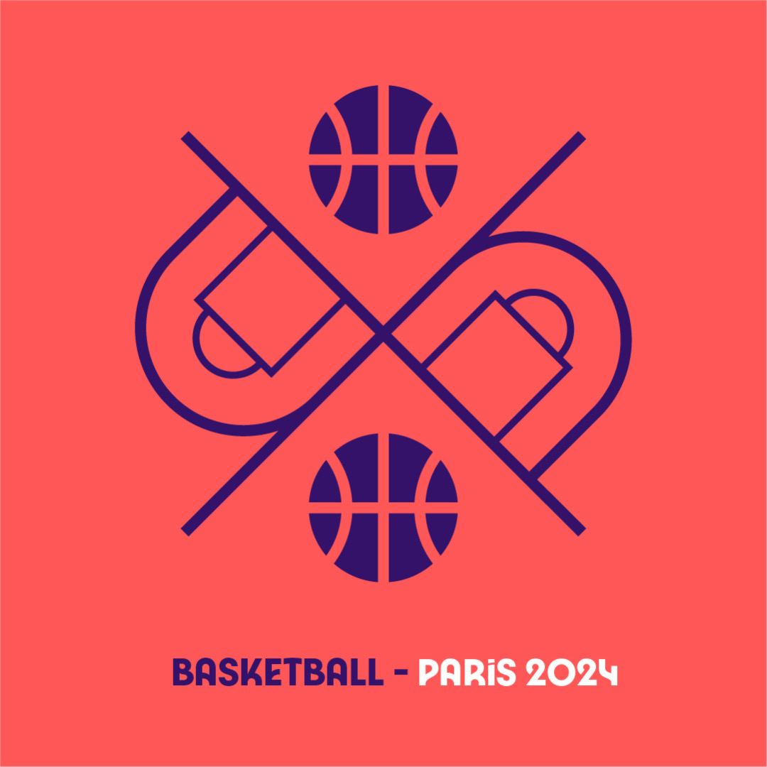
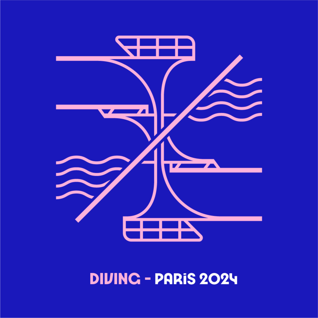
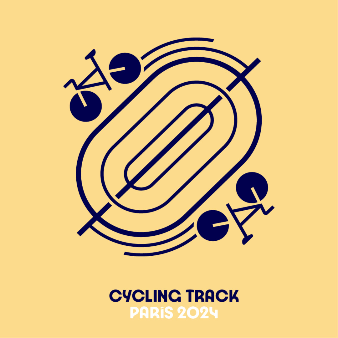
There are no characters in the pictograms this time, partly so the International Olympic Committee can keep things inclusive. As such, of the 70 emblems in total, eight are shared between the Olympics and Paralympics.
Julie Matikhine, Paris 2024 brand director, tells Creative Review that the Games’ visual identity is summed up by a play on words: “Sous les pavés, les Jeux,” meaning, “Under the paving stones, the Games.” The phrase reenacts the “Sous les pavés, la plage!” slogan plastered on many protest signs during the 1968 civil demonstrations in Paris. This tribute embodies the “revolutionary attitude” of the French, Matikhine adds.
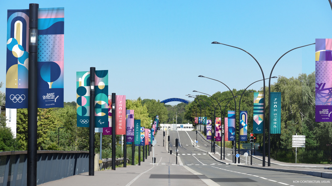
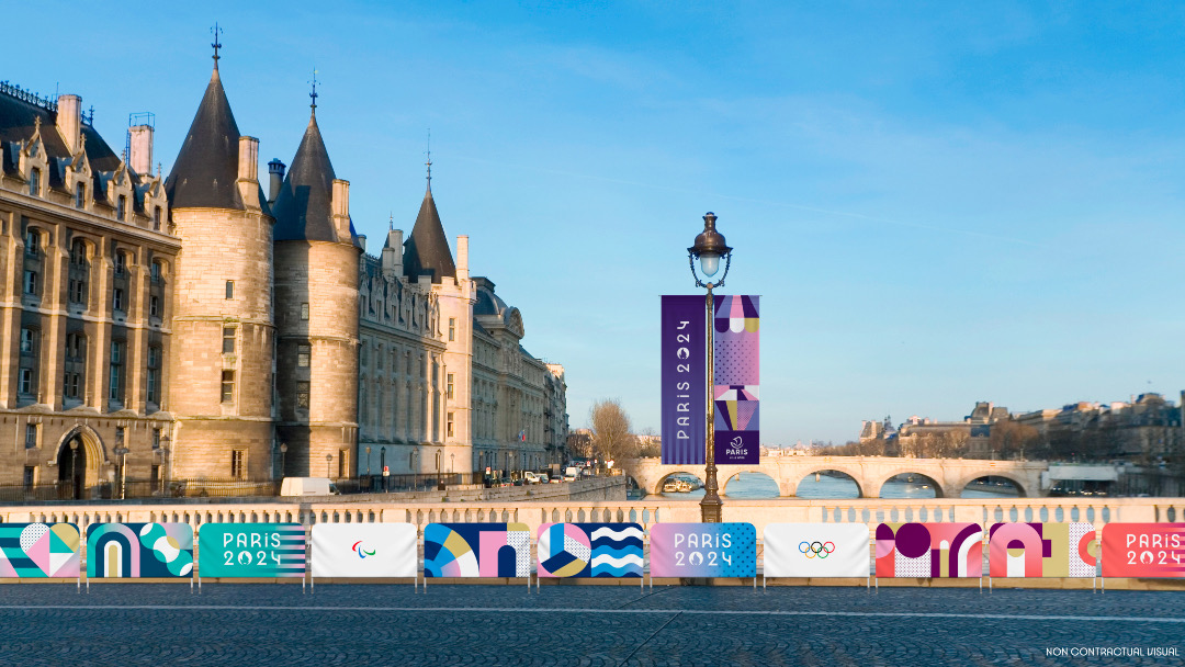
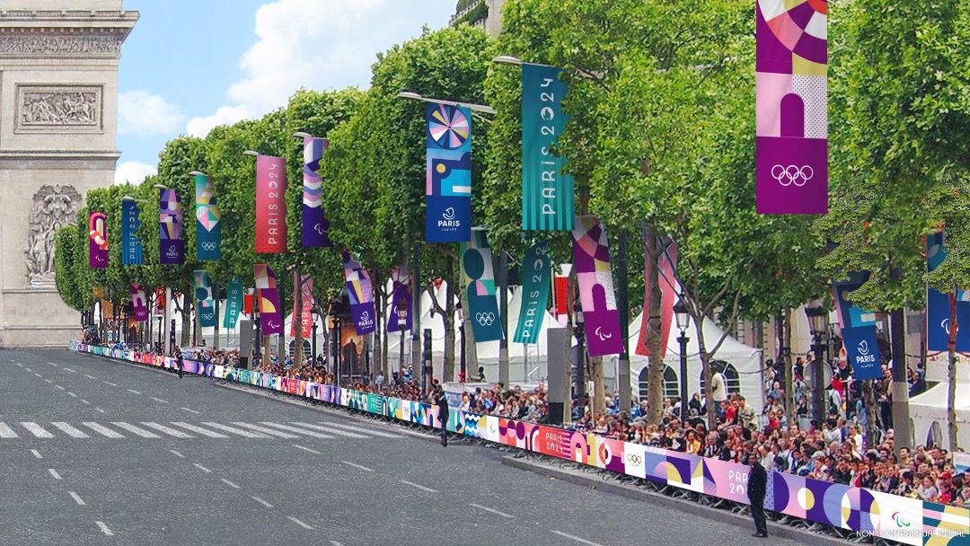
As for the “paving stones,” you’ll see them as squares all over the design system. Paving stones line every city in France, and their simple shapes serve as building blocks for all sorts of things. In the case of the Look of the Games, the architectural pieces form an interchangeable grid system inspired by the Art Deco style, which was also paraded in the 1924 Olympic games in Paris.

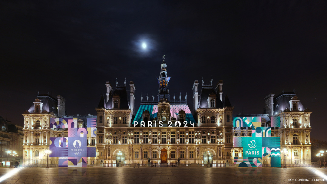
Paris 2024 chose pastels of purple, green, pink, blue, red, white, and gold as its color palette. They’re optimistic and inviting, and a delicate twist on the usual rainbow.
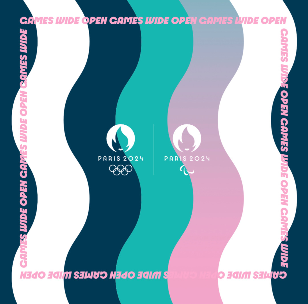
“We are Paris, we are French”—the nation of culture and fashion, explains Matikhine. “We don’t want it to be a rainbow of colors.”
[via Creative Review and Eurosport, images via Paris 2024]


