
Toblerone’s ‘Less Swiss’ Packaging Without Matterhorn Rolls Out Onto Shelves
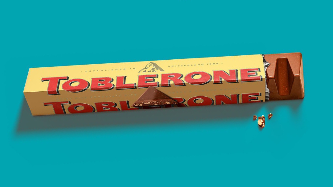
Toblerone has had to move mountains to align with the Swissness Act, as some of its production is shifting abroad. For legal purposes, it has replaced its Matterhorn emblem with a more “modernized and streamlined” variant.
Parent company Mondelez International will be taking some of Toblerone’s operations to the Slovakian capital of Bratislava by the end of this year, making the candy no longer authentically Swiss by the standards of the government of Switzerland.
Under ‘Swissness’ laws, which came into effect in 2017 to uphold the nation’s expectations for quality, food and beverage brands can only feature Swiss symbols or crosses, and identify as “Swiss-made,” if they source 80% of a product’s raw materials and 100% of milk and dairy products locally. Much of manufacturing should also come from Switzerland.
Per a Metro.co.uk report, the first chocolate bars without the Swiss Alps have entered retail.
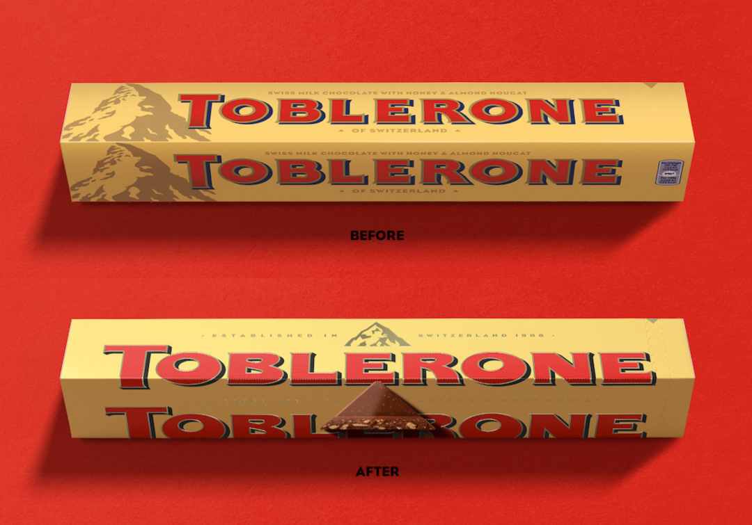
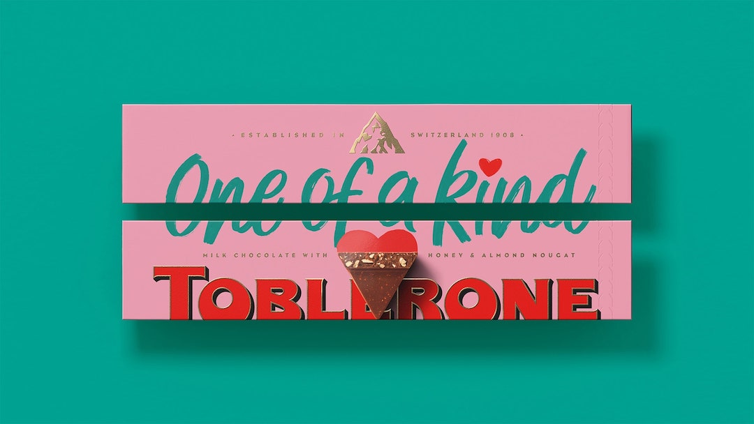
It turns out that the new branding has been bubbling under the surface since last year. The new mountain imagery, which swaps out the Matterhorn peak for a more generic mountain top, appeared in an announcement for a redesign of the triangular bars, where brand design agency Bulletproof had been tasked by Toblerone to develop a quirky visual identity to “be more triangle.”
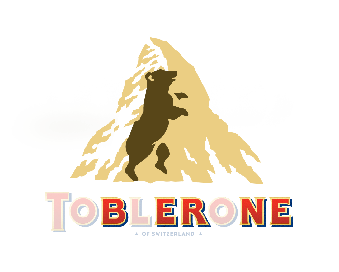
Notably, the overhauled mountain includes a simplification of the also iconic—albeit hidden—bear, whose hind legs used to be more nuanced. If you didn’t see the creature then, you’d be less likely to notice it with the new look.
The bear was in reference to the city of Bern, also known as the City of Bears.
Instead of taking up a sizable amount of space on the packaging, the new, geometric mountain has been downsized and now hovers above the wordmark, as opposed to sitting next to it.
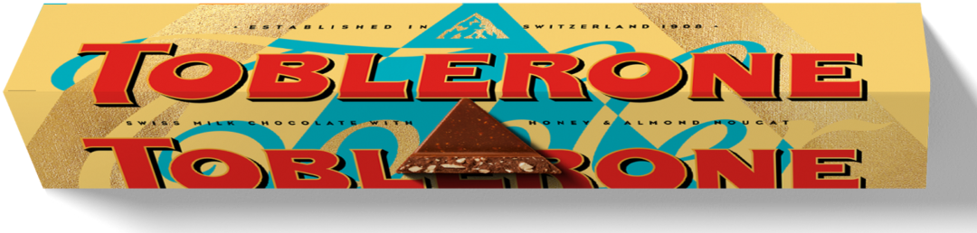
Lastly, to establish the new production changes, the packs are labeled with “established in Switzerland,” replacing “of Switzerland.”
[via Metro.co.uk, images via various sources]


