
Toblerone Lives On The Edge With Brand Makeover That Makes It ‘More Triangle’
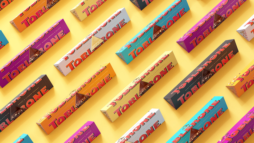
Toblerone chocs up its ability to still live at the top of customers’ minds—over a century on—to its unmistakable triangle shape, which is also a nod to the Swiss Alps.
When Theodor Tobler introduced this iconic confection with Emil Baumann in 1908, he also thought up its name and packaging. It was unapologetically triangular in shape, a refreshing trait even by today’s standards.
The company has now tapped brand design agency Bulletproof to overhaul the Toblerone visual identity with a new brand purpose that amplifies Tobler’s instinct to be different: to ‘Be More Triangle’ in a sea of squares, AKA conventional chocolate bars.
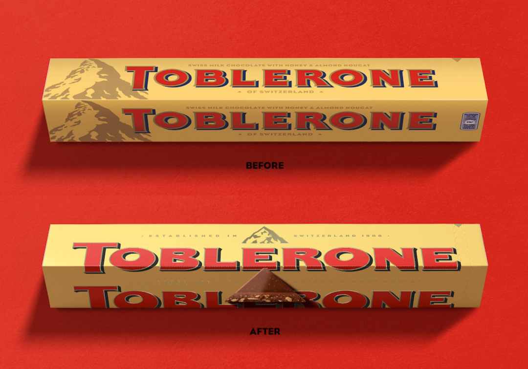
Rejecting conventions often associated with aesthetic perfection, the new logo revives hand-drawn gems from Toblerone’s past, like the off-center counters in the ‘O’ and a fleshed-out base for the letter ‘E’.
“Quirks that were once frowned upon are now celebrated as a badge of distinctiveness,” describes the brand agency. The wordmark brings back the “original quirkiness” from the first Toblerone logo. Meanwhile, a new typeface honors the script of Tobler’s signature.
View this post on Instagram
While the changes are distinct, the redesign remains quintessentially Toblerone and might not even be noticeable to consumers. It retains the famous Matterhorn illustration—although the mountain has been redrawn to, well, “be more triangle”—and continues to give that hidden bear a roof over its head.
Red and gold remain the primary colors, but they’re now much brighter and brimming with “vibrant positivity.”
Refusing to conform, the emboldened logo now sits ever-so-slightly between edges of the pyramidal packaging.
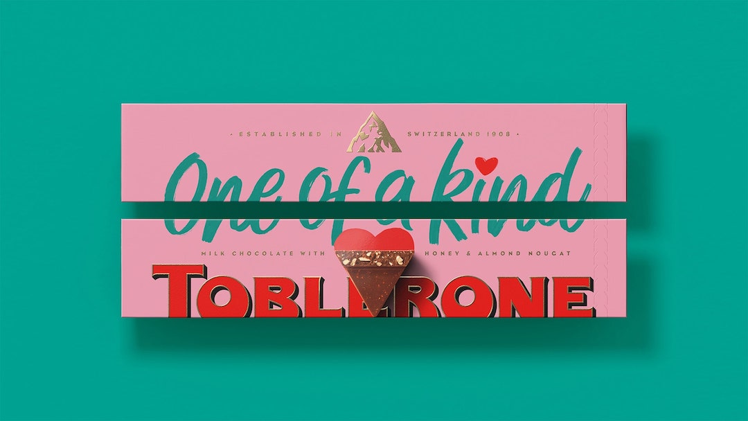
In line with the revamp, Toblerone has launched an online gift store where customers can personalize their chocolate packaging in big and bold ways.
[via Dieline and Logo Designer, images via Bulletproof]


