
Burberry Steps In A New Direction With ‘Equestrian Knight Logo On Soles Of Shoes
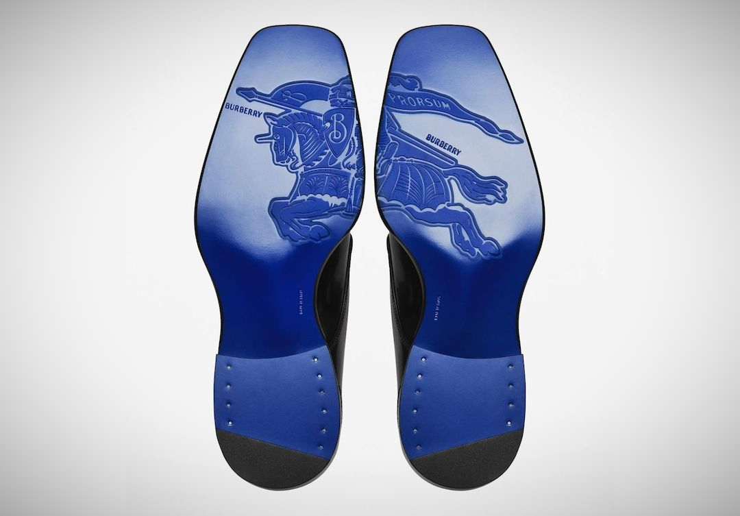
Daniel Lee is taking new strides to revamp and reinvent the Burberry label under his vision. Lee took up the helm of the luxury label after its previous Creative Director, Riccardo Tisci, left the company after five years.
Under Tisci, the brand’s identity relied heavily on its iconic check print and trench coats. However, Lee thinks otherwise as he steers the focus away from what Burberry was previously known for, and instead pushes forward its Burberry Equestrian Knight logo that debuted in 1909. And, fit for the new era, the emblem has also been given a modern update.
The new direction is notably seen on its newly redone Instagram page, which spotlights a bright electric blue hue underpinning most posts. It is hallmarked by roses, rabbits, tartans, and celebrities like Stormzy, Mary J Blige, Jodie Comer, Kano, and more.
One of the more eye-catching reveals for its Fall/Winter 2023 collection was three pairs of shoes. Funnily, you couldn’t see the footwear itself, and instead, it was its sole that stole the show. On it was the Equestrian Knight in all of its storied fame, embossed as one image over both sides of the shoe in that same electric blue. It appears on what looks like two pairs of brogues and a pair of furry stilettoes.
View this post on Instagram
The imagery is crisp and clear, and almost too painful to step on in the real world. However, it also shows a new road Burberry seems to be walking down, looking towards other aspects of its brand to signify it instead of its usual print.
That said, Lee hasn’t fully gotten rid of the checks yet. The fashion house debuted its first swimwear line filled with trunks and bikinis decked out in the Burberry pattern just the day before.
[via Hypebeast and Highsnobiety, cover image via Burberry]


