
Adobe Adopts New Wordmark, But No, It’s Not Its Official Logo
Composite image via Adobe / YouTube
Adobe’s logo has stayed relatively the same for 30 years. Recently, however, it’s taken on a new look that’s noticeably more modernized.
The branding appears in several of the company’s social media posts and, most recently, in the videos showing off Adobe’s game-changing Firefly generative artificial intelligence tools.
View this post on Instagram
The emblem seamlessly pastes Adobe’s iconic red, open triangle in front of the other letters, which are more rounded than the text in the original logo. It’s set in the Adobe Clean Black font.
In its animated form, which you can catch sight of in the first second of the promo below, the wordmark rotates to reveal just the side of the letter ‘A’, which then expands into a border to open the video.
Overall, the look is sleeker. However, sticklers for change might be disappointed to know that this design isn’t a new corporate logo but, rather, an extension of the Adobe expression.
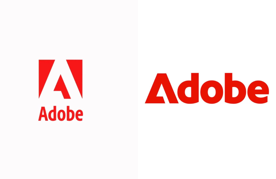
The official logo (left) and the secondary wordmark (right). Video screenshots via Adobe
It’s not a logo, Adobe insists. It’s a wordmark.
Asked about a possible brand refresh, the company’s head of brand strategy and customer insights Heather Combs told Fast Company that the classic logo isn’t going anywhere. Neither is it being replaced.
The rounded typeface is just a “very fresh, bold” addition to the Adobe brand tool kit to cast a wider net for how the brand expresses itself, said Combs.
The classic Adobe branding isn’t broken and is recognized by all, Combs added, so there’s no need to cancel it out. Instead, the company hopes to “build off” of the positive feelings that people get when they look at the logo.
[via Fast Company, images via Adobe / YouTube]


