GoDaddy Drops Laidback Mascot For Heart-Shaped Logo To Spotlight Entrepreneurs
Web domain company GoDaddy has revealed its new logo, signalling a new direction for the brand.
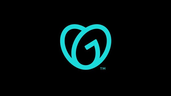
The new design features a sans-serif typeface, with the word “Go” interlocking into a heart. This is huge leap from GoDaddy’s previous quirky branding that had a laidback mascot next to the company’s name.
#GoDaddy New Logo pic.twitter.com/WvIOhrQaJG
— Raju (@iwanttech) January 15, 2020
Designed by GoDaddy’s internal design team along with branding firms Lippincott and Codo, the new emblem resembles a “young girl who’s a little bit of a bandit—with a ponytail and patch over her eye—wanting to grow up and be somebody,” GoDaddy’s CEO Aman Bhutani told Fast Company.
The platform has also redesigned its homepage and created new advertising campaigns to feature the new symbols.
With the overhaul, GoDaddy hopes to champion real-life GoDaddy users, or “Everyday Entrepreneurs,” instead.
GoDaddy’s chief brand officer Cameron Scott told Fast Company that the company wishes to convey that it will be present from customers’ “first step,” and will always have their backs in the ideas they execute.
Our new logo, the GO, is all about empowering you — the everyday entrepreneur — to do what you love. Go after your dreams and make ‘em real, knowing we’re here to help every step of the way. #makeyourownway pic.twitter.com/8eVtTRrSID
— GoDaddy (@GoDaddy) January 14, 2020
What a way to kick off 2020! This new visualization of who we are embodies the can-do spirit of our customers and our commitment to their success. I can’t wait for us to fill this new logo with the love and purpose we have for our everyday entrepreneurs. https://t.co/MZYtDWqzuz
— Aman Bhutani (@sh0kunin) January 14, 2020
[via Creative Bloq, opening image via GoDaddy]
Also check out these recent news


