Don't miss the latest stories
BMW’s Logo Gets Minimalist Update With A Meaningful Transparent Outer Ring
By Izza Sofia, 04 Mar 2020
Subscribe to newsletter
Like us on Facebook

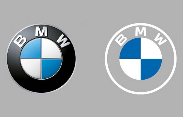
Left: Old logo Right: New logo
BMW has unveiled a brand new logo on the company’s new Concept i4 car.
The new flat logo still carries the basic circular shape and architecture, as well as the blue and white colors of the Bavarian state.
What’s new is the outer circle, which is now transparent instead of black. The transparent ring will take on a different appearance depending on the exterior color of the car.
The 3D effects and lighting, too, have been removed to create a minimalist look, a world of difference from the classical emblem.
The simplicity of the new mark shows that the company acknowledges the 103-year history of the brand, while modernizing it to fit the digital age.
According to senior vice president of customer and brand Jens Thiemer, the new transparent logo is designed to “radiate more openness and clarity,” and endeavors to appeal to younger audiences.
The redesigned symbol has been added to the company’s site, which reveals the history of the logo. It appears that this redesign is the biggest change to the logo, as the black ring has finally been replaced since its introduction in 1917.
Welcome to the future of JOY.
— BMW (@BMW) March 3, 2020
Introducing the new two-dimensional, transparent interpretation of the iconic #BMW logo.
The BMW Concept i4.#THEConcepti4 pic.twitter.com/GH6qmbAJvP
BMW changes their logo for the first time in 23 years. pic.twitter.com/aK9Gce7cFB
— S I D (@sidsays_) March 4, 2020
[via Motor 1, opening image via BMW Blog]
Receive interesting stories like this one in your inbox
Also check out these recent news


