
Apple’s Clean Attention To Detail In New Mac Icons Incites Design Orgasms
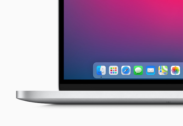
Image via Apple
When Apple unveiled macOS Big Sur, it also introduced the “biggest” redesign for the Mac operating system in over a decade. The macOS interface now closely follows the iOS design for consistency without them being too confusingly alike.
Normally, making dramatic changes to something your audience is familiar with will trigger a negative reaction. While the revamped icons for the operating system still have their detractors, design enthusiasts are, in general, fawning over them due to the impeccable detail dedicated to the shortcuts.
Apple introduced drop shadows and depth to the rich new macOS iconography, and the additions—in layman’s terms—make the icons “pop,” indeed. The graphics seem to float above their backdrops and appear much more authentic.
It’s not just their 3D transformations that are inspiring awe. Some of the icons come with Easter eggs that can only be seen when you zoom into them. The new Mail icon, for instance, sees Apple Park’s address embossed on the envelope.
“The new icons in macOS Big Sur are fundamentally still Mac but so refreshing and pioneering,” commended Google Chrome designer Elvin Hu.
Admittedly, not everyone will be won over by the new drop shadows, but the icons will probably just need some getting used to.
The new icons in macOS Big Sur are fundamentally still Mac but so refreshing and pioneering. Congratulations to everyone that worked on this huge release!! pic.twitter.com/aS4iAk5qJL
— Elvin 🏳️🌈 (@elvin_not_11) June 22, 2020
Look at this beauty 😍 pic.twitter.com/oF5RL2thoD
— Andreas Storm (@avstorm) June 22, 2020
Apple’s attention to detail pic.twitter.com/wQn8HZMvD7
— Alex 🌚 (@alexmuench) June 23, 2020
New Mac OS Big Sur has everything more rounded and it's like skeuomorphic design is coming back. Look at these app icons 😍 . More details here https://t.co/wwNu5HufKf pic.twitter.com/fnRGTFWDSB
— vijay verma (@realvjy) June 23, 2020
Evolution of the Safari icon on Mac #WWDC20
— Joe Allam (@joeallam) June 22, 2020
From pre-2014 skeuomorphic, to flat design, to finding a balance in between. pic.twitter.com/Jsu7v3jrA7
For those who need the side-by-side comparison of the new Mac OS icons and iOS set. pic.twitter.com/mvNnqlz2NE
— Tanner Christensen / Hiring Designers! (@tannerc) June 23, 2020
[via various sources, cover image via Apple]
Also check out these recent news


