
Google Photos Users Express Dismay Over App’s ‘Simplified’ Pinwheel Redesign
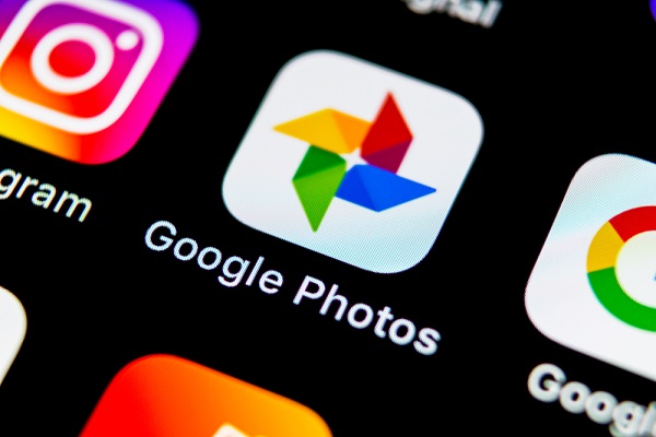
Image via BigTunaOnline / Shutterstock.com
Google Photos has gotten a new logo to reflect the “simplified experience” it offers users in 2020.
The new logo was highlighted by Justin Duino, who showed the revamped Googles Photo symbol in a tweet. The icon is a departure from the pointed pinwheel and has a new rounded shape for each of its four sections.
According to Google, the new flattened logo pays homage to “childhood and nostalgia,” but not everyone seems to be impressed by the “simplified” logo.
“I’m torn. I like the simplicity, but there is a point when something becomes too simple, to the point where it loses identity,” Arun Maini explained in a tweet. “Why are so many companies going for simplistic logos now? There is no need for change,” one Twitter user weighed in.
Another Twitter user claimed that the new logo resembles the branding of a US supermarket chain that looks like a fruit bowl.
Google stated that it retained the “familiar pinwheel shape to remind you of past memories.” Sadly, the pinwheel is unrecognizable in the simplified form, Creative Bloq critiqued. Because the new logo has been stripped off of its two-tone shading and pointed shapes, it somehow loses the “tactile quality” and the semicircles now look like “four separate abstract shapes,” the website further explained.
A designer has even redesigned the Google Photos logo without it losing its familiar overall shape.
However, despite criticisms from the public, the new logo is consistent with those of other Google apps, such as Chrome and Maps.
Today we’re rolling out a new, simplified Google Photos experience to help you find and relive your memories.
— Google Photos (@googlephotos) June 25, 2020
https://t.co/4IXKnkSqkK pic.twitter.com/ky9q62sLBx
Thanks, I hate it. pic.twitter.com/W5NSKuDjiJ
— Justin Duino 💻 (@jaduino) June 25, 2020
I'm torn. I like the simplicity, but there IS a point when something becomes TOO simple, to the point where it loses identity
— Arun Maini (@Mrwhosetheboss) June 25, 2020
Why are so many companies going for simplistic logos now? I get not being too complex but the Google Photos logo was fine with the way it was. There is no need for change https://t.co/iiVrlESRoB
— PownicMania (@PownicMania5000) June 25, 2020
Fixed it pic.twitter.com/K2AUcb9aJ3
— Michał Janas (@QuaXZ3) June 25, 2020
Hi we’re @googlephotos and we’d like to sell you some groceries. @CreativeBloq pic.twitter.com/RXYFCa45sv
— 𝕊𝕥𝕖𝕧𝕖𝕟 𝕎𝕚𝕝𝕤𝕠𝕟 (@singersteve) June 25, 2020
[via Creative Bloq, opening image via BigTunaOnline / Shutterstock.com]
Also check out these recent news


