Rolls-Royce Gets A Luxe While Contemporary Rebrand To Suit A Modern Audience
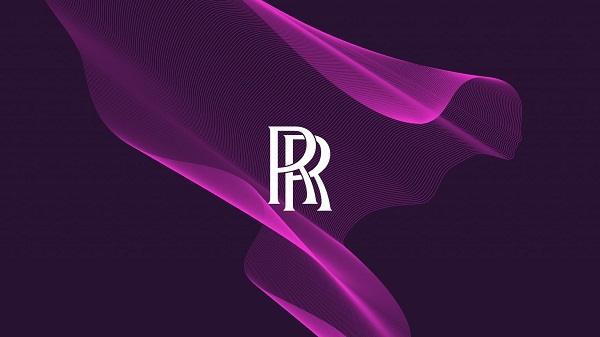
Image via Rolls-Royce
British luxury brand Rolls-Royce has teamed up with Pentagram partner Marina Willer to overhaul its visual identity for a younger audience.
The redesign includes an updated typography and color palette, a new icon inspired by its famous figurine, as well as a computer-generated pattern for its digital presence. The company hopes to stay true to its heritage while giving the brand a fresher appeal.
On top of luxury automobiles, Rolls-Royce has expanded its brand to offer luggage, bags and other high-end accessories for car owners, so the new branding will have to accommodate all of these offerings instead of just the automobile sector.
The new look should also adapt to the digital world and app for the Whispers members club, as according to Rolls-Royce, its customer base gets younger.
After exploring Rolls-Royce’s trademarks, Wills and her team decided that the core details—the double “R” monogram badge—would remain unchanged as it carries an “incredible value.”
The Rolls-Royce Motor Card wordmark, however, has been tweaked to “express more a lifestyle brand than a corporate brand” while staying in line with the original monogram. The “L’s” of the name now have a slight angle inspired by the company’s 1930’s wordmark. This is to “indicate movement,” Willer explained.
Rolls-Royce’s wordmark is designed with a new typeface called ‘Riviera Nights’. Willer said that Pentagram chose this typography as it “depicted luxury without being overtly decorative.”
Wills added that the overall visual concept is developed with the phrase, “quiet power,” in mind. “It’s not shouty. It stimulates the silence you experience in a Rolls-Royce,” she said.
Another change to the brand is the graphic version of the brand’s icon, The Spirit of Ecstasy, which stands on top of the cars’ hood. Illustrator Chris Mitchell redrew the statuette into a “simplified, modern form” to be used as a graphic symbol. The icon also now faces forward instead of backward while showing “strength and power.”
Willer also developed a pattern for the brand after drawing inspiration from other luxury brands such as Hermès. Dubbed the Spirit of Ecstasy of expression, it sees a pattern design that extends from the curves of the icon, forming a ribbon of parallel lines.
The idea is to emulate a silk-like movement, which drapes over surfaces and adding a luxe touch to it. “This is when science meets art, a bit like the brand,” she added.
Pentagram also chose purple as the brand’s core color, with accents of fluoro orange and pink. Miller said purple has always been associated with luxury, and it looks “softer, less masculine and harsh” than black. “It still has authority and elegance, but yet it’s broader not just to gender but culture,” Miller described.
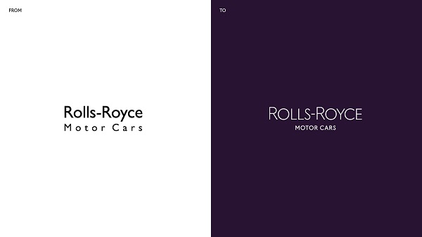
Image via Rolls-Royce
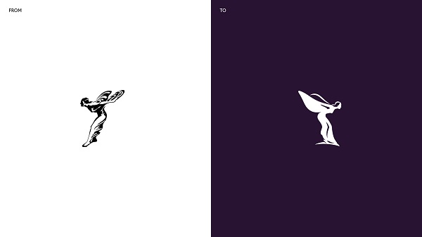
Image via Rolls-Royce
Image via Rolls-Royce
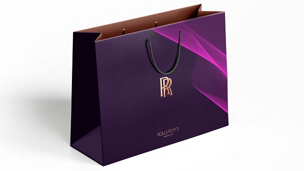
Image via Rolls-Royce
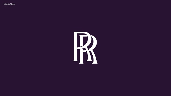
Image via Rolls-Royce
[via It’s Nice That, opening image via Rolls-Royce]
Also check out these recent news


