
The Most Popular WFH Wall Colors Are Also The Worst For Your Productivity
Image via Shutterstock
So, you’ve tried every trick in the book in hopes of working more proficiently in your home office, but nothing’s working. Perhaps a slight change in “scenery” could take things further?
Turns out, the colors that most people have been facing every day at home might actually be the least inspiring.
Bland tones bring out the blues
Image via Shutterstock
In a new study involving 4,626 participants, MyJobQuote.co.uk found that 54 percent have stuck to looking at a white wall, while beige and gray take up 37-percent and 32-percent of walls respectively. Unfortunately, these options are the most likely to make you feel down, according to a psychologist.
Lee Chambers MSc MBPsS, who was asked to comment on the research findings, brought up a 2015 University of Texas study that found employees working in offices “without a splash of color, especially those in neutral white, gray and beige,” experienced more “sad and depressive feelings.” The outcome seems to be more apparent for workers identifying as female.
Orange is the new blurghh, especially for men
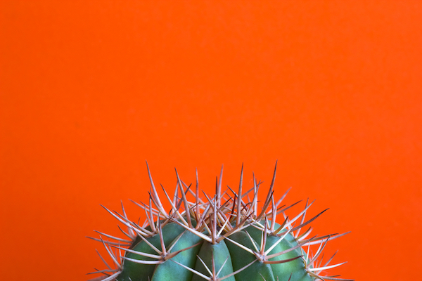
Image via Shutterstock
Orange is the color painted on 17-percent of walls. However, the same study from the University of Texas noted that this hue can especially hurt productivity for males. The good thing is you can fix this by picking “a peachier shade,” Chambers recommended, as it tends to be perceived as more “happy and welcoming.”
Ring ring, yellow, creativity?
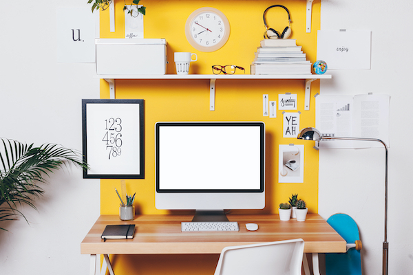
Image via Shutterstock
Thankfully, there’s hope for those grappling to get more creative within the confines of four walls. The fourth most common home office hue—yellow (24 percent)—is often described as the color of creativity, and tends to be the choice for many “innovation labs and creative spaces,” Chambers related.
Yellow has also been found to boost information retention, so this could be the key color to use for note-taking.
“If you have a creative job, yellow is definitely a solid choice,” the psychologist added. But be careful not to overdo it—getting too sunshiney with your background can create eye fatigue. Also, Chambers said you’ll tend to get “agitated and lose emotional balance” after staring at this vibrant color for too long.
Need more inspiration? To find out which other colors to choose or avoid for your work-from-home space, check out this report.
[via Welp Magazine, images via Shutterstock]
Also check out these recent news


