
Baskin-Robbins Finally Celebrates The Hidden ‘31’ With Major Logo Redesign

Image via Jones Knowles Ritchie
Logo design buffs would be aware that Baskin-Robbins’ secret flavor has always been the ‘31’ hidden in its BR initials. Now, everyone’s in on this cool mystery.
The ice cream behemoth has scooped up a massive brand overhaul with creative agency Jones Knowles Ritchie (JKR), and the new identity serves up the previously-hidden digits like they’re the flavor of the month, every day of the month. The hope is to honor Burt Baskin and Irv Robbins’ initial goal for variety—and to make that happen, the agency has transformed the ‘31’ into “a canvas for flavor expression,” one that flexibly changes up to depict Baskin-Robbins’ innovative flavors.
“The once-small, family-run shop grew to epic proportions thanks to imaginative flavors born from an unparalleled commitment to all things new and different. But with growth, comes dilution. And at Baskin, big became boring,” JKR reflected. “Nearly 75 years after the brand’s inception, it was time to get back to Burt & Irv’s original business plan: variety.”
With endless delicious possibilities for the “canvas,” Baskin-Robbins will be able to create individual mini-identities for its variants, which speaks of its ability to master a whole spectrum of flavors.
JKR also worked with graphic design studio Face37 to give Baskin-Robbins a bespoke typeface inspired by the ‘31’ symbol and its assymmetrical features.
Have a taste of the diverse new Baskin-Robbins identity below.
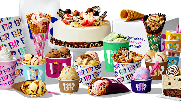
Image via Jones Knowles Ritchie

Image via Jones Knowles Ritchie
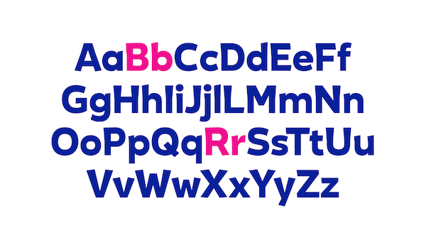
Image via Jones Knowles Ritchie
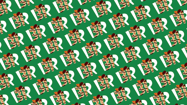
Image via Jones Knowles Ritchie
[via Ad Age, images via Jones Knowles Ritchie]
Also check out these recent news


