
Here’s Why Highway Signs In The US Have Two Different Typefaces
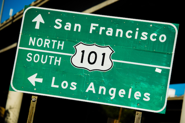
Image via Shutterstock
As you’re aware, one of the primary functions of typography is to provide clarity, particularly for signage like directional guides. This is why highway signs in the United States use two specific fonts: Highway Gothic and Clearview.
But why are there two of them? Vox explains this in a new informative video, shown below.
Highway Gothic was introduced in 1948 to standardize signs for the new highways popping up in the US and to ensure that riders could better comprehend text on the road. Its kerning is deliberately set far apart, and its distinct angled tops allow drivers to read the signs from afar. The angle at the top of the lowercase ‘L’, for instance, prevents confusion in spellings like “Illinois.”
However, when reflective signs became predominant in the 1980s, some of the characters in Highway Gothic got more difficult to distinguish. When light reflected on them, the lowercase ‘A’, ‘E’, and ‘S’ began to look the same as the letter ‘O’. This was especially troubling for elderly drivers.
That’s when font designers developed Clearview, which solves the problems faced by Highway Gothic with its wider and larger internal spaces.
Today, both typefaces are in use on highways.
[via Vox, cover image via Shutterstock]
Also check out these recent news


