How ‘French Dispatch’s Fictional ‘New Yorker’-Style Magazine Covers Were Created
Images created by Javi Aznarez and Erica Dorn for The French Dispatch
Even before watching the film, one might feel like they already know The French Dispatch magazine.
It was important for producers to establish this instant connection and familiarity from the start. It is a Wes Anderson film, after all, where stories feel like they are extracted directly from dreams or strike as moments of déjà vu.
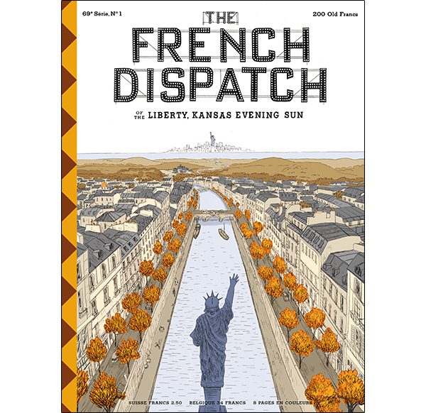
Image created by Javi Aznarez and Erica Dorn for The French Dispatch
For graphic designer Erica Dorn, the fashioning of memories from thin air proved to be “one of the biggest challenges,” she told AIGA Eye on Design. “The publication needed to feel like a historic magazine that had been around a long time, which also belonged in the world alongside other iconic magazines (like the New Yorker), but at the same time needed to have its own identity.”
For inspiration, she studied New Yorker magazines from 1975 and earlier, as well as old Paris Review issues. While The French Dispatch is steeped in nostalgia, it isn’t tied to a specific era, as with Anderson’s other films.
The movie itself is Anderson’s love letter to The New Yorker, and even loosely bases some of its characters from real moments and journalists of the magazine.
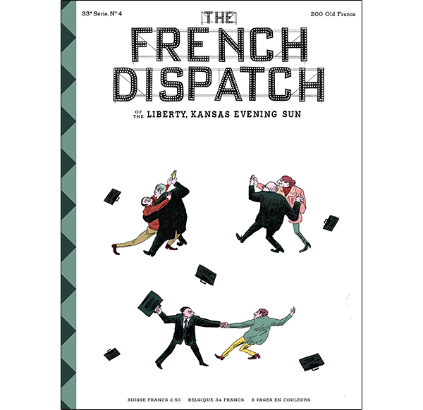
Image created by Javi Aznarez and Erica Dorn for The French Dispatch
One of Dorn’s first artworks for the film was the masthead of the fictional magazine. It so happened that producers were working on The French Dispatch bureau set at the time, so “Wes suggested we try the signage on the facade as the masthead, including the flashbulbs inside the letters and the scaffolding that holds it in place.”
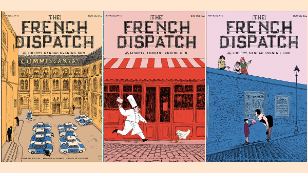
Print publishers in the real world obsess over what to put on the front of every issue. For covers that would strike a chord, Anderson and co-producer Octavia Peissel commissioned illustrator Javi Aznarez to create dozens of faux magazine covers. Aznarez, who also designed the film poster, has famously drawn for The New Yorker and The Washington Post, so his touch on the made-up publication also helps bridge the gap between fiction and reality.
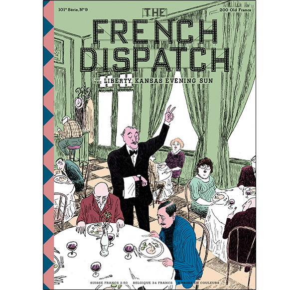
Image created by Javi Aznarez and Erica Dorn for The French Dispatch
Aznarez drew from his own imagination and memories to design the covers. Sticklers for details would be pleased to know that there’s an anecdote for every piece—a cover of a headless chicken being chased by a cook, for instance, was based on a true story of a chicken that survived for months without a head, and the addition of the cook comes from a plotline in the film.
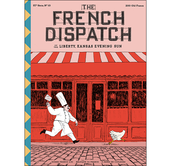
Image created by Javi Aznarez and Erica Dorn for The French Dispatch
In another, a pianist’s lifeless body is slumped over a piano, having just been shot dead through the window. That’s a reproduction of one of Aznarez’s childhood fantasies. “At my parents’ house we had a neighbor who gave piano lessons. At first, it may seem very bucolic to hear a piano in the background, but when it plays every day you feel like murdering the neighbor,” he described.
The artist said he was “given a lot of freedom” to produce the covers, and that it was “great therapy” to be able to indulge his dark thoughts with humor.
Image created by Javi Aznarez and Erica Dorn for The French Dispatch
For all the effort that goes into the covers, it’s easy to forget that The French Dispatch magazine isn’t real, or that the pages within are blank.
“Because no one ever opens the magazine in any of the shots, the only physical pieces that exist of the fictional magazine are the covers, and the chapter titles designed to look like pages from the magazine (except that they are designed for the exact crop you see in the movie),” explained Dorn.
Still, there’s a plethora of stories from the magazine that live in the creators’ heads. “It exists in our imagination as ‘a factual, weekly report on the subjects of world politics, the arts (high and low), fashion, fancy cuisine and fine drink, and diverse stories of human-interest set in faraway quartiers,’” expressed the designer.
[via AIGA Eye on Design, images created by Javi Aznarez and Erica Dorn for The French Dispatch]
Also check out these recent news


