Monotype Study Reveals That Font Choice Subconsciously Affects People’s Emotions
By Mikelle Leow, 25 May 2022
Image courtesy of Monotype
Have you ever looked at a poster on a lamp post and thought it was dubious? Maybe that’s not your gut feeling telling you that there’s something wrong, but the typeface being used.
Non-designers, too, have a sense of the emotional elements being radiated by fonts, as validated by a study completed by type foundry Monotype and applied neuroscience firm Neurons. In fact, they posit that typeface choice alone can drive up positive response “by up to 13%,” which means designers have been right to pour hours into selecting the perfect font family for their projects.
The research looked at the emotional associations and reactions of 400 participants toward three distinct typefaces: Cotford, a languid serif; FS Jack, a humanist sans-serif; and Gilroy, a geometric sans-serif. These were selected for their use by brands or similarity to typeface used by brands, though Monotype refrained from name-dropping real companies to ensure a fair test.
The typefaces were set in single words and sentences, which respondents were then asked to rate based on metrics like how sincere, trustworthy, memorable, or confident the text felt. Common buzzwords describing brand values—like “quality,” “trust,” and “innovation”—were also displayed in all three typefaces to measure the contrast between emotional responses.
The results confirm what brands and designers have known for ages.
Languid serifs: high-quality, relevant, memorable, trustworthy
When looking at the word “quality,” consumers were most drawn to the Cotford serif, which has “long associations with the world of fashion and luxury.” It’s likely they recognize its elegant nuances from years of exposure to luxury marketing, says Monotype.
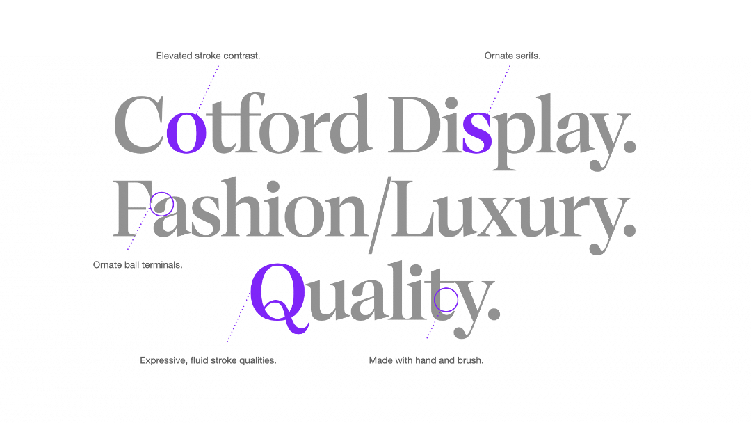
Image courtesy of Monotype
“The research showed Cotford Display Regular boosted people's positive perceptions of the word ‘quality,’” notes the type foundry. Set in this font, the word spurred a 14% uptick in people’s perception of relevance, a 10% rise in memorableness, and a 9% increase in trustworthiness.
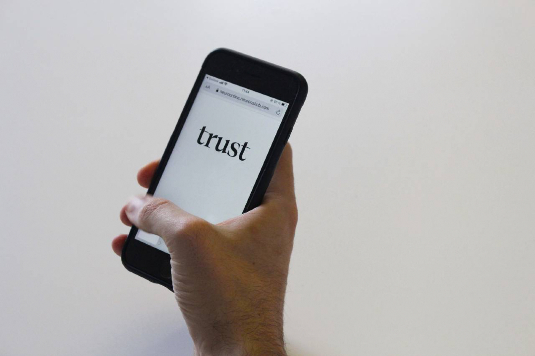
Image courtesy of Monotype
Humanist sans-serifs: innovative, prominent, unique, sincere, friendly
The humanist sans-serif, FS Jack Regular, generated a 9% increase in perceptions of innovation, a 7% rise in prominence, and a 3% increase in how unique a word comes across. Monotype elaborates that the font’s unique double-story “a” and “g” could have contributed to this response. Its humanist feel reaffirms the notion that lettering resembling calligraphy “may prompt a deeper, instinctive emotional reaction.”
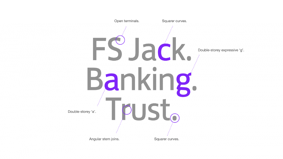
Image courtesy of Monotype
Plus, set in the word “trust,” the humanist sans-serif improved participants’ sense of confidence in the sincerity and honesty of a conceptual brand.
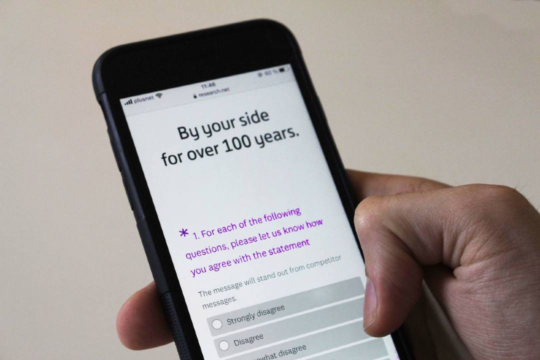
Image courtesy of Monotype
Geometric sans-serifs: authentic, reliable, successful
Finally, respondents deemed slogans set in the geometric sans-serif, Gilroy Bold, most authentic, with a 5% uptick in perceptions for honesty. This is compelling as the font happens to be used “by a long list of household brands,” says Monotype.
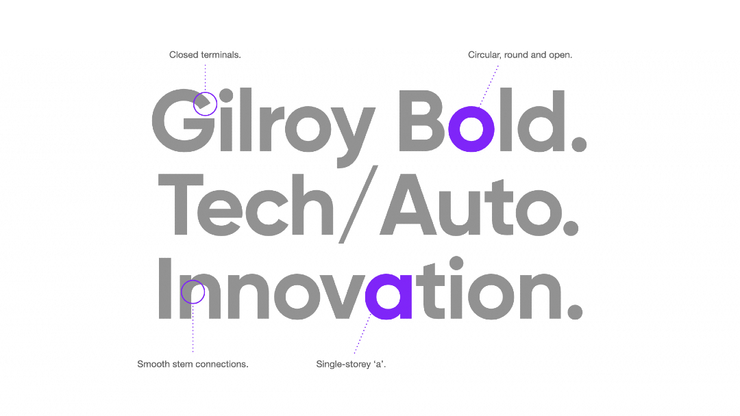
Image courtesy of Monotype
“Results underscore that geometric sans serifs have become visual shorthand for reliability and success,” says the type services firm.
Takeaways
“This study tested our biggest assumptions about consumers’ emotional response to type and confirmed everything the broader design community has believed about type for decades—that it measurably affects consumers’ recognition of, confidence in, and recollection of brands,” concludes Monotype senior brand director James Fooks-Bale.
“Even in the absence of color, logo, movement or any other traditional element of visual identity, typography plays a crucial role in conveying trust, sincerity, and reliability—brand marketers, agencies, and creatives should take note,” Fooks-Bale continues.
[via Monotype]


