Don't miss the latest stories
Advertise Newsletter
Network
  • The Bazaar
  • The Creative Finder
  • Deals
Shop

Follow

Share this

Google
Apps
Branding
Logo Design
Redesign
Technology
Samsung
More
  • Donald Trump
  • Viral News
  • McDonalds
  • UI/UX
  • IKEA
  • AI Generators
  • Creativity
  • Amazon
  • Burger King
  • Balenciaga
  • Fashion
  • Microsoft
  • Music
  • Apple
  • Logo Design
  • Redesign
  • Technology
  • Samsung
  • Donald Trump
  • Viral News
  • McDonalds
  • UI/UX
  • IKEA
  • AI Generators
  • Creativity
  • Amazon
  • Burger King
  • Balenciaga
  • Fashion
  • Microsoft
  • Music
  • Apple
MENU
  • Advertise with us
  • Submit tip/feedback
  • Work with us
  • Subscribe to newsletter
  • Subscribe to RSS
Advertise here
Advertisement

Google Officially Unveils Play Store Logo Redesign, Marking A Decade For The App

By Alexa Heah, 26 Jul 2022

Share on Facebook Twitter
Subscribe to newsletter
Like us on Facebook
Image via Google


Can you believe it’s already been 10 years since Google opened the (digital) doors of Google Play?


Since its launch, the online marketplace has been used by 2.5 billion people across 190 countries each month, with more than two million developers having built applications. 


Just a couple weeks ago, keen eyes on the internet had spotted that Google’s Play Store had subtly tweaked its logo, toning down its neon-hues to be more in line with the colors used in the Gmail, Google Drive, and regular Google emblems. Then, the symbol was only shown as a tiny icon, so hats off to users for noting the refresh.


For the Google Play Store's 10th anniversary... there's a brand new logo

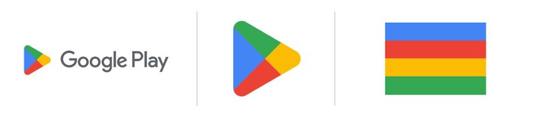
New (left) vs. old (right)

Nerds, FIGHT! pic.twitter.com/oor57rTvsK

Advertisement
Advertisement
— Ray Wong (@raywongy) July 25, 2022


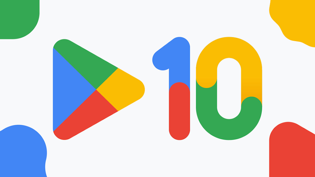
Now, the technology giant has officially confirmed the change, saying that it had planned to mark a decade of the Play Store’s journey with a redesigned logo that “better reflects the magic of Google, and matches the branding shared by many of our helpful products.” 


While the change isn’t too obvious at first glance, upon closer look, you’ll see that the triangle in the image appears more symmetrical, and its corners are more curved.


Take a look at the Google Play Store’s new logo and its colors below.


Image via Google


[via Digital Trends and Google, images via Google]

Share on Facebook Share on Twitter
If you’re enjoying DesignTAXI, please consider supporting our work with a contribution. Thank you. Cancel anytime.

Receive interesting stories like this one in your inbox
Advertise here

More related news

Advertise here
Also check out these recent news
WTF
Link to news page

Uber Eats Ridiculed For Listing Strange AI-Generated Images Of Food

Industrial Design
Link to news page

Mondrian’s Art Style Whips Up A Visual Feast In Chic, Modular Outdoor Kitchen

Tesla
Link to news page

Tesla Makes A $1,500 Cybertruck, But It’s For Six To 12-Year-Olds (So It Says)

Barbie
Link to news page

Barbie Gets Turned Into An American Girl Doll, Reminiscing Her First Form

Balenciaga
Link to news page

Balenciaga Hands Out Fake Energy Bars As Fashion Show Invitations