Major League Baseball Logo Has An Optical Illusion That Strikes A Nice Balance
A classic American symbol, the Major League Baseball (MLB) logo pretty much hits a home run in the field of design. Not only is it a display of patriotism with its colors, but it also plays with negative space to match the perception of the beholder.
As noted by Mental Floss, the red, blue, and white emblem with a cutout of a batter can be viewed in two different ways.
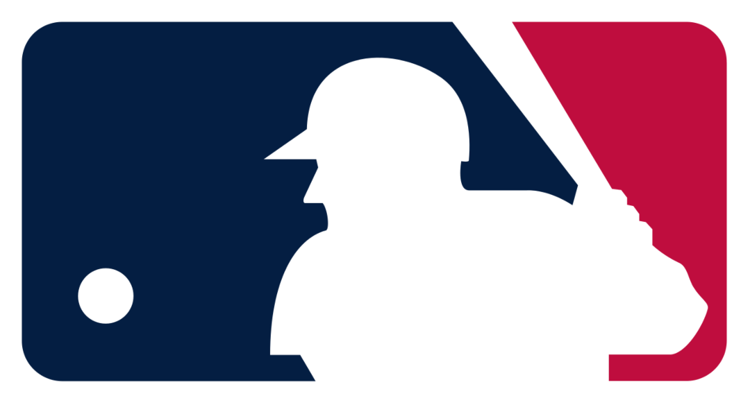
Some people imagine the player’s back to be facing them, which would make him right-handed. On the other hand (ahem), the figure can also be imagined to be facing the front, which could mean he’s a southpaw, or a left-handed hurler.

As it turns out, designer Jerry Dior purposefully made the character ambiguous when he created the logo in 1969, ensuring audiences couldn’t identify a specific face, handedness, or race.
The designer also shut down speculations that the silhouette was based on right-handed power hitter Harmon Killebrew, whose heyday spanned from the late 1950s to 1971. Dior told ESPN back in 2008 that the character was drawn from reference photos of various baseball players. “It’s not any specific person,” he insisted.
In other words, the logo can be envisioned with any MLB player (fair play), therefore striking a happy medium.
[via Mental Floss and Archysport, images via various sources]


