Don't miss the latest stories
Advertise Newsletter
Network
  • The Bazaar
  • The Creative Finder
  • Deals
Shop

Follow

Share this

Branding
Creativity
Culture
Entertainment
Film
Logo Design
Redesign
More
  • Typography
  • Adobe
  • Beauty
  • Cars
  • Travel
  • Apple
  • Pop Culture
  • Industrial Design
  • Twitter
  • Artificial Intelligence
  • KFC
  • Art
  • Books
  • Adidas
  • UI/UX
  • Barbie
  • Entertainment
  • Film
  • Logo Design
  • Redesign
  • Typography
  • Adobe
  • Beauty
  • Cars
  • Travel
  • Apple
  • Pop Culture
  • Industrial Design
  • Twitter
  • Artificial Intelligence
  • KFC
  • Art
  • Books
  • Adidas
  • UI/UX
  • Barbie
MENU
  • Advertise with us
  • Submit tip/feedback
  • Work with us
  • Subscribe to newsletter
  • Subscribe to RSS
Advertise here
Advertisement

Sundance Film Festival Unveils Evergreen Identity Inspired By Moviemaking

By Alexa Heah, 19 Apr 2023

Share on Facebook Twitter
Subscribe to newsletter
Like us on Facebook
Image courtesy of PORTO ROCHA


For the first time since it was established in 1985, the Sundance Film Festival has developed a long-term brand identity, with the new visuals aiming to increase public recognition of the famed event.


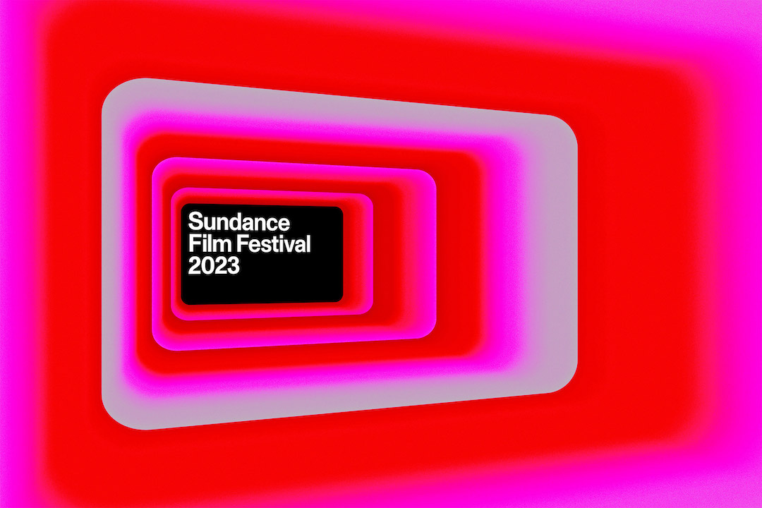
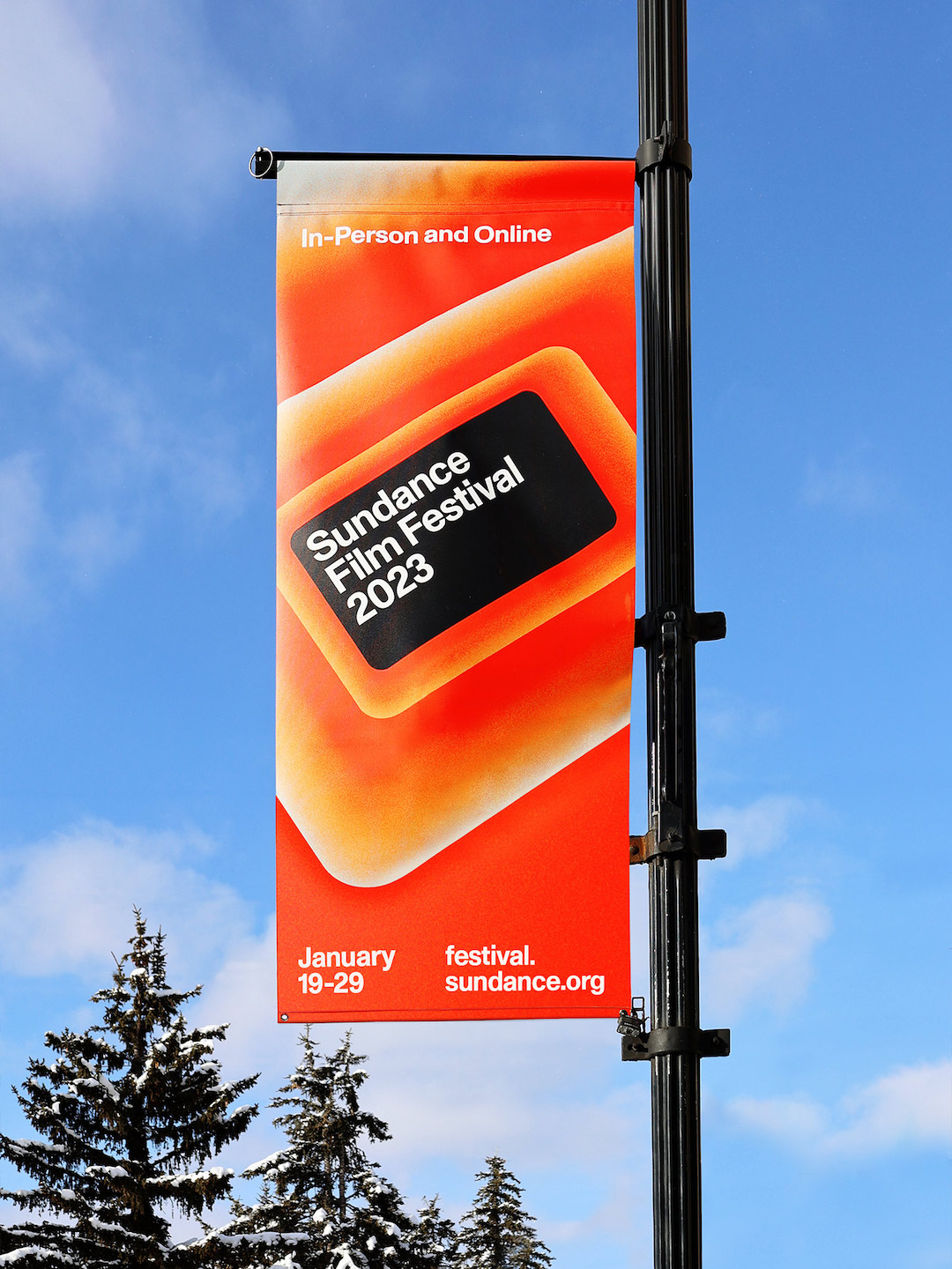
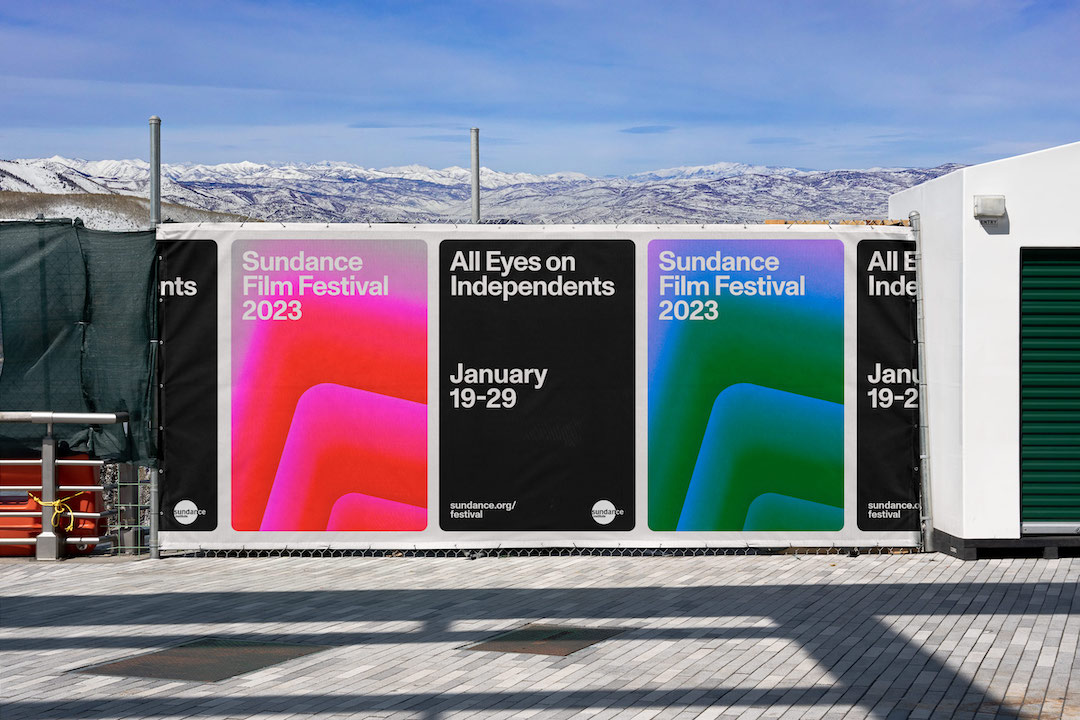
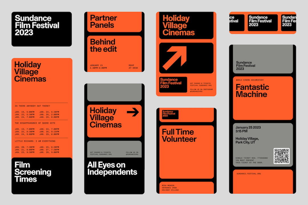
Naturally inspired by filmmaking, the redesigned logo features the aspect ratio—an “iconic identifier” for the festival and the craft in general—and will be the festival’s key emblem for the next four decades as the industry continues to evolve. Sundance tapped branding agency PORTO ROCHA to work on the ambitious endeavor.


Image courtesy of PORTO ROCHA


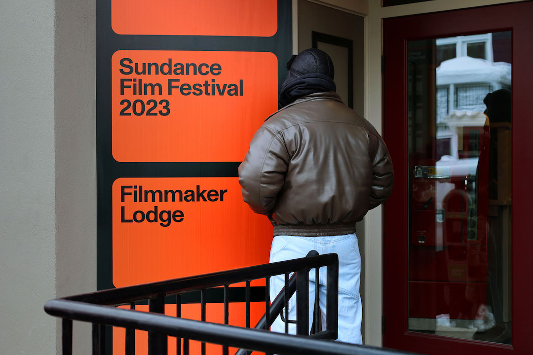
To come up with an enduring brand identity that would resonate with independent film buffs worldwide, the agency decided to go with a timeless yet contemporary aesthetic. As such, the 16:9 aspect ratio will feature as both the brand’s signature symbol and a framing device.

Advertisement
Advertisement


According to the creatives, the frame is one that can be applied to any footage or stills that need to be spotlighted, drawing the viewer’s attention to specific moments, characters, and emotions portrayed within each film.


Image courtesy of PORTO ROCHA


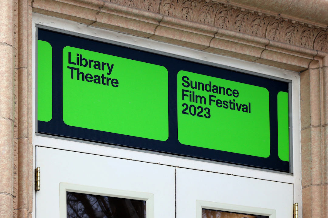
The choice of Monument Grotesk for the festival’s official typeface is meant to convey a strong presence that’s “neutral enough to speak to diverse genres and titles.” In addition, many of the brand elements follow old-school film strip cells—telling stories while being rooted in filmmaking.


Interestingly, the festival’s identity isn’t passive but is set to evolve as the industry does. The agency said that “as new perspectives come into focus, so will new brand gestures,” with the brand-new tagline—‘All Eyes on Independents’—placing creators front and center.


Image courtesy of PORTO ROCHA


Image courtesy of PORTO ROCHA


Image courtesy of PORTO ROCHA


[via PORTO ROCHA, images courtesy]

Share on Facebook Share on Twitter
If you’re enjoying DesignTAXI, please consider supporting our work with a contribution. Thank you. Cancel anytime.

Receive interesting stories like this one in your inbox
Advertise here

More related news

Advertise here
Also check out these recent news
Video Games
Link to news page

Super Mario Bros’ Torsos Turn Into Insulated Tumblers For 7-Eleven

KFC
Link to news page

KFC Fuels Eyes With Illusion Billboards You’ll Have To Shake Your Head At To See

Toys
Link to news page

Collectible Toys Get The ‘Disneyland’ Treatment At New ‘Pop Land’ Theme Park

Spotify
Link to news page

Spotify Explores AI-Generated Playlists Crafted From Text Prompts

Barbie
Link to news page

Barbie Honors Stevie Nicks With Her Own Doll