Porsche Crosses The 75-Year Mark With Its Crest Refitted For A New Era
By Nicole Rodrigues, 02 Jun 2023

It’s Porsche’s 75th anniversary and to mark the occasion, a new set of crests from the German marque will adorn its cars starting this year.
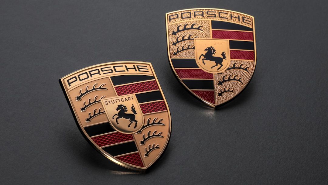
But fret not—the iconic emblem is not going anywhere out of sight. It is merely polished for a sleeker appearance to match modern times, and most of the changes will require a closer look to be noticeable.
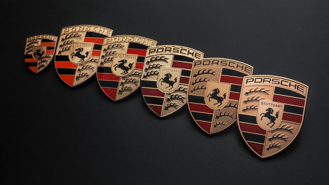
Since the logo was first used in 1952, it had only been subtly tweaked on five occasions, while mostly remaining true to its brand origins.

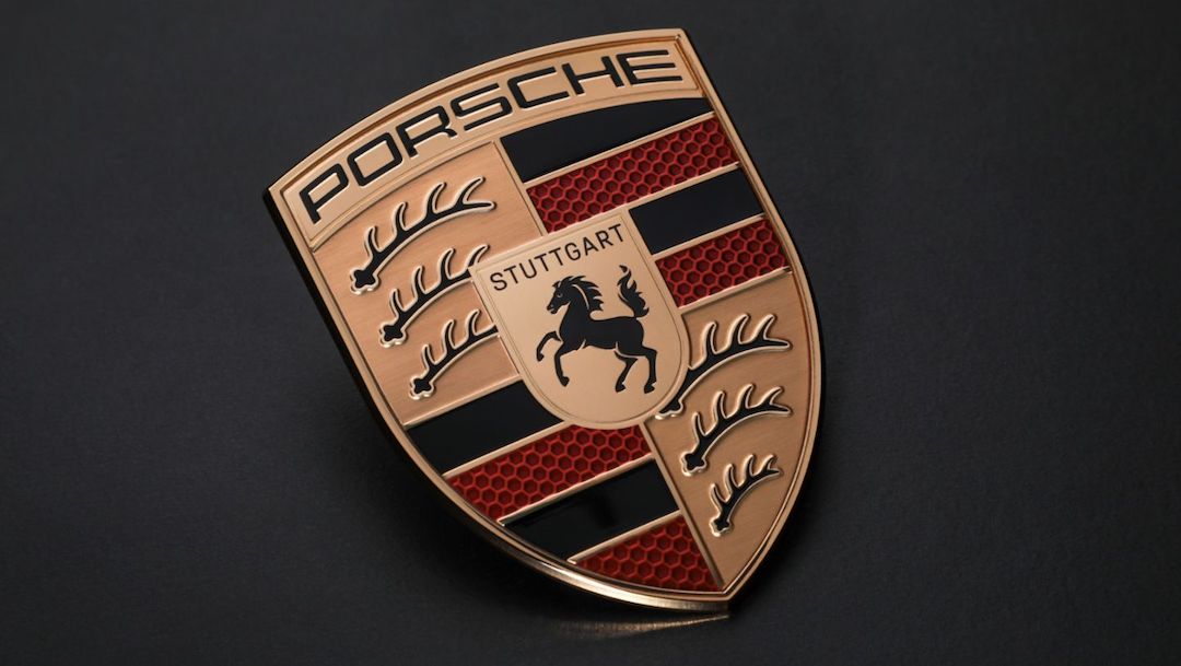
One of the more notable changes this time around is its texture. The new logo is clear and smooth, allowing its soft honey-like gold coloring to pop. And, speaking of honey, it has also switched up the red stripes to incorporate a honeycomb pattern.
Right smack in the center, Porsche has saddled up the word “Stuttgart” to accompany a slightly more detailed horse after it was removed from its last redesign in 2008.

“The modernized crest became the occasion for us to rework our brand design. We will be using the crest in a more targeted way to underline emotional highlights. At the same time, the Porsche lettering will take on even greater significance,” said Chief Marketing Officer Robert Ader.
[via Car and Driver and Jalopnik, images via Porsche]


