All The 2024 Colors Of The Year Unraveled By Brands So Far
By Mikelle Leow, 23 Aug 2023
Image generated on AI
It will be months before PANTONE announces its much-anticipated Color of the Year, but already, its rivals have beaten it to the Viva Magenta-flavored punch.
Interior paint brands such as HGTV Home by Sherwin-Williams, Behr, Valspar, Glidden, and Dutch Boy have named their own defining swatches for 2024, varnishing the landscape ahead of time. These colors go beyond aesthetics; they reflect our collective desires for comfort, individuality, and balance within our living environments.
Below, check out all the Colors of the Year that have been unveiled thus far. Will they shape the ambiance in your home?
Persimmon (HGTV Home by Sherwin-Williams)
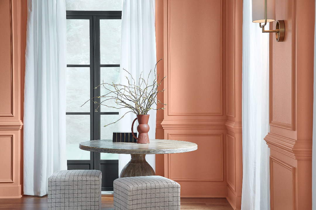
Image courtesy of HGTV Home by Sherwin-Williams
‘Persimmon’ is a grounded terracotta shade imbued with an energetic, warm, and refreshing aura. This earthy hue balances the energy of tangerine with neutral undertones, making it ideal for fostering positive interactions in spaces like living rooms and kitchens, describes Ashley Banbury, Color Marketing Manager at HGTV Home by Sherwin-Williams.
Cracked Pepper (Behr Paint Company)
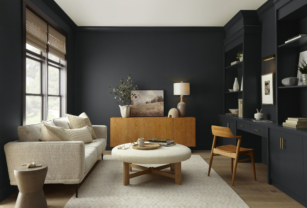
Image via Behr Paint Company / PR Newswire
‘Cracked Pepper’ is a soft black that stands as a timeless statement of confidence, and was chosen by the brand to represent the coming year after it noticed a growing inclination toward darker hues in interior design. As its name suggests, Cracked Pepper not only offers boldness but also lends a subdued flavor, making it a versatile choice for both homes and hospitality settings.
Renew Blue (Valspar)
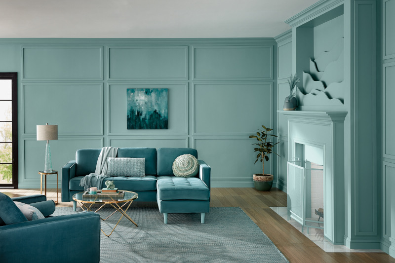
Image courtesy of Valspar
‘Renew Blue’, a serene blue with hints of grayed sea-green, speaks to wellness, comfort, and balance in our spaces. The invigorating hue reflects our pursuit of consistency and well-being within our living spaces. Sue Kim, Valspar Director of Color Marketing, explains that the tone draws inspiration from fleeting natural elements like fog and glacier lakes. This color aims to elevate moods, encourage self-expression, and bring a calming balance to various design styles.
Limitless (Glidden Paint by PPG)
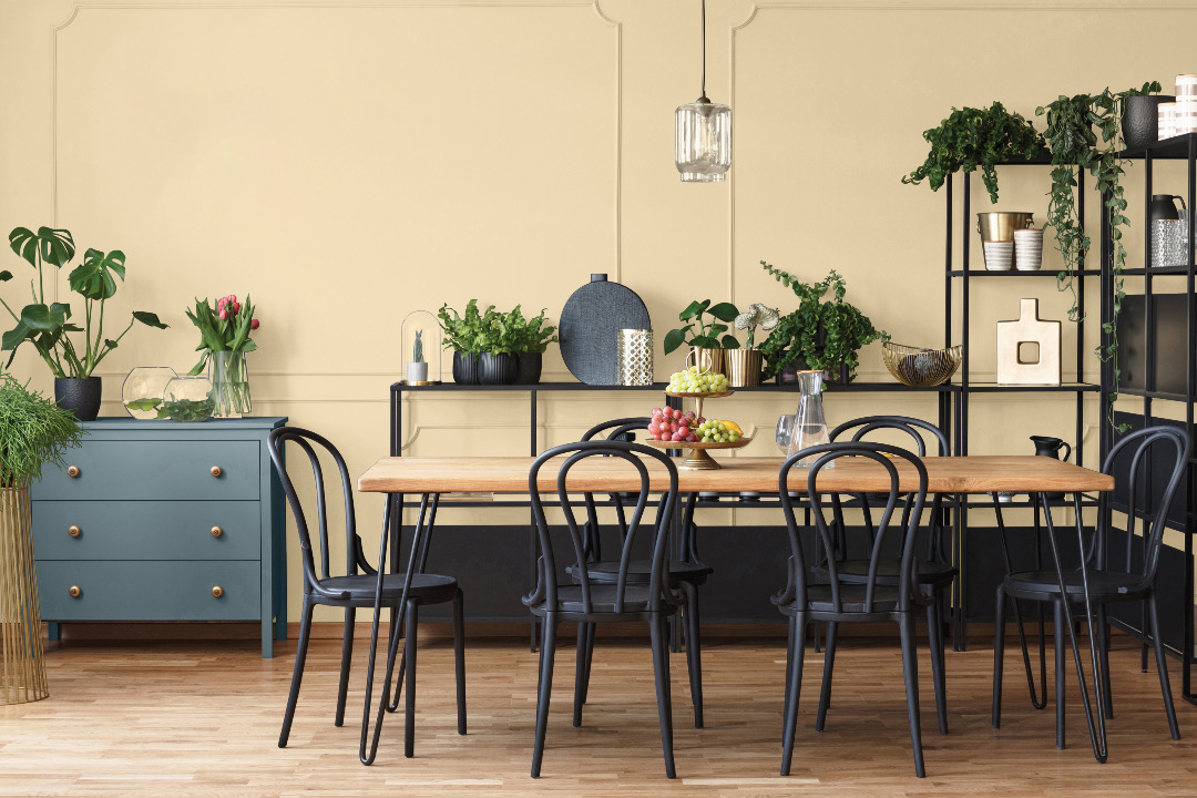
Image courtesy of Glidden
‘Limitless’ is a warm honey beige that seeks to overthrow cool neutral tones and gray as go-to neutrals. “The modern neutral is so versatile that the ways to describe it are, well, limitless… but, no matter what it’s called, it’s anything but yellow,” describes Glidden Paint by PPG.
Ironside (Dutch Boy Paints)
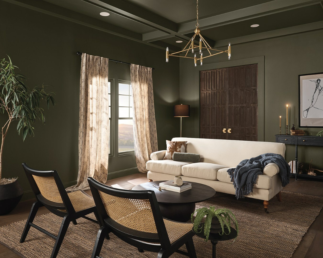
Image via Dutch Boy Paints / PR Newswire
‘Ironside’, a deep olive shade steeped in comfort and sophistication, adds a moody charm to both expansive areas and intimate corners. Like Cracked Pepper, this shade stems from a growing fascination for darker themes, although its calming green undertones invite occupants in the space to get cozy, wind down, and find inspiratoin.
[via various sources]
This article was crafted with assistance from an AI engine, and has been manually reviewed & edited.


