Google’s Original Logo Designer Explains How It Came To Be
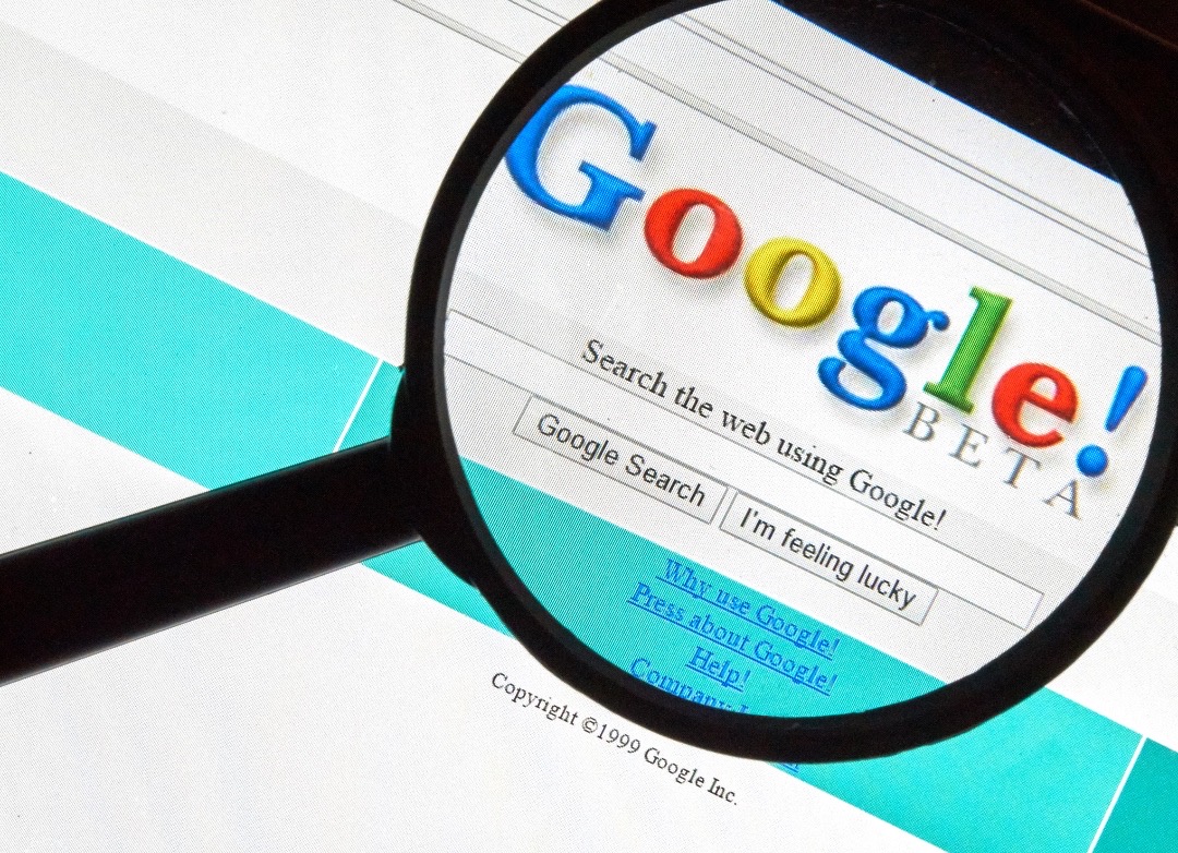
Photo 66605742 © Dennizn | Dreamstime.com
Turning 25 this year, Google is getting sentimental and looking back on its origins. One of its integral puzzle pieces is, without a doubt, its logo.
In a new blog post, the tech behemoth walks down memory lane by recounting how its quintessential branding has led it to where it is today.
In the late 90s, the digital landscape was evolving at a dizzying pace, and two Stanford University PhD students, Larry Page and Sergey Brin, were on the brink of something big: Google. They needed a logo, a visual identity to represent their revolutionary search engine. Enter Ruth Kedar, an art and product design instructor at Stanford, who was later tasked with crafting Google’s iconic logo.
The backdrop of Kedar’s creative journey was a world in political and economic flux. Yet, it was also a time marked by pop-culture milestones, from the release of Harry Potter to Celine Dion’s chart-topping hit, My Heart Will Go On, notes Google. Kedar drew inspiration not from the chaos but from the rich tapestry of culture itself, resulting in a logo that transcended time.
The designer embarked on shaping a logo that would become instantly recognizable. At a time when the internet was met with skepticism, and the concept of search engines was novel, Kedar aimed to make Google feel accessible.
Her solution was inspired by the world of children’s play and primary colors, a bridge between people's apprehension towards technology and the joy of discovery.
25 years ago Ruth Kedar was an established designer and professor at Stanford when she was asked by two Stanford students to help create a logo for their new startup. Those students were Larry Page and Sergey Brin and the company was Google! Here are some of the early designs she… pic.twitter.com/0ytc5wrn1U
— Alpaca Tech😎 (@AlpacaAlpacaAl1) September 13, 2023
For Kedar, play wasn’t just a juvenile concept; it was about curiosity, risk-taking, and the sheer fun of exploration. In Google’s playful little office, peppered with lava lamps, LEGO cubes, and primary colors, the logo took shape. These hues, akin to children’s building blocks, symbolized the idea that search was about constructing knowledge and unlocking possibilities.
The use of primary colors wasn’t arbitrary. They served as the foundation for an infinite spectrum of colors, mirroring the infinite knowledge accessible through a simple search.
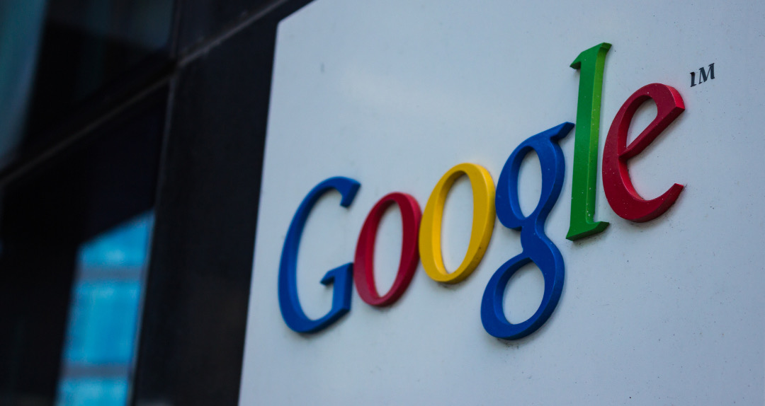
Photo 136014397 © Bruno Coelho | Dreamstime.com
Continuity and search were at the heart of Google’s mission, and Kedar’s choice of the Catull typeface suitably encapsulated this ethos. The resulting logo, with its subtle playfulness and deceptive simplicity, mirrored Google’s commitment to making technology user-friendly and accessible to all.
Decades later, Google’s logo remains a central part of our daily lives, a testament to Kedar’s enduring design.
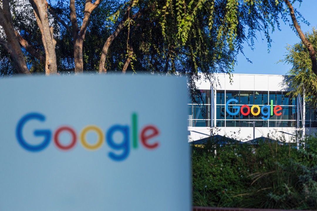
Photo 287692489 © Christian Offenberg | Dreamstime.com
“It’s extremely rare that a brand you’ve been involved with remains a ubiquitous presence in your everyday life, let alone for so long,” reflects the Google logo’s original designer.
[via Google, images via various sources]
This article was crafted with assistance from an AI engine, and has been manually reviewed & edited.


