
Tesco Brilliantly Overhauls Logo To Let Its Produce Do The Talking—And Spelling
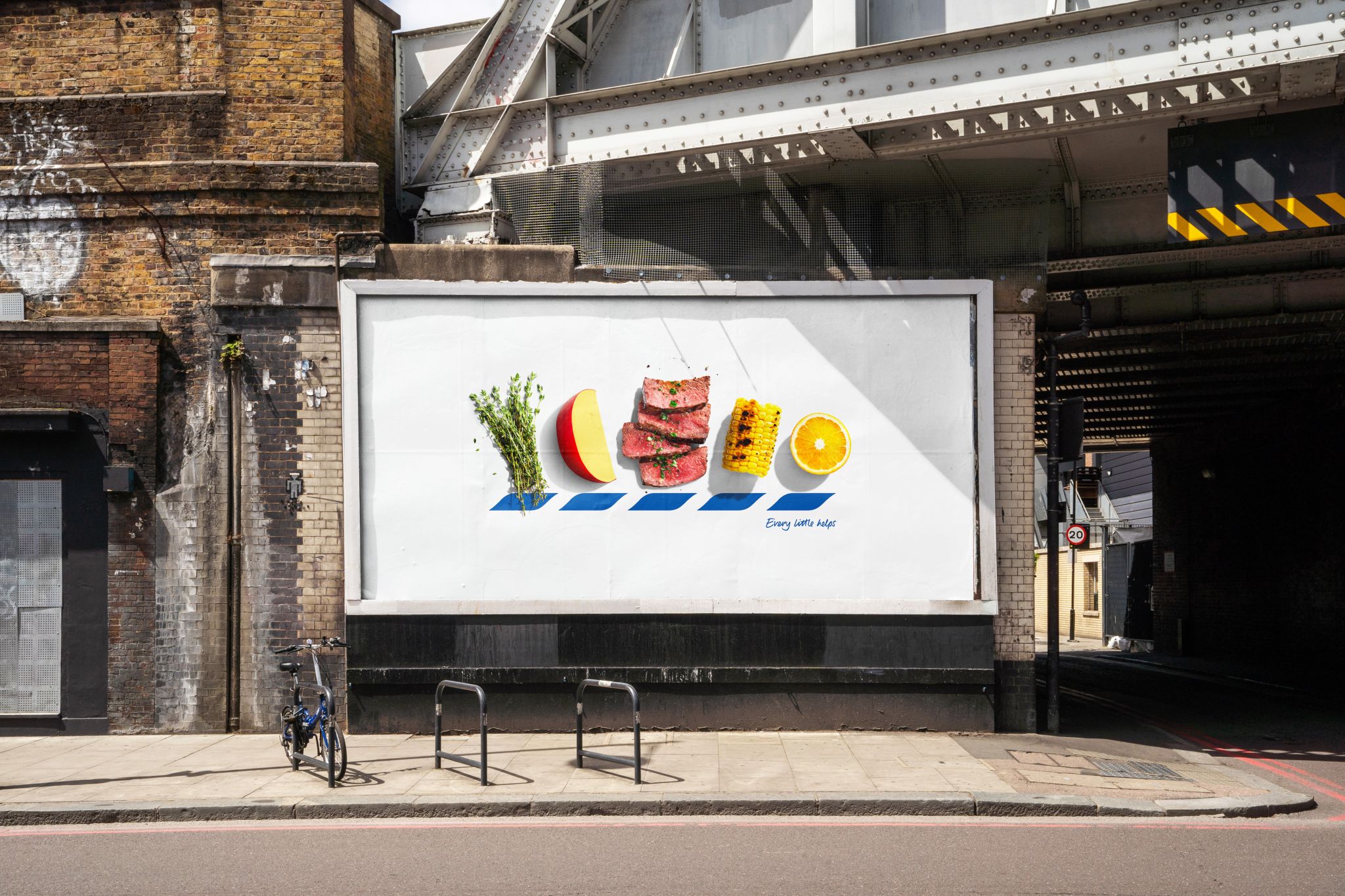
Thyme, Edam, Steak, Corn, and Orange. Image via BBH London
Tesco is playing with food—and the rules of logo design—with a clever campaign, entitled ICONS, that’s making the advertising community do a double-take.
New daring billboards developed by BBH London swap out the letters in the supermarket’s name with artistic, corresponding images of fresh produce, making food the main course of the branding. The campaign leans on this simplicity to make an impression, focusing on the appeal of everyday food items in a way that feels both elegant and playful.
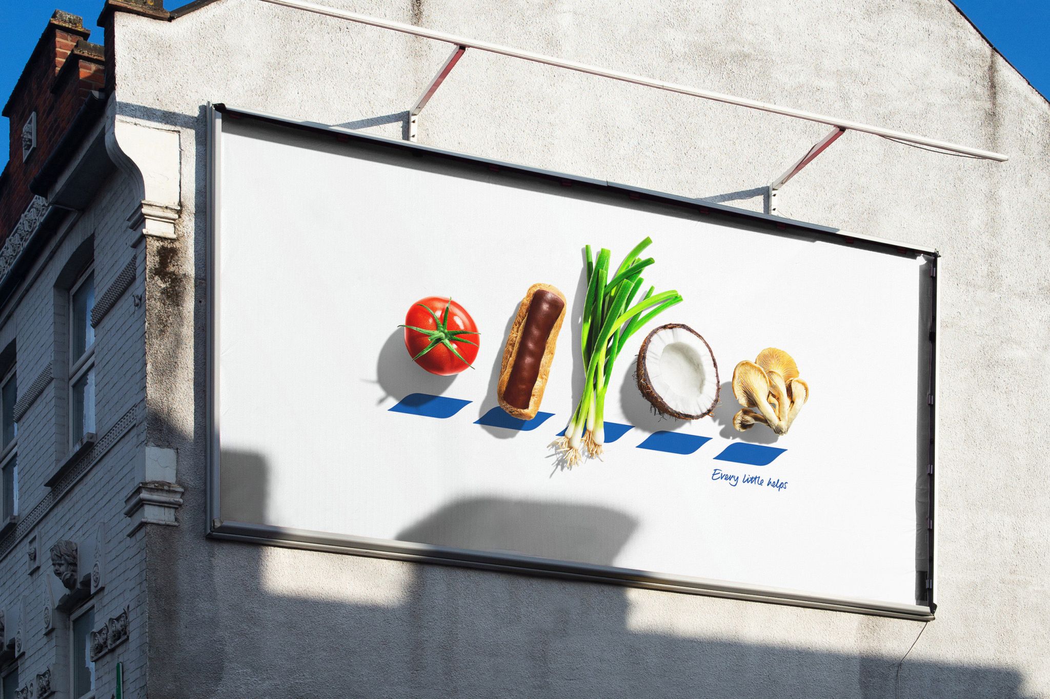
Image via BBH London
Will Cooper’s detailed photography brings the concept to life, turning ordinary fruits and vegetables into typographic elements. While legibility is now out of the window, the brand’s trademark blue chevrons are deliberately left behind in the visuals, inviting bystanders to connect the pieces through a playful visual puzzle.
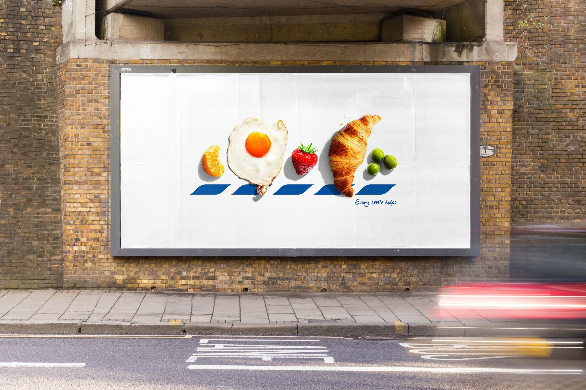
Image via BBH London
Even without the company’s name in bold letters, the endeavor relies on the grocery chain’s well-known association with fresh food to keep things recognizable. As each image of food represents the T, E, S, C, or O of the Tesco name, the posters encourage passersby to engage by figuring out which item matches each letter, reinforcing the message that Tesco stands for quality food.
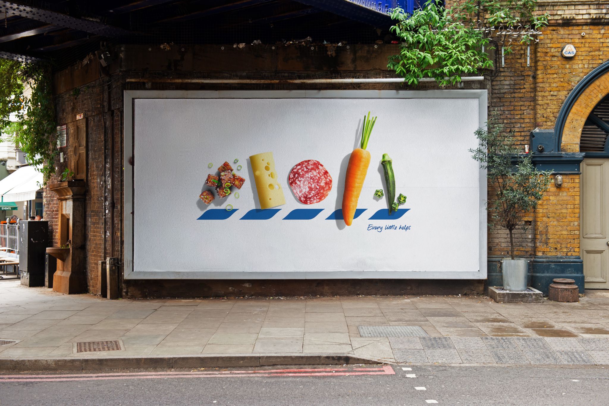
Image via BBH London
Felipe Serradourada Guimaraes, deputy executive creative director at BBH London, emphasizes that it takes a certain level of assurance for a brand to play with a logo like this.
“You need to have icon status to be able to play with your logo with such confidence,” Guimaraes shares. “We at BBH are lucky enough to have one of the most iconic brands out there, Tesco, and to work with a team which is willing to throw away the rule book which dictates how it’s used.”
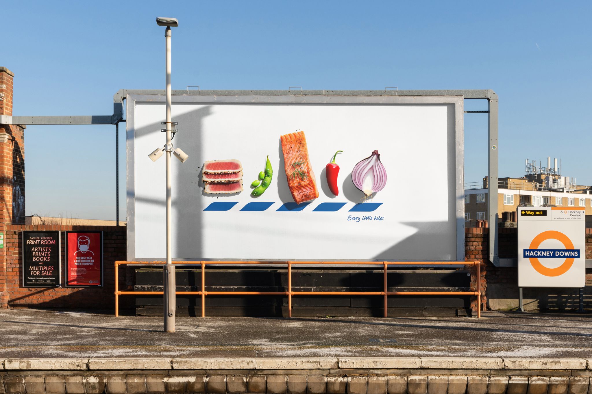
Image via BBH London
[via The Drum, Creative Boom, Campaign UK, Ads of the World, images via BBH London]


