
Durex’s New Logo Could Give You Blue Balls If You’re Truly Anal About Alignment
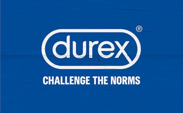
Image via Durex
Durex recently announced a new visual identity consisting of a flat two-tone logo redesign and a typeface hilariously named ‘One Night Sans’. While the revamped look is turning many design enthusiasts on, some think a slight detail in the logo is leaving much to be desired.
Digital creative and designer Helder Cervantes, for one, discovered that the top and bottom spaces sandwiching the ‘d’ in the Durex name aren’t evenly aligned. “Not today hun, I have a migraine,” he responded, highlighting the geometrical differences in the logomark.
While he likely meant it as a joke, others pointed out that the logo is optically perfect rather than mathematically precise.
For more potentially jarring trivia like this one, Google’s ‘G’ symbol is geometrically flawed, as well, and is instead designed to appear more aesthetically-pleasing.
Not today hun, I have a migraine https://t.co/vRqcb17F4e pic.twitter.com/DsF0CKaaIa
— Helder Cervantes 🤟 (@heldercervantes) February 19, 2020
😐 It’s optically aligned. Perfect as it is.
— Martyn Schmoll (@martynschmoll) February 20, 2020
[via Creative Bloq, cover image via Durex]
Also check out these recent news


