
Toyota Unveils Flashy 2D Oval Logo & Drops Wordmark In Progressive Brand Refresh
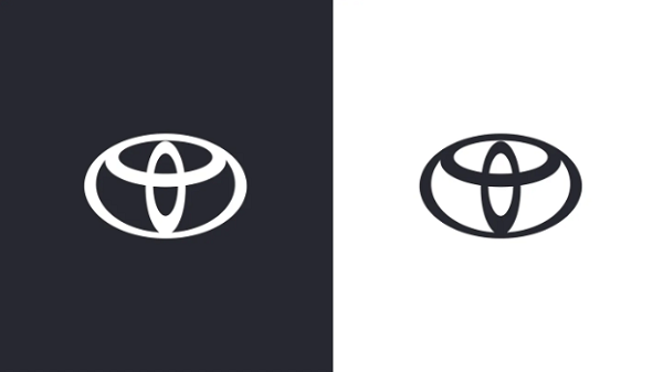
Image via The&Partnership
Toyota has unveiled a new visual identity as part of the company’s journey into becoming a “more progressive brand while guaranteeing longevity in a digital world.”
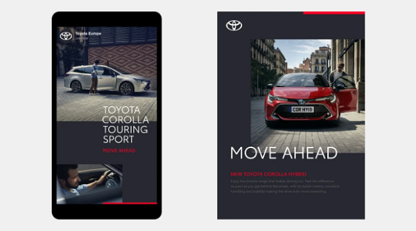
Designed by creative agency The&Partnership, the rebrand, which includes a redesigned logo, color palette and typeface, will be rolled out across internal and external brand communications in the Europe division.
The Toyota symbol consisting of ovals is now a flattened 2D design, following in the footsteps of Nissan and Volkswagen. The revamp sets to transition the brand into a more digitally-focused future.
The automaker has also dropped its wordmark, acknowledging that its emblem is recognizable enough. The new branding also appears clearer with less visual clutter.
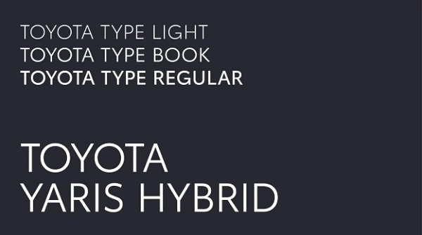
A bespoke sans-serif typeface, ‘Toyota Type’, has been designed by Monotype in hopes to “enhance clarity and consistency” across the brand’s communications.
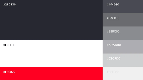
In addition, The&Partnership has updated he brand’s primary color palette to a clean and premium black and white colorway with red accents.
Speaking about the brand refresh, The&Partnership’s head of design Dan Beckett explained that the key to the project was to “bring the brand identity up to date” while “preparing it for years to come.”
“As well as re-modernizing the brand, we also sought to bring a more premium feeling while working hard to simplify the brand architecture and creating a design system which will be fluent across today and tomorrow’s touchpoints. Toyota has recently made great forward strides in its product design and we really wanted to see that reflected in the visual identity,” Beckett continued.
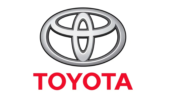
Old logo

New logo
[via It’s Nice That, opening image via The&Partnership]
Also check out these recent news


