
Velveeta’s First Logo Refresh In 20 Years Celebrates Cheese’s ‘Sweetness’
Screenshot via Velveeta
The world is moving to flat minimalist logo designs, and this is no secret. We’ve seen it in Volvo and the BBC. And now, we’re about to see it on, of all things, cheese.
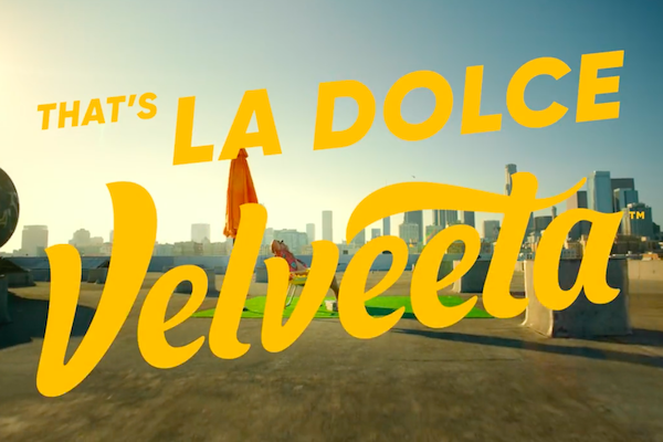
Velveeta has just revealed its refreshed logo, a first in more than two decades. This was designed by Jones Knowles Ritchie, and accompanies the “La Dolce Velveeta” campaign.
A script-inspired typeface spells out the brand’s name, reminiscent of the oozy cheese beyond the packaging, with elements like the oval and underscore removed for a minimalistic-yet-bold statement.
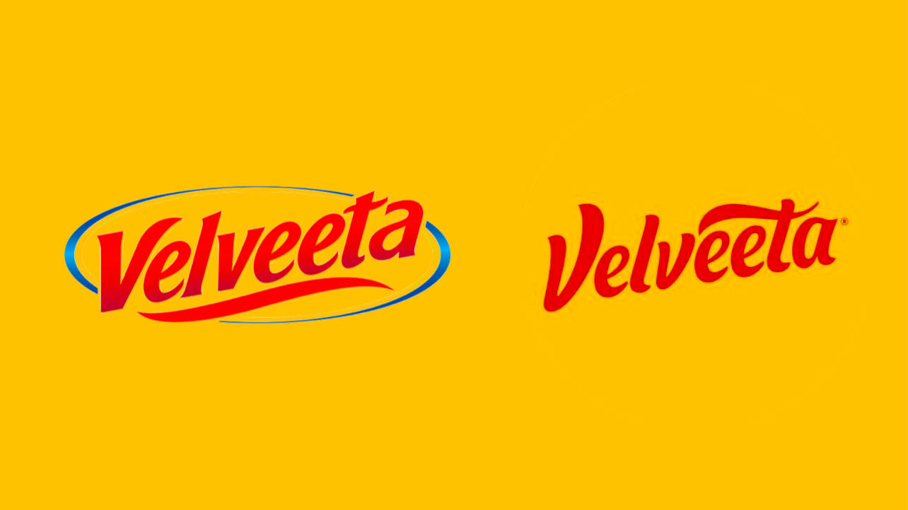
Old and new logo. Images via Kraft Heinz and Velveeta
The brand reportedly saw an increase in first-time customers in 2021, PRINT magazine reports, which is why it decided to shift its identity to a more modern aesthetic. “Our new logo is simpler, bolder, more creamy, and more expressive,” Leah Bowman, Heinz’s associate brand manager of Velveeta, explains to AdAge.
In line with this change is a new tagline and introductory spot. Of course, all of it is swathed in warm yellow goodness. Drawing inspiration from the Italian saying “la dolce vita” (“the sweet life”), this clip features customers luxuriously enjoying lavish sweet treats, albeit with a very cheesy twist.
Simple joys come in the form of melty cheese, after all.
New tagline. New lifestyle. Come join the party. #LaDolceVelveeta pic.twitter.com/ILzYhgyNkI
— VELVEETA (@CheesyVelveeta) November 4, 2021
[via AdAge, images via Velveeta and Kraft Heinz]
Also check out these recent news


