
BBC’s Brand Makeover Confuses People Further With Assortment Of Colorful Logos
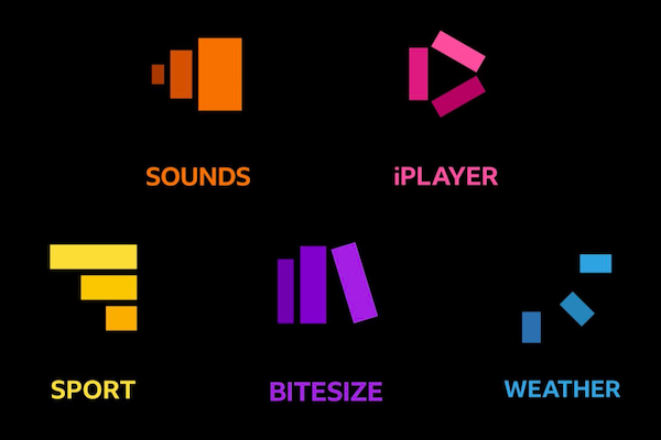
Image via BBC
Back in July, the BBC faced a lot of backlash surrounding its “new” logo, which looked pretty much identical to its old one.
Now, the media company has expanded its rebranding to the “modernization” of its other services. This includes updated logos for News, Weather, Sounds, Bitesize, and iPlayer.
Each will have three blocks arranged in a different pattern, saturated with a different color, and the name of the service printed neatly underneath. Apparently, this will make the sites easier to for audiences to navigate.
A coherence in the designs will “join the dots” between the services “through simplified layouts and graphics,” the company states. This one, at least, will be less of a subtle shift.
It all appears to make sense to the BBC, at least. However, the “audiences” that it’s referring to don’t all seem to agree with the sentiment. A Reddit user has been quick to add it to the ‘CrappyDesign’ subreddit, saying that the company had followed in Google’s “terrible footsteps.”
This is a reference to the recent rebranding of Google’s Workspace products, which users felt had nothing to do with the actual apps. Reiterating this is one user who notes that they wouldn’t have been able to identify what the rectangles are supposed to mean if it weren’t for the product names printed below.
News design has me stumped.
— fickleskittle (@fickleskittle) October 19, 2021
iplayer - play button
Weather - sun rays
Sports - league tables
Bitesize - books
Sounds - volume displays
News - deformed trees?
The change to its main logo was marked by the letters of the BBC now spaced slightly wider apart than before, swapping the Gill Sans font for a new Reith font, which belongs to the company and was named after its founder. Despite its controversial reveal in July, it hadn’t been rolled out yet.
Image via BBC
Now, in the fall, the company has officially introduced the logo to television screens as promised. Perhaps unsurprisingly, it has drawn the amusement of social media, with one user pointing out that rival media company ITV apparently had some good fun with this announcement.
ITV hosts actually on air cackling at the new BBC logo is the pettiest rivalry mood ever and i’m here for it pic.twitter.com/iknfSZh0Pp
— Shiraz Saz (@sarahhill_) October 20, 2021
Updated designs to the main BBC logo were rolled out on TV channels BBC One, Two, and Four on Wednesday, shown in junctions between programs. It’ll also hit BBC Scotland and BBC Alba before gradually finding its place across all the services the company has to offer.
Here’s a look at what’s to come across @BBC TV, online and mobile 📺 💻 📱@BBCiPlayer | @BBCSounds | @BBCSport | @BBCNews | @BBCScotland | @BBCWales | @BBCnireland | @bbcbitesize | @bbcweather | pic.twitter.com/rtHRXV3JP4
— BBC Press Office (@bbcpress) October 19, 2021
The full set of new BBC service logos / icons#idents pic.twitter.com/XXGdxl7yrm
— Back the BBC 📺📻📡📱 (@back_the_BBC) October 19, 2021
Those are terrible.
— DavidT_DSGN (@DavidT_design) October 20, 2021
The iPlayer is one of the most recognizable logos for the past decade. BBC sounds also has a good identity.
And that Sport logo means nothing at all.
Oh dear.
[via The National, images via BBC]


