
Volvo Takes Flat, Minimalist New Logo Out On A Spin
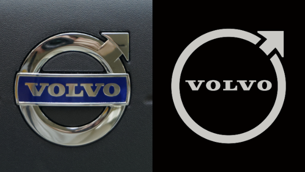
Old logo (left) VS new logo (right). Images via ID 30079654 © Pricopsorin | Dreamstime.com and Volvo
As automakers depart from a fuel-drenched history, they’ve also lightened up their logos along with pacts to go electric. Volvo appears to be the latest to give its branding a make-under, and even with all the minimalist redesigns that have appeared in recent years, this one is truly barebones.
Image via Volvo
The rebrand strips off the metallic polish as well as the middle bar from the famous ‘iron mark’ emblem, leaving the matte Volvo wordmark to float in the center. For old time’s sake, the Swedish car company has kept the circle and diagonal arrow, although the area where the arrow sits has been snipped off to add dimension to the flat design.
Meanwhile, the refreshed typeface appears slimmer and more elegant.
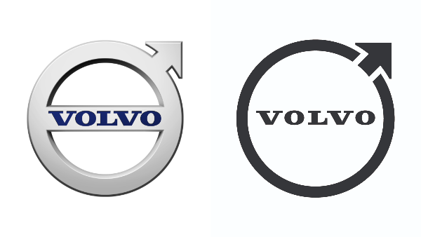
Old logo (left) VS new logo (right). Images via Wikimedia Commons (public domain) and Volvo
A standalone wordmark envisions the Volvo script with more space between the letterforms. Volvo has another version of it specifically for products and small screens for when “clear visibility of the Volvo spread word mark can’t be ensured,” a spokesperson told Australian automotive news site Drive.
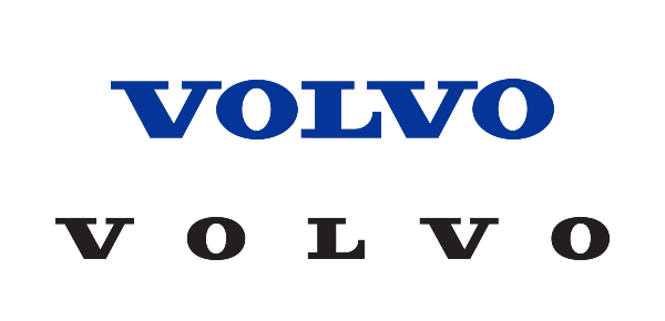
Old script (above) VS new logo (below). Images via Wikimedia Commons (public domain) and Volvo
The first cars to sport the new branding will be rolled out in 2023. Volvo says it will be a “gradual” transition; the company commenced the switch on its main website, social media channels, and mobile app, and intends to move “in other areas step by step” before phasing out the old version.
[via Drive, images via various source]
Also check out these recent news


