
The Olympics Presents First Full Branding, Playing Outside Of Iconic Ring Hues
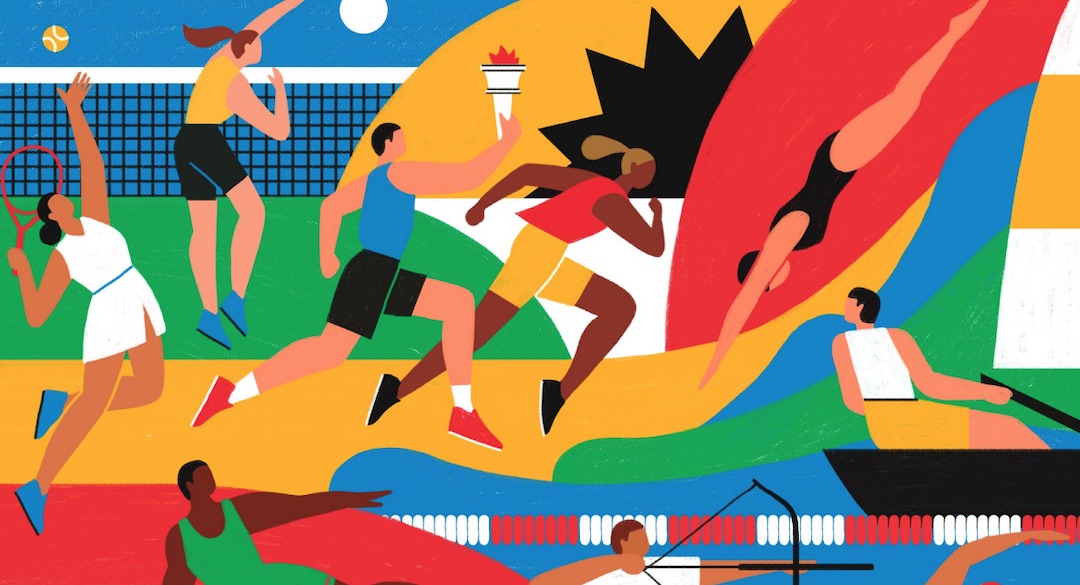
On track and course for the Paris 2024 games, the Olympics committee has revealed a new brand identity covering graphics, typography, and illustrations. All these are geared to catapult the sporting event into the digital age.
The Olympics symbol may be one of the most recognized logos in the world. The iconic five interlocking rings in yellow, blue, red, green, and black symbolizing the different continents have been so far sufficient in representing the brand.
However, since the modern games began in 1896, a complete brand identity has not been formulated. According to the committee, this would be the first time it has branched into creating a vibrant host of art and typefaces to represent the games over different channels for global consistency.
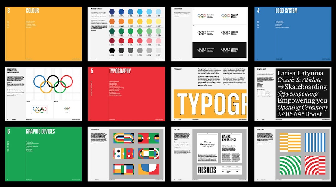
Work for the visual identity, designed in tandem with creative agency Hulse & Durrell, began back in 2018.
Over the last Summer and Winter games, the committee has already begun introducing aspects of the new typeface such as the Olympic Headline, Olympic Sans, and Olympic Serif.
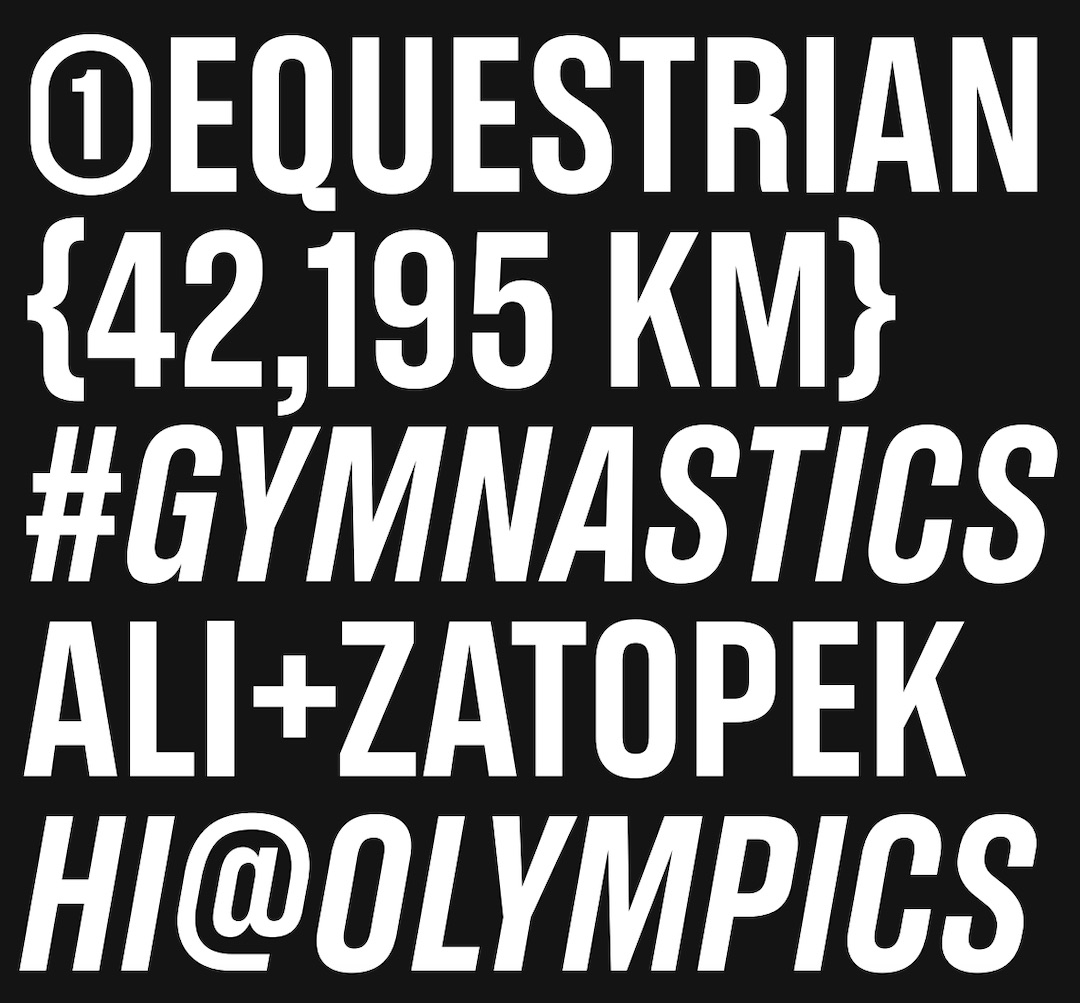
Type design agency Dinamo’s Fabian Harb and Seb McClauchlan and design studio Principal’s Julien Hérbert were tasked to create the font family.
In addition, 17 different illustrations depicting the games’ spirit were produced by artists Francesco Ciccolella, Abbey Lossing, and Karan Singh.
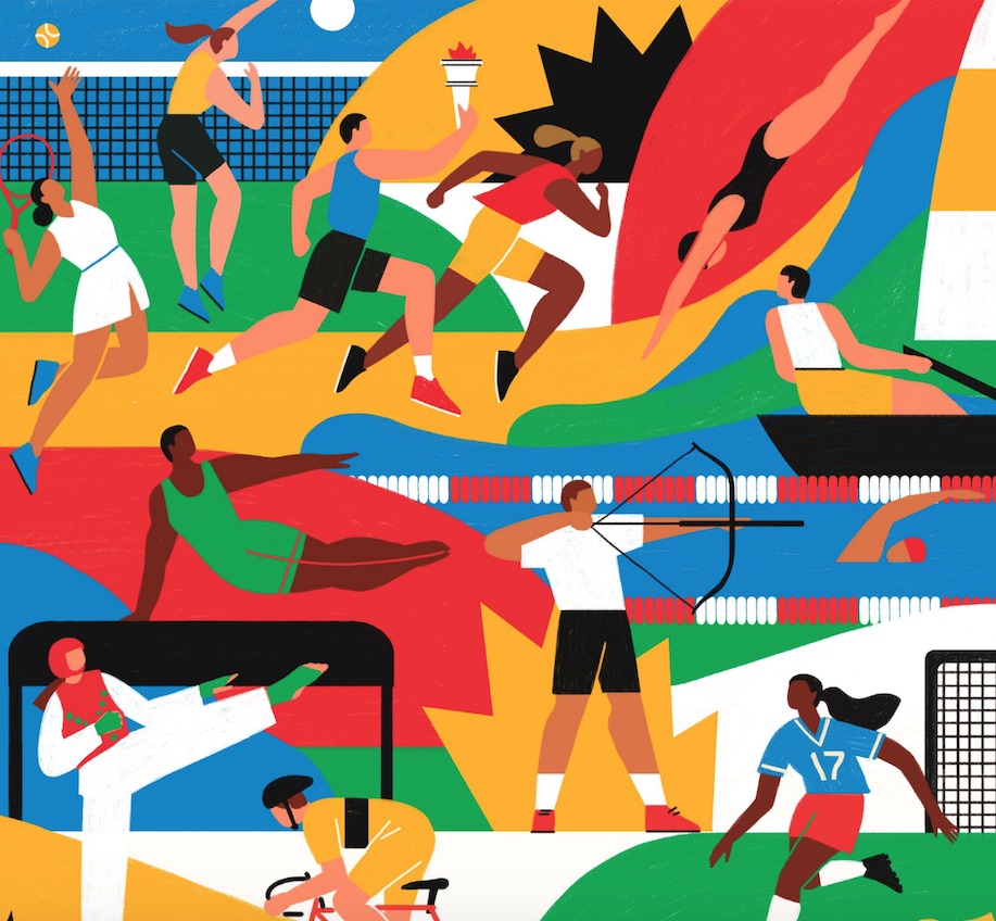
Simple hand-drawn images have been creatively conceived to capture the heart and spirit of the games while at the same time being optimized to be cropped or edited for different mediums.
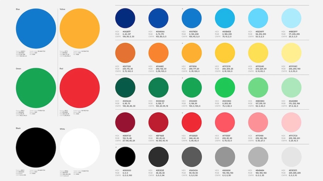
The color palette has also been reworked to incorporate more shades of the classic five hues. The gold, silver, and bronze medal have also been added to the spectrum.
The entire library of work is set to fully go on display by Paris 2024, which will be the first game that will see the brand come to life in such a way. Until then, the committee plans to roll out the new branding on different touchpoints in its marketing.
Take a look at the full suite of designs here.
[via Dezeen and International Olympics Committee, images via International Olympics Committee]


